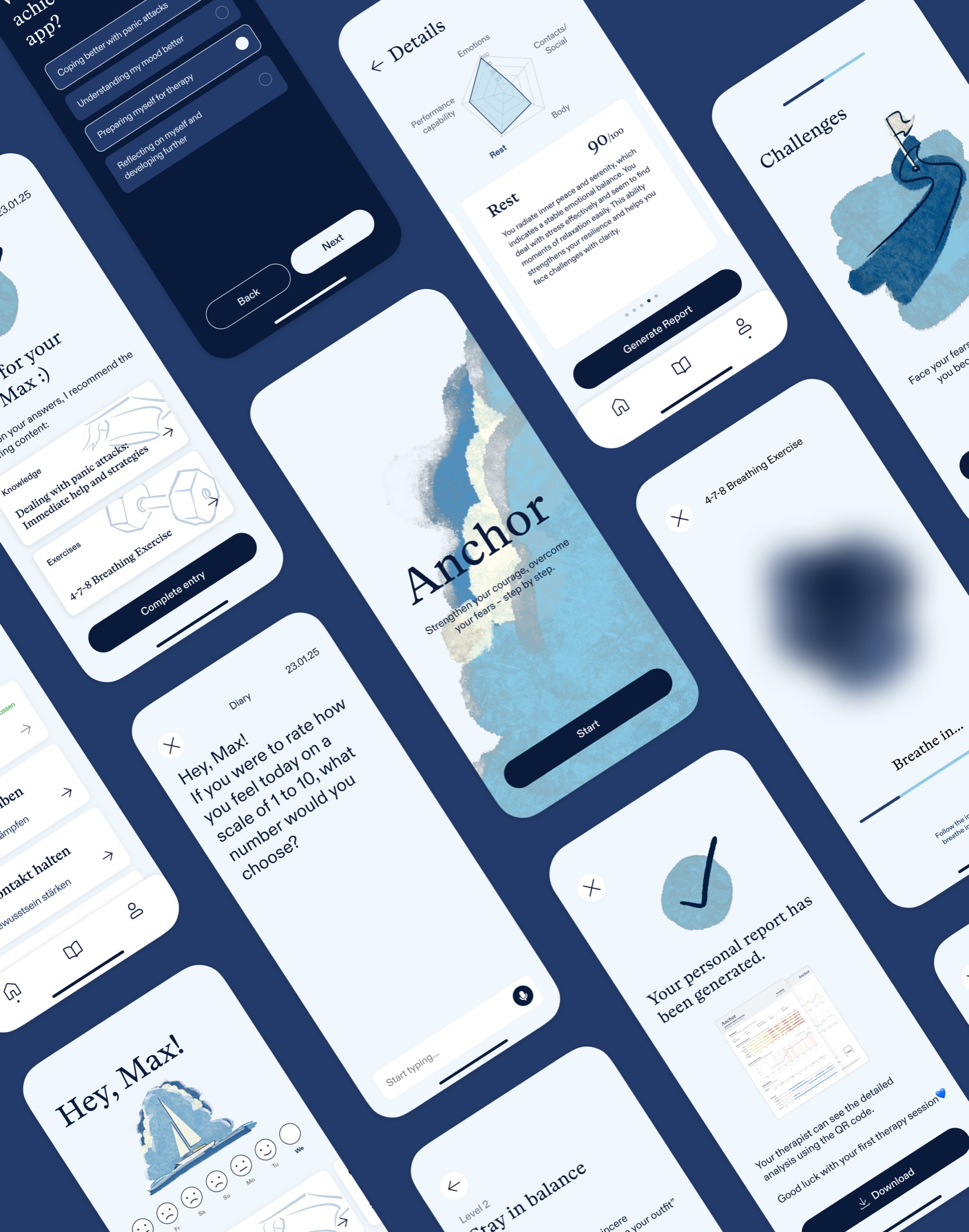
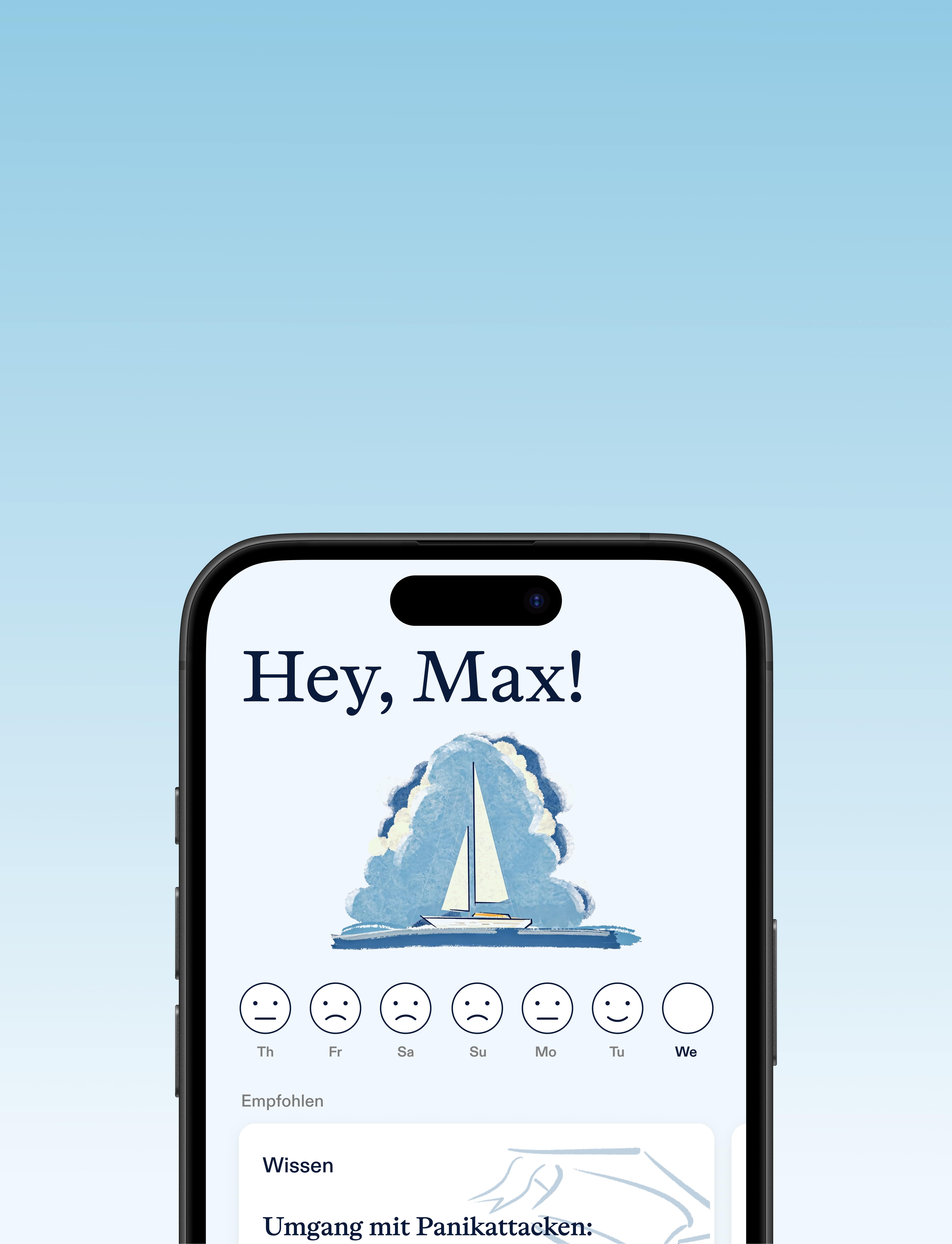
Anchor supports people with anxiety disorders and panic attacks through the often lengthy wait for therapy — a time when many feel lost and alone.
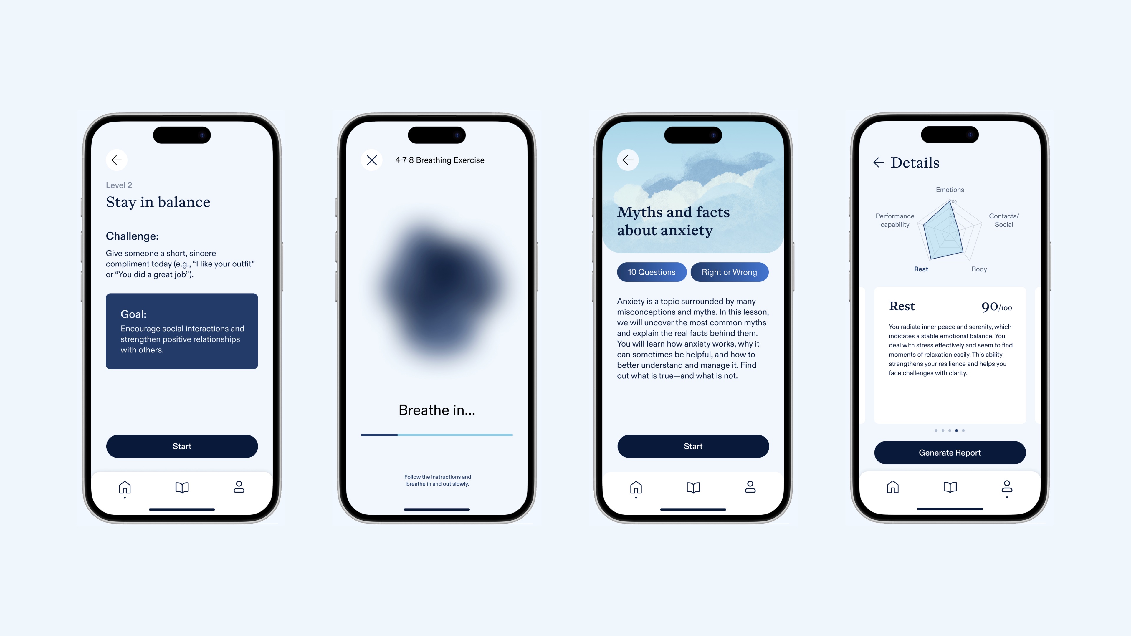
With personalized exercises, a mood-tracking tool, and expert-backed insights, the app helps users better understand their anxiety, actively build mental resilience, and track their progress. By providing structure and support, Anchor makes the waiting period a meaningful first step and ensures a smoother transition into therapy.
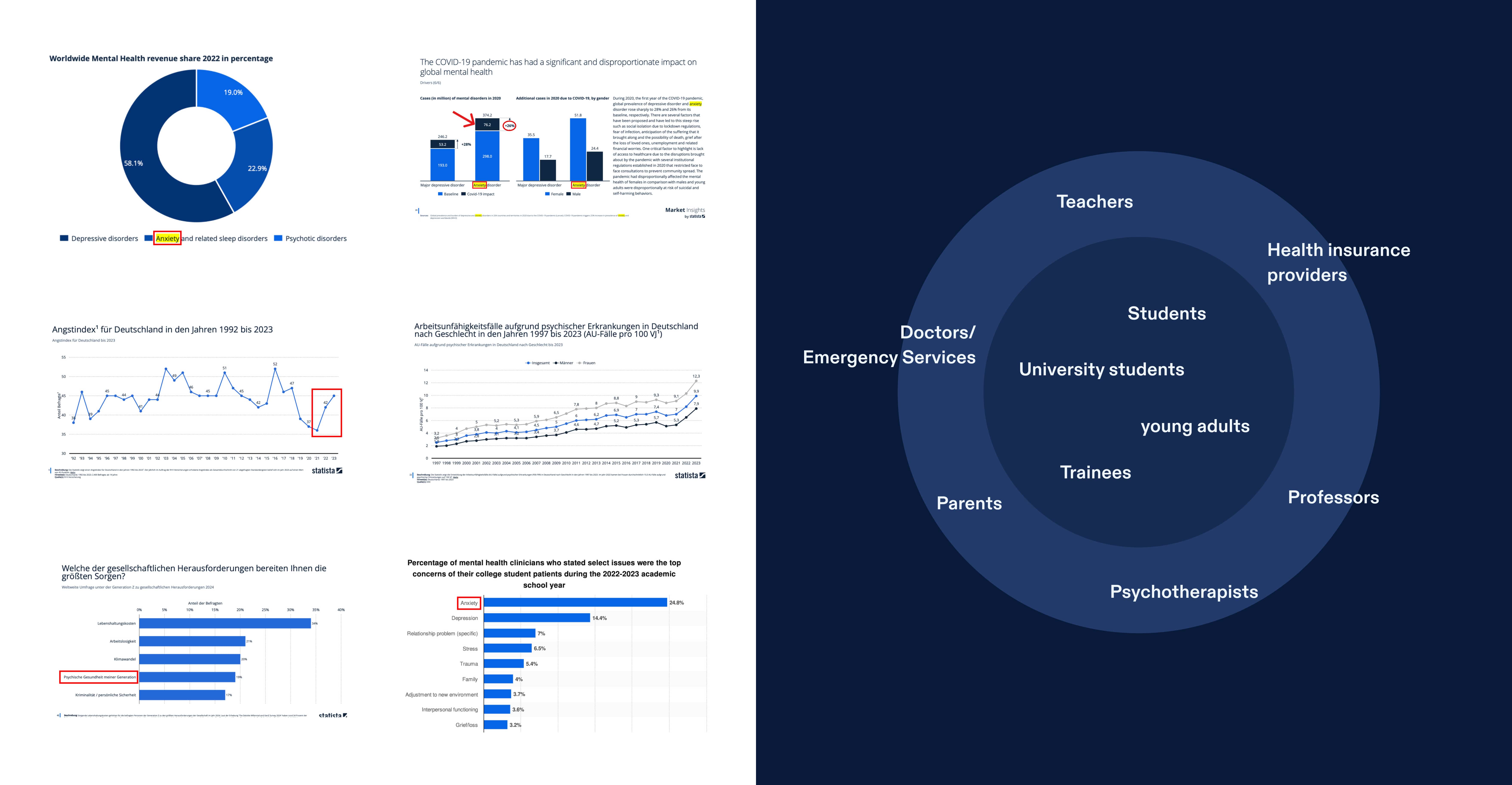
Anxiety disorders among young adults surged by 26% post-pandemic, and in Germany mental-health-related sick leave climbed from 8% in 2019 to 12% in 2021. Despite over 50% of Gen-Z naming anxiety as a top concern, average wait times for psychotherapy often exceed three months — leaving many to manage panic attacks, sleep loss, and social isolation alone. This untreated gap worsens symptoms and increases the risk of long-term impairment.
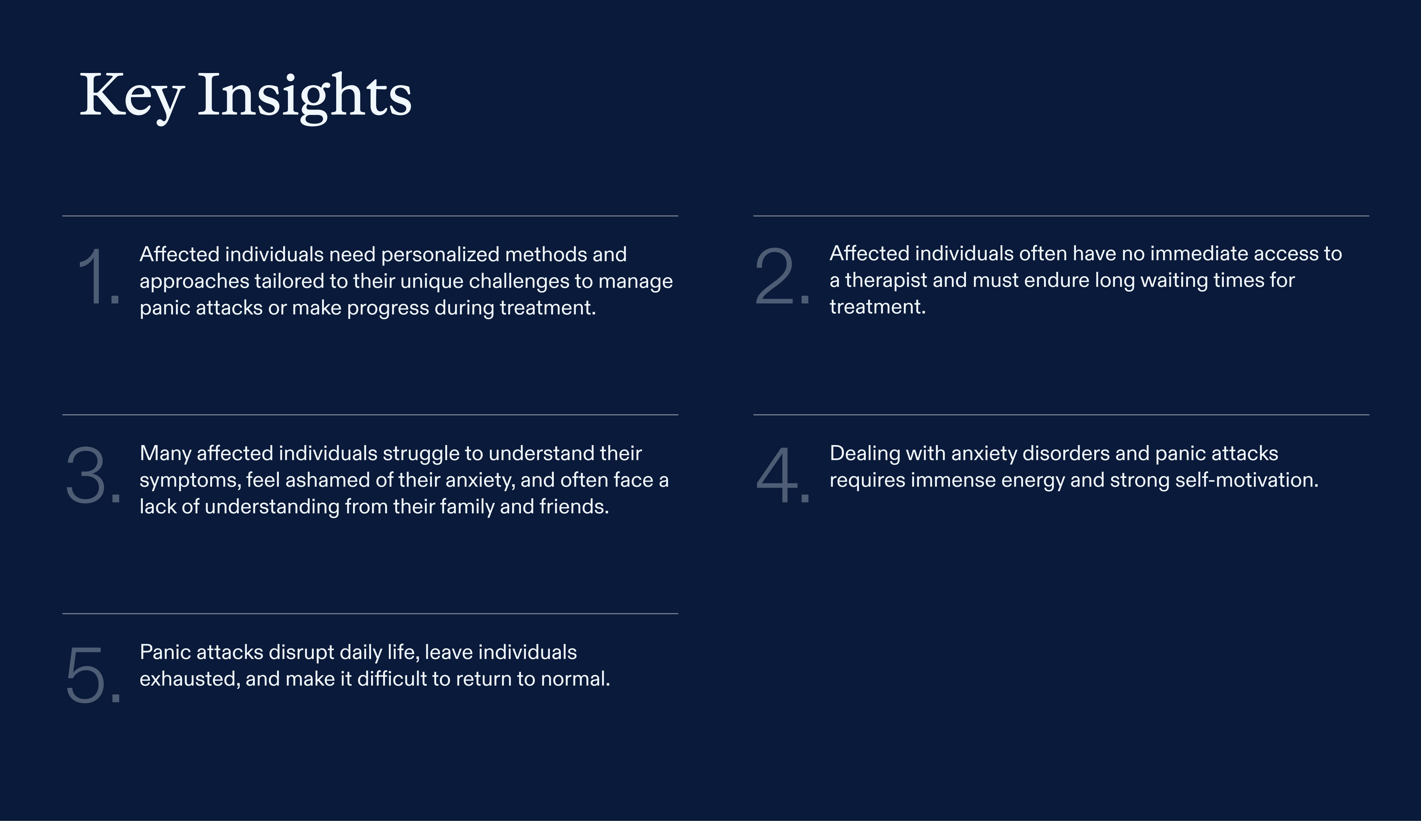
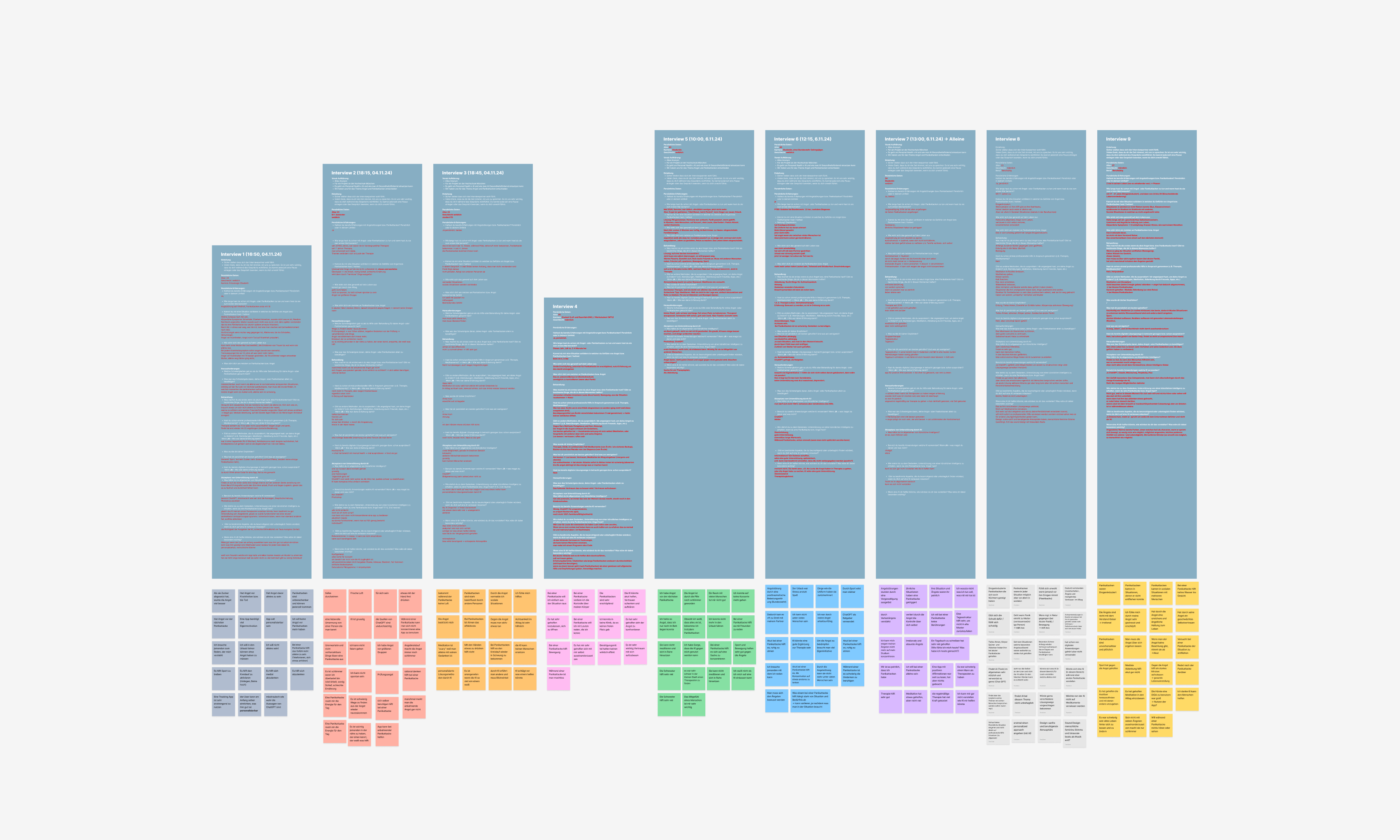
We conducted nine in-depth interviews with people who experience anxiety or panic attacks, plus one with a licensed psychotherapist. Recruiting participants for intimate, emotionally charged conversations required extreme sensitivity: we built trust through active listening, clear consent, and empathetic prompts. These sessions revealed not only pain points around self-management and stigma, but also the gap in support during therapy wait times.
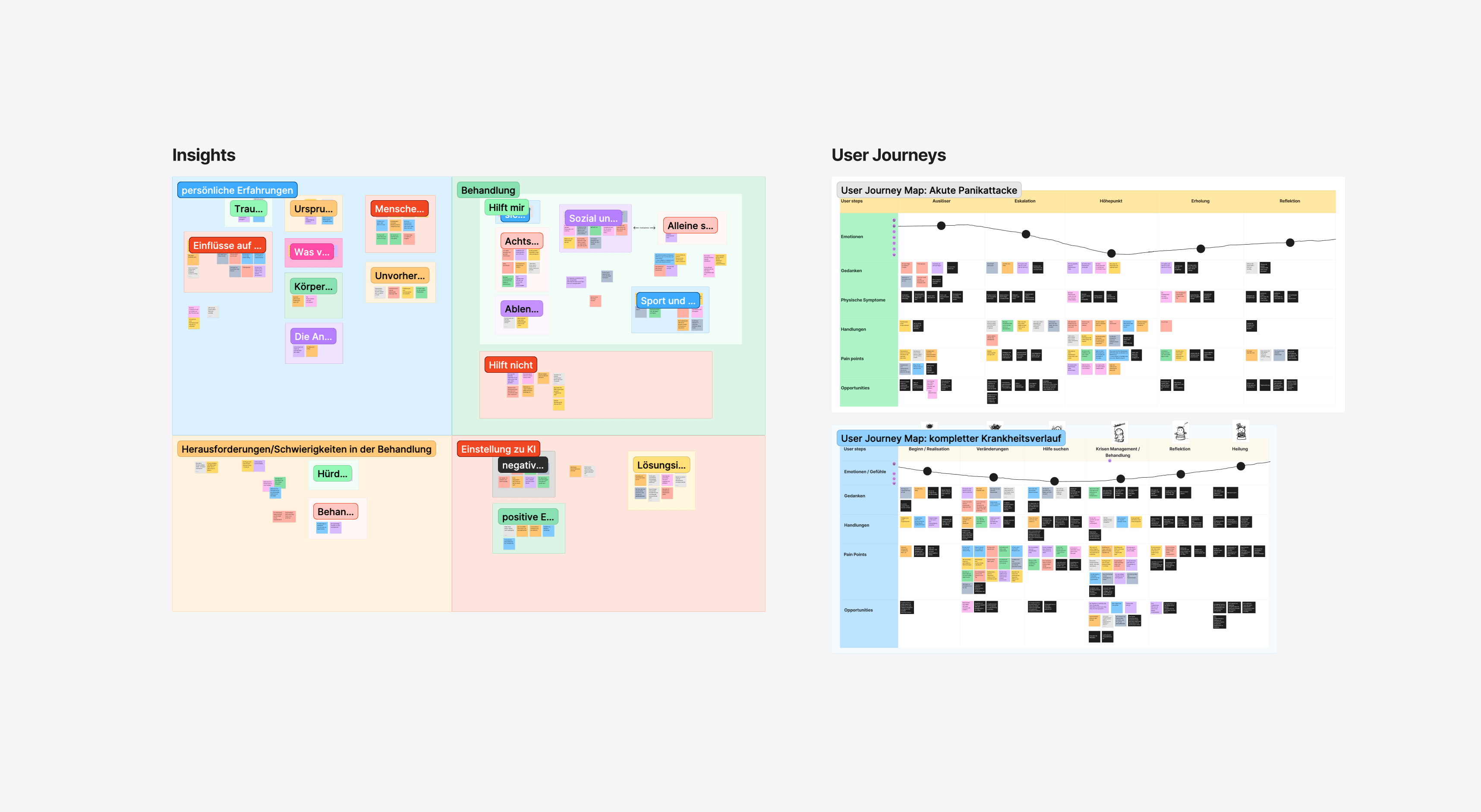
To make sense of our qualitative data, we mapped two patient journeys — one high-level and one detailed — to visualize emotional states, triggers, and touchpoints over time. We then grouped insights thematically to uncover design opportunities. This methodical synthesis helped us identify where users felt most lost, where they needed education versus immediate relief, and where small interventions could boost resilience.
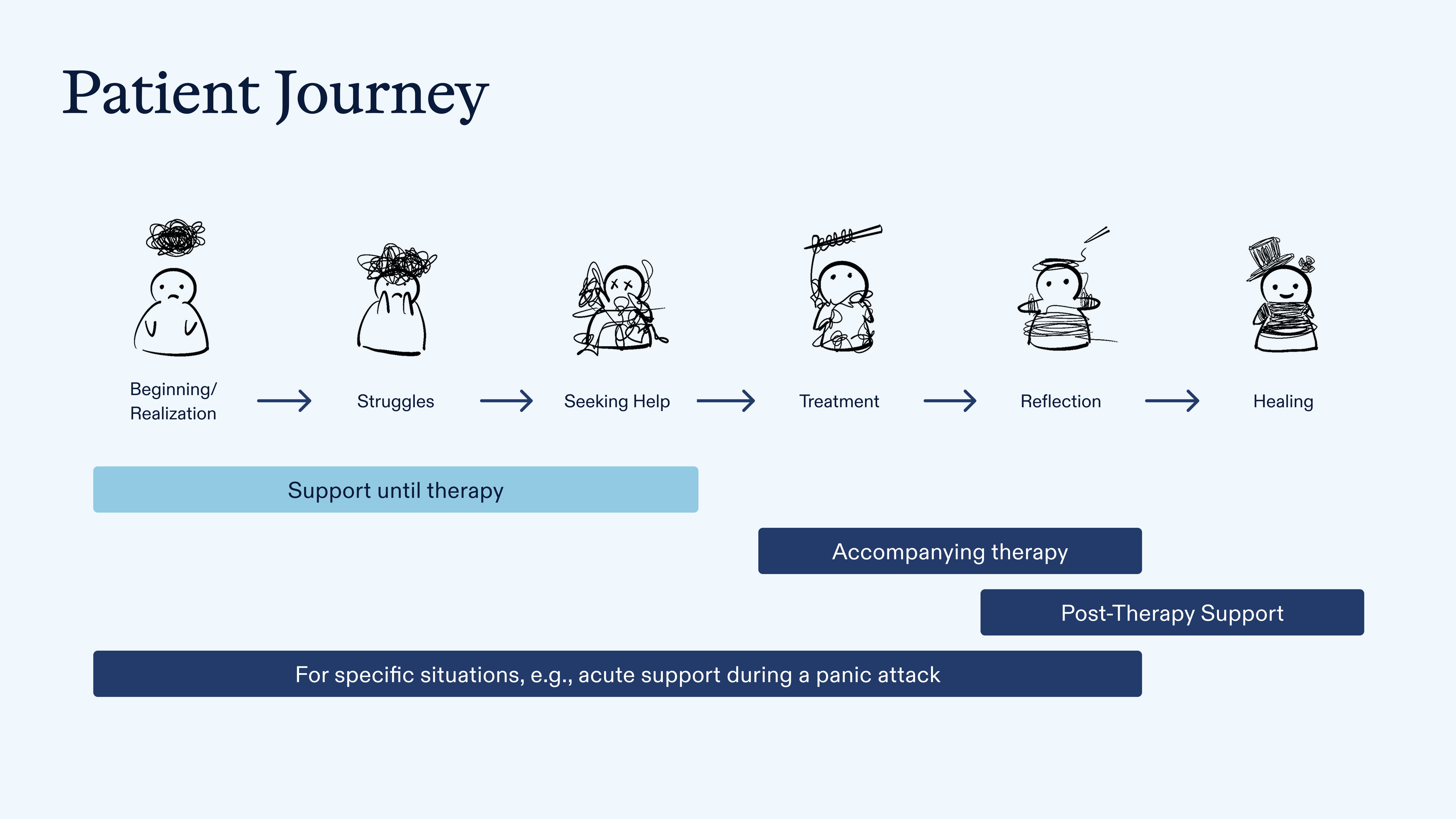
Instead of repeating existing in-therapy app features, we focused on the unaddressed pre-therapy waiting period. By overlaying our patient journey with stakeholder inputs, we spotted a unique opportunity: create an accessible, structured support system to guide users from crisis toward treatment. Anchoring our strategy on this gap let us craft a service that becomes the meaningful first step in mental-health care.
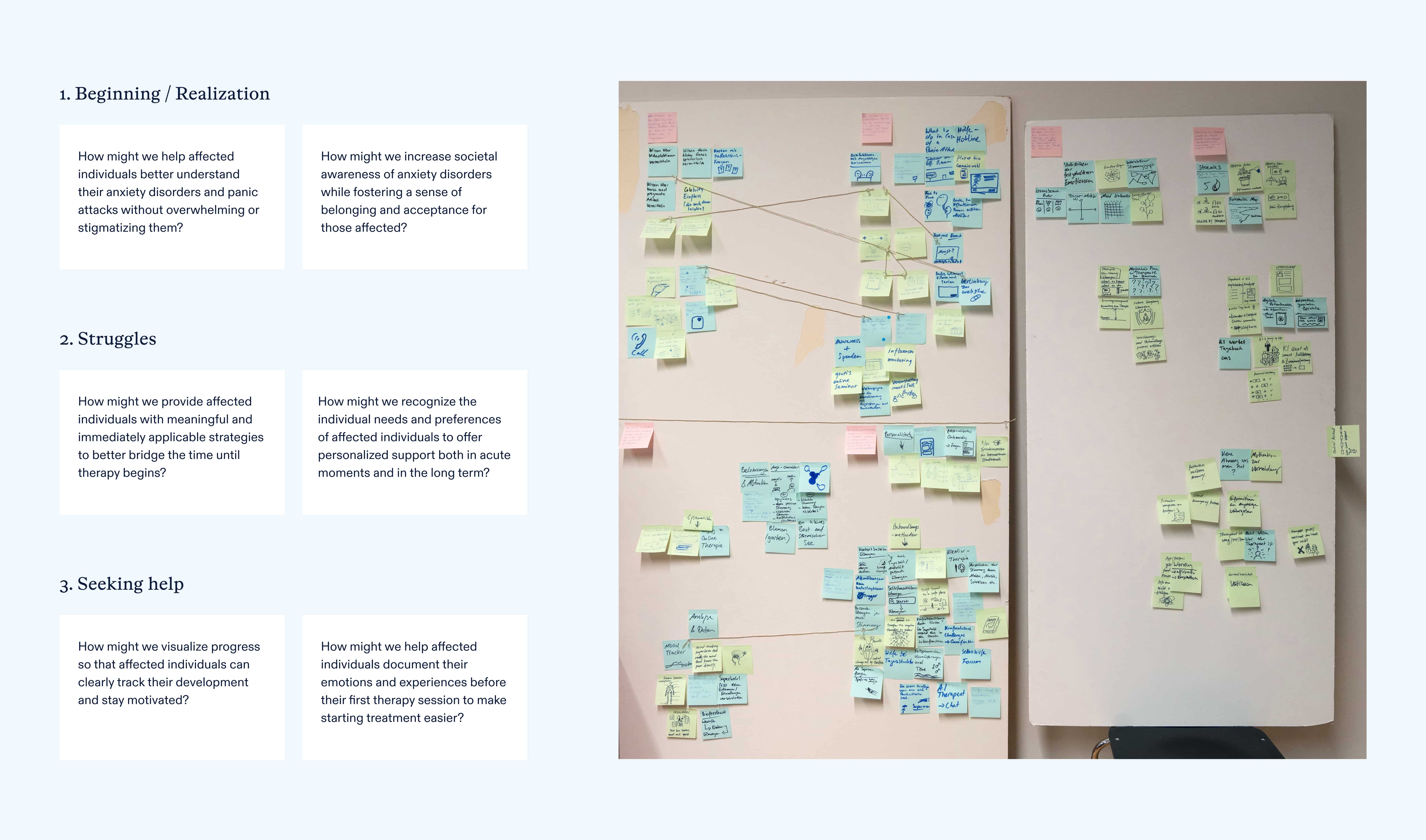
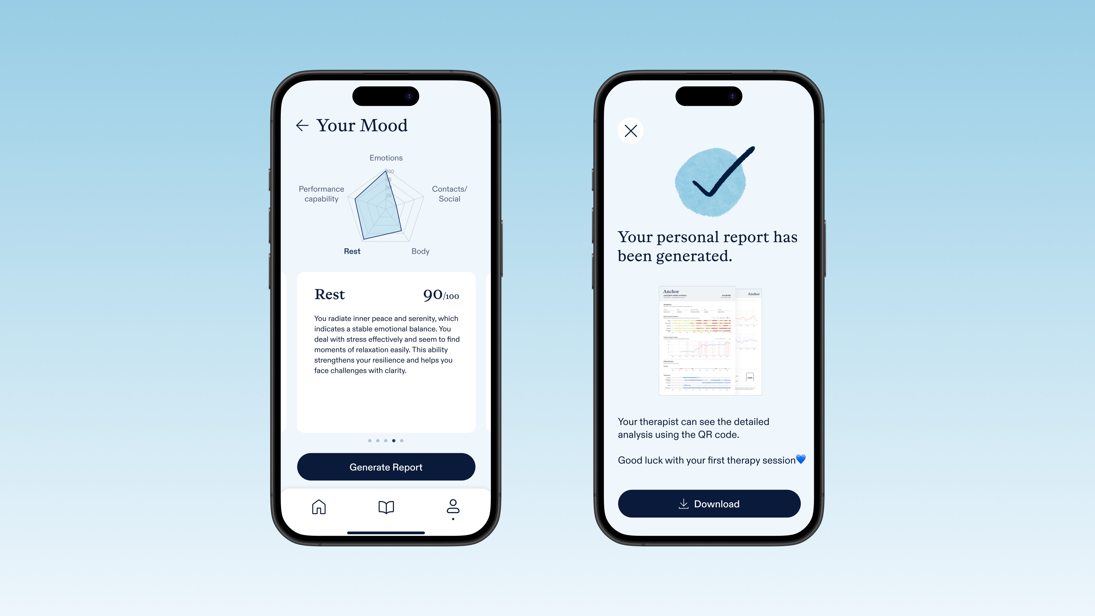
We framed three journey phases — Beginning/Realization, Struggles, and Seeking Help for Therapy — and for each defined How-Might-We questions to spark targeted solutions. For example, "How might we offer immediate calming exercises without overwhelming new users?" and "How might we track progress so users see their own growth?" This led to a suite of features, from empathetic journaling to challenge-based exercises, that directly map back to our insights.
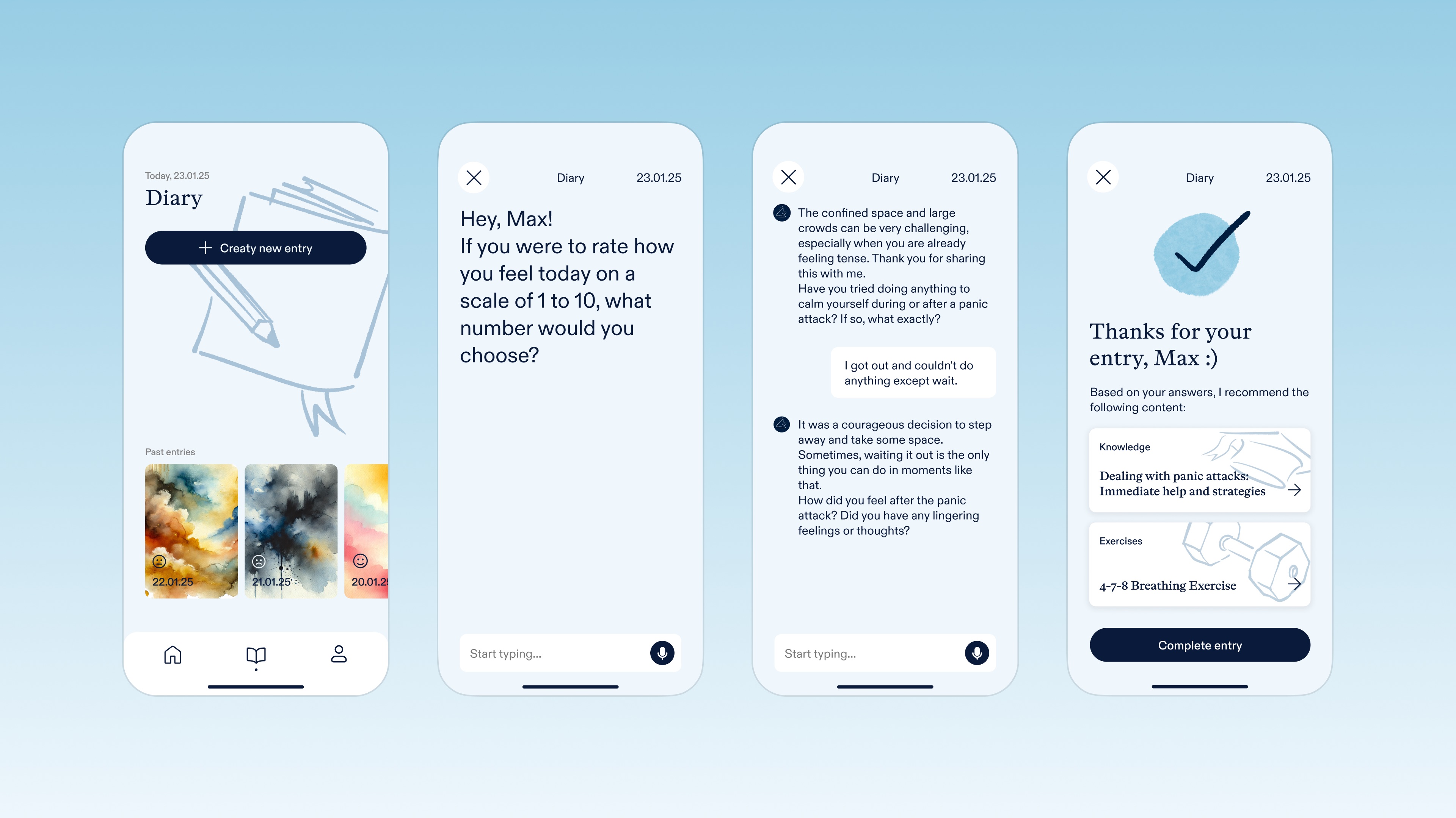
The conversational AI-powered diary is our signature feature: rather than static text fields, users talk through their experiences in a supportive chat interface. Empathetic prompts encourage openness and reflection, while natural language processing tailors follow-up questions. This human-centred approach lowers the barrier to self-disclosure and creates richer data for both users and their future therapists.
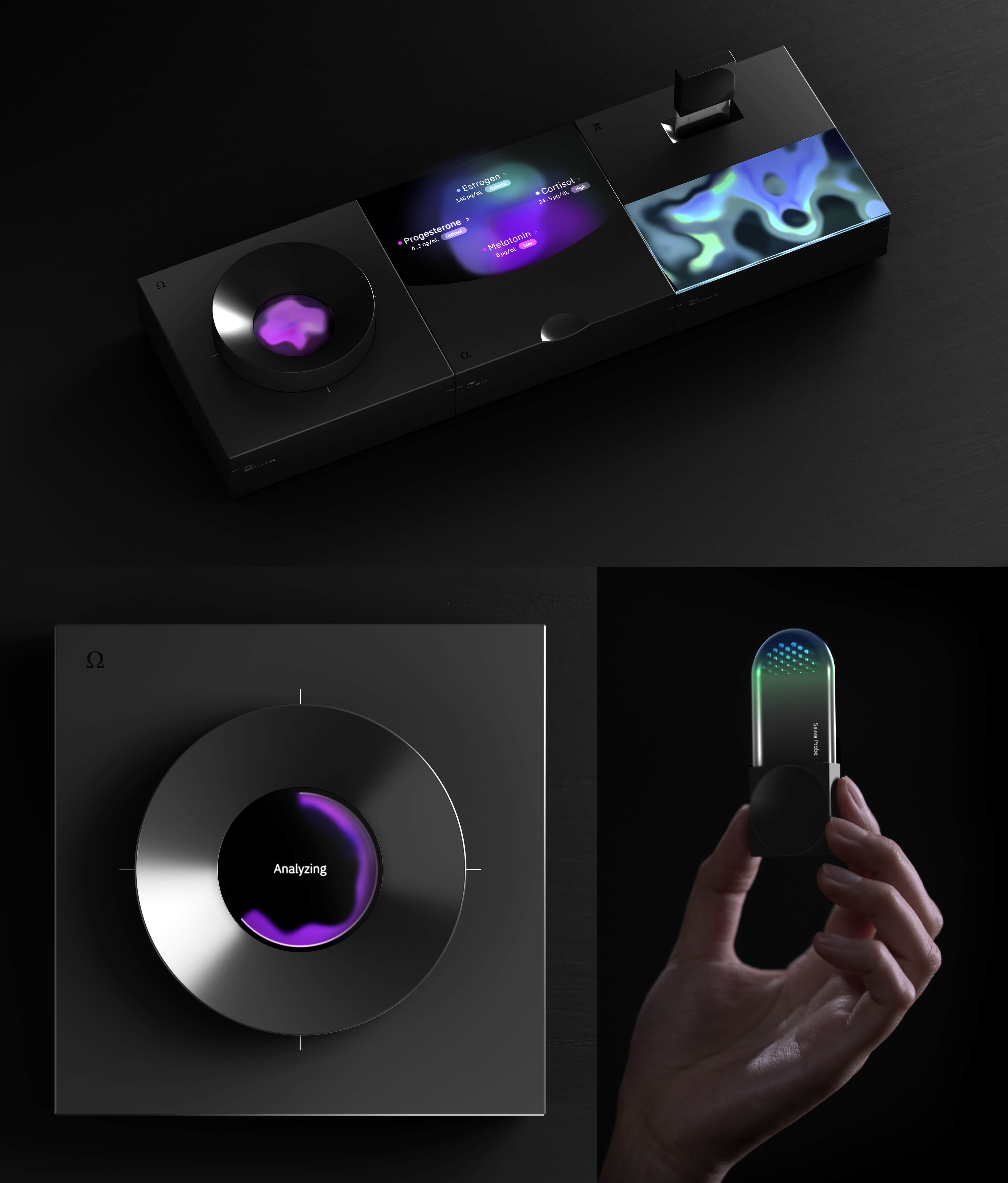
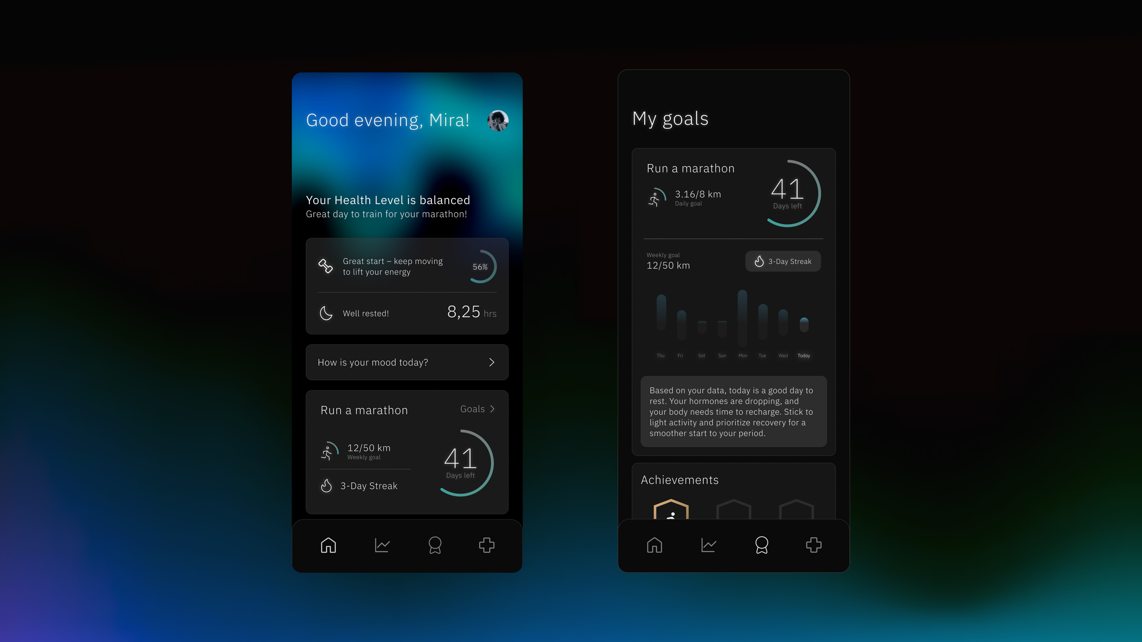
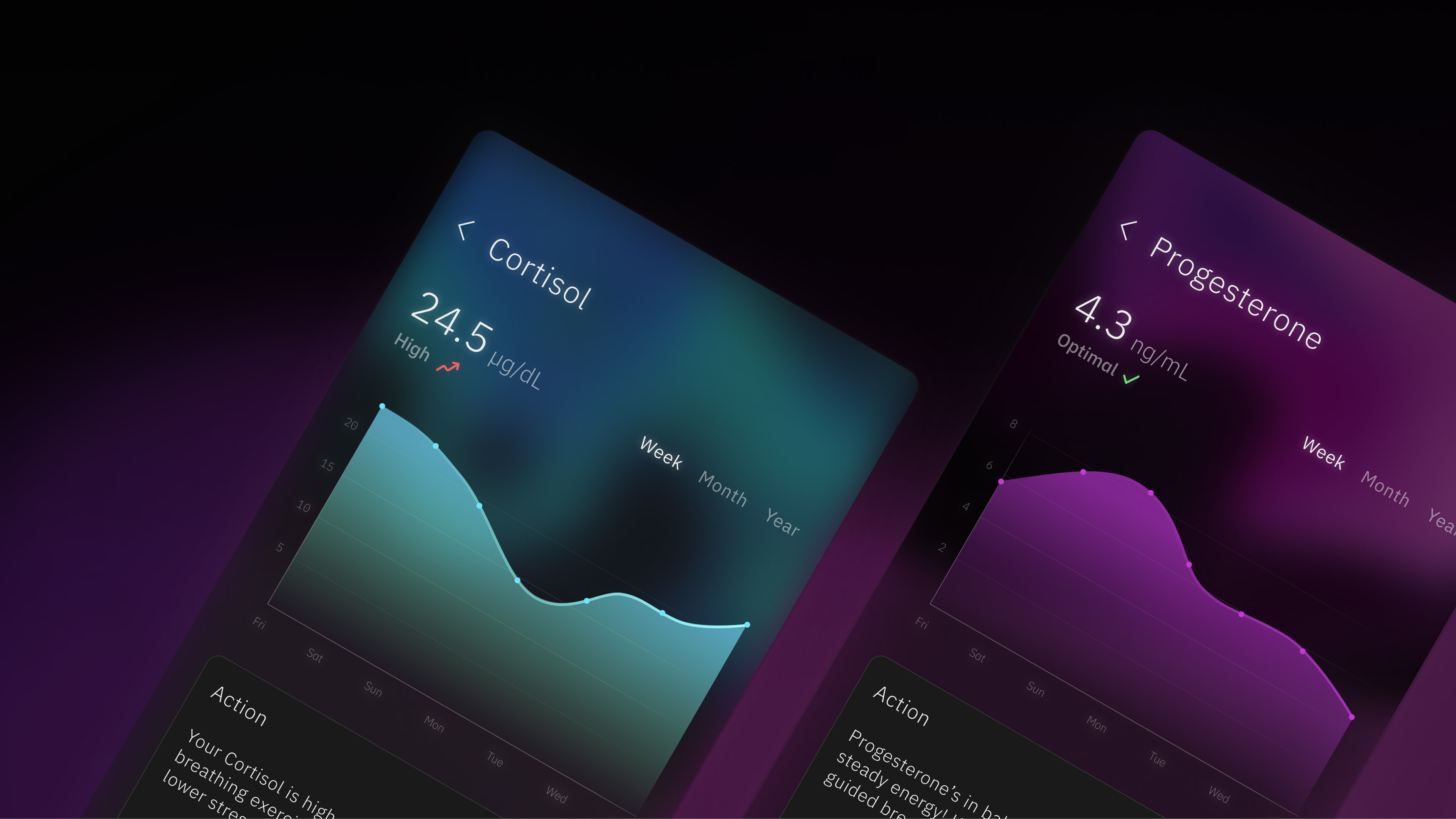
Orbis turns complex hormone data into clear, personalized guidance that empowers users on their path to hormonal balance and self-discovery.
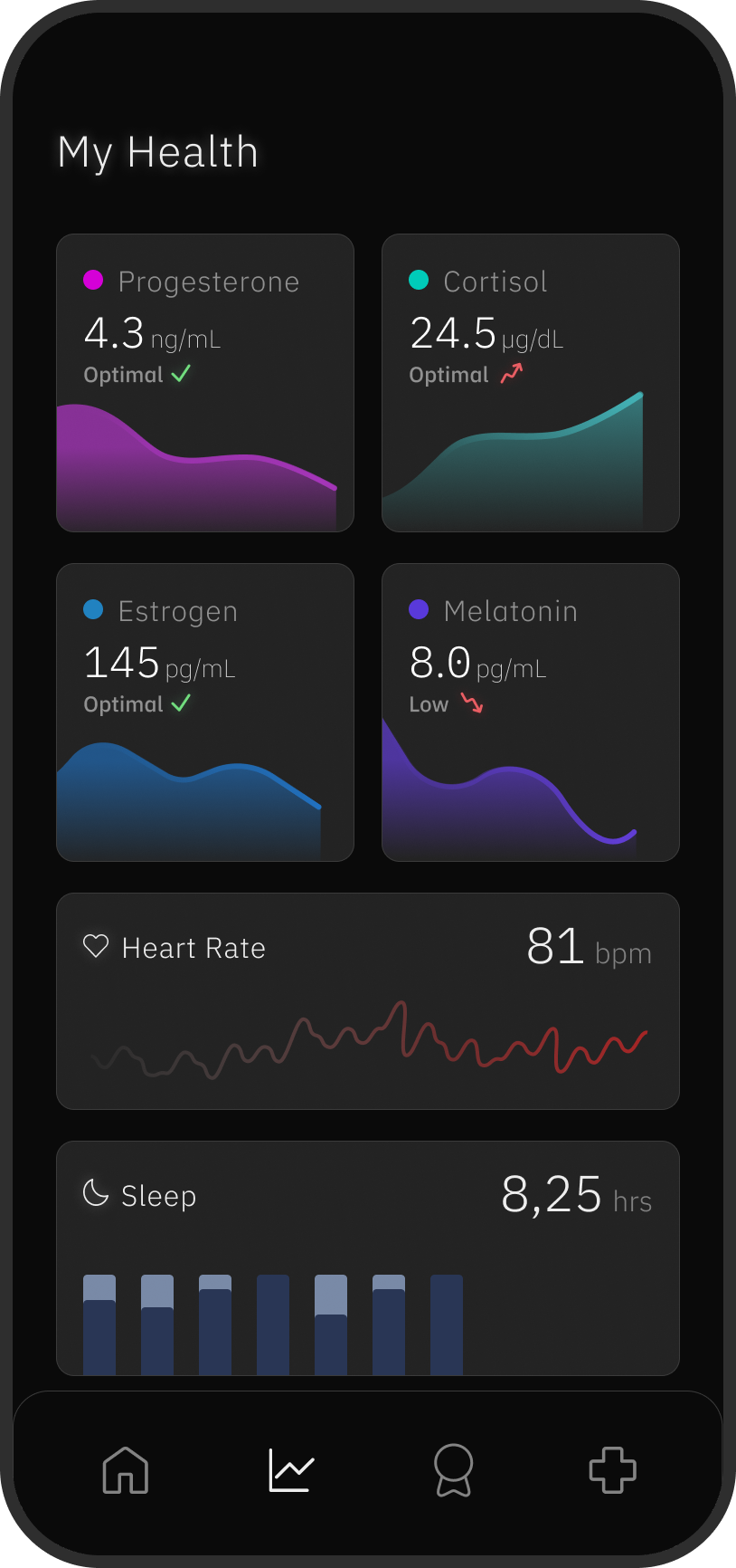
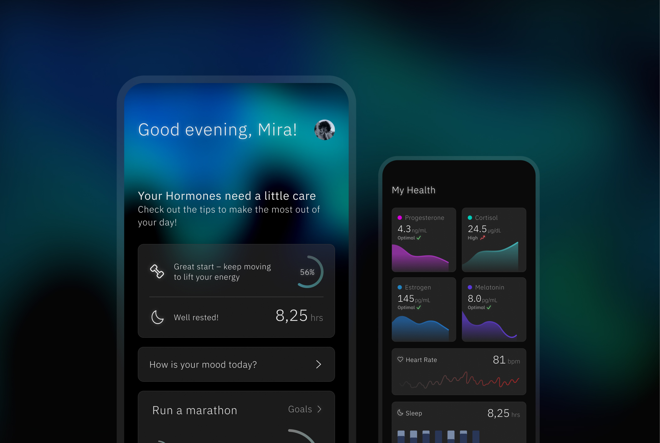
By seamlessly combining insights from the ORBIS device with other health platforms, the companion app offers a complete, holistic view of both physical and emotional well-being.
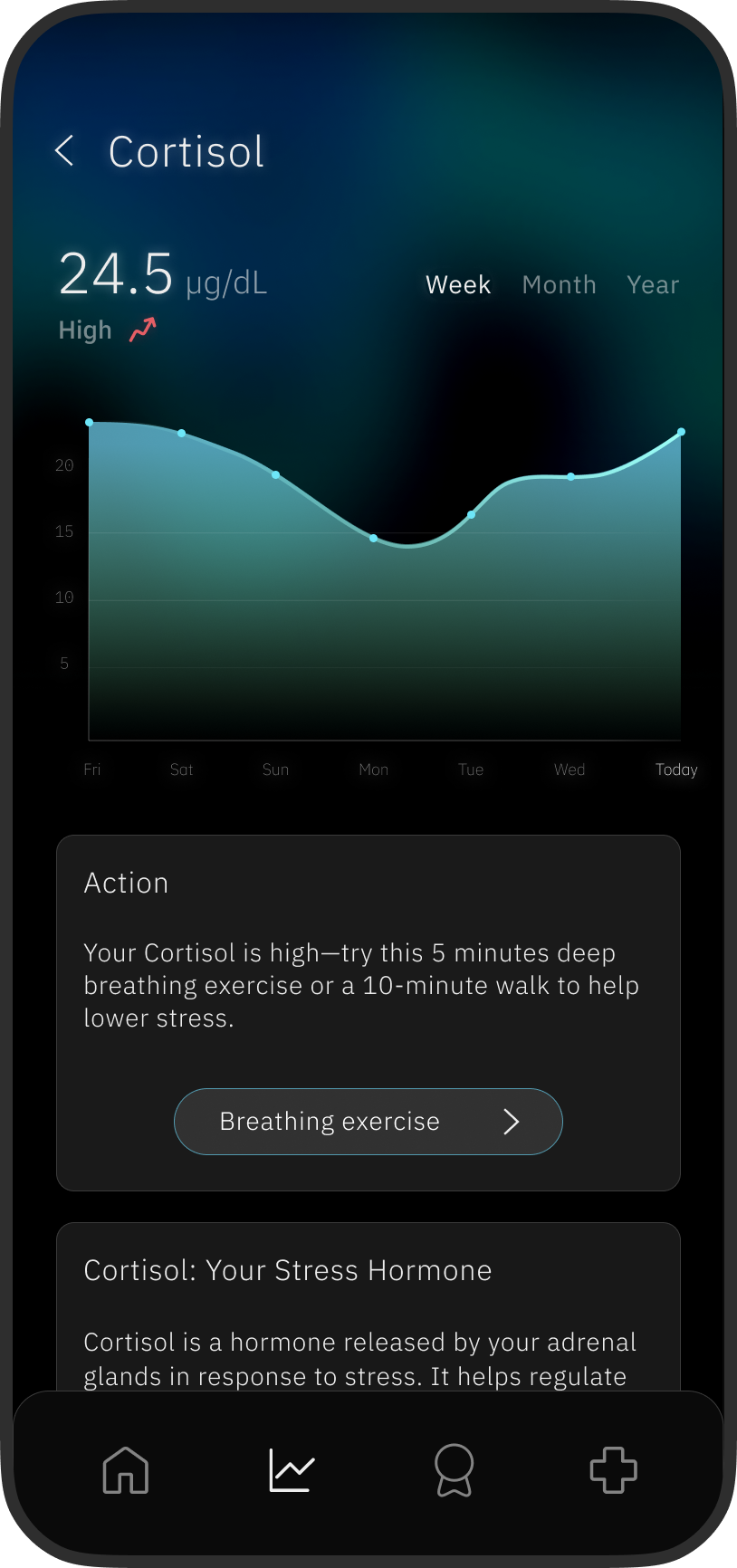
Through intuitive goal-setting, tailored recommendations, and smart data interpretation, the app transforms passive tracking into active self-improvement, making health feel approachable, motivating, and truly personal.
The Orbis Hormone Analyzer by FLUID is a sleek, at-home health device that empowers users to monitor hormone levels through painless blood and saliva sampling. Designed with a minimalist aesthetic, it integrates seamlessly into daily life, transforming clinical testing into a sophisticated, consumer-friendly experience.
This approach reflects a broader shift in healthcare — from reactive, provider-centric models to proactive, user-centered care — where wellness is integrated into lifestyle through intuitive, high-quality technology.
FLUID created the device as a future medical design vision, and my task was to design the companion app around it. The real challenge was making sure the app actually added value: the device already carries a screen that can display plenty of information, so anything I designed risked being redundant.
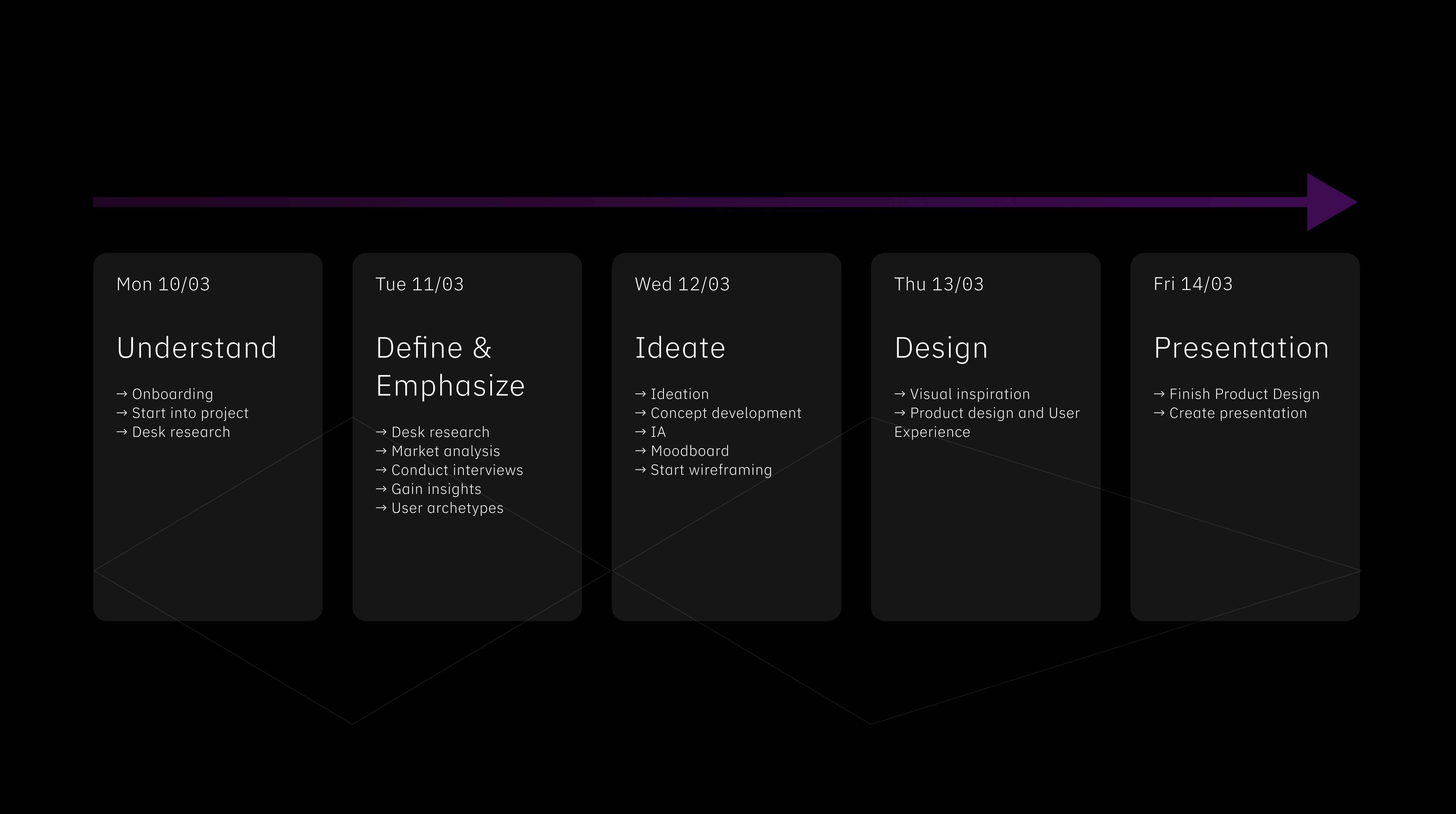
With four days to go from brief to presentation, I planned the sprint myself — mapping each day from understanding and research through ideation, design and the final handover.
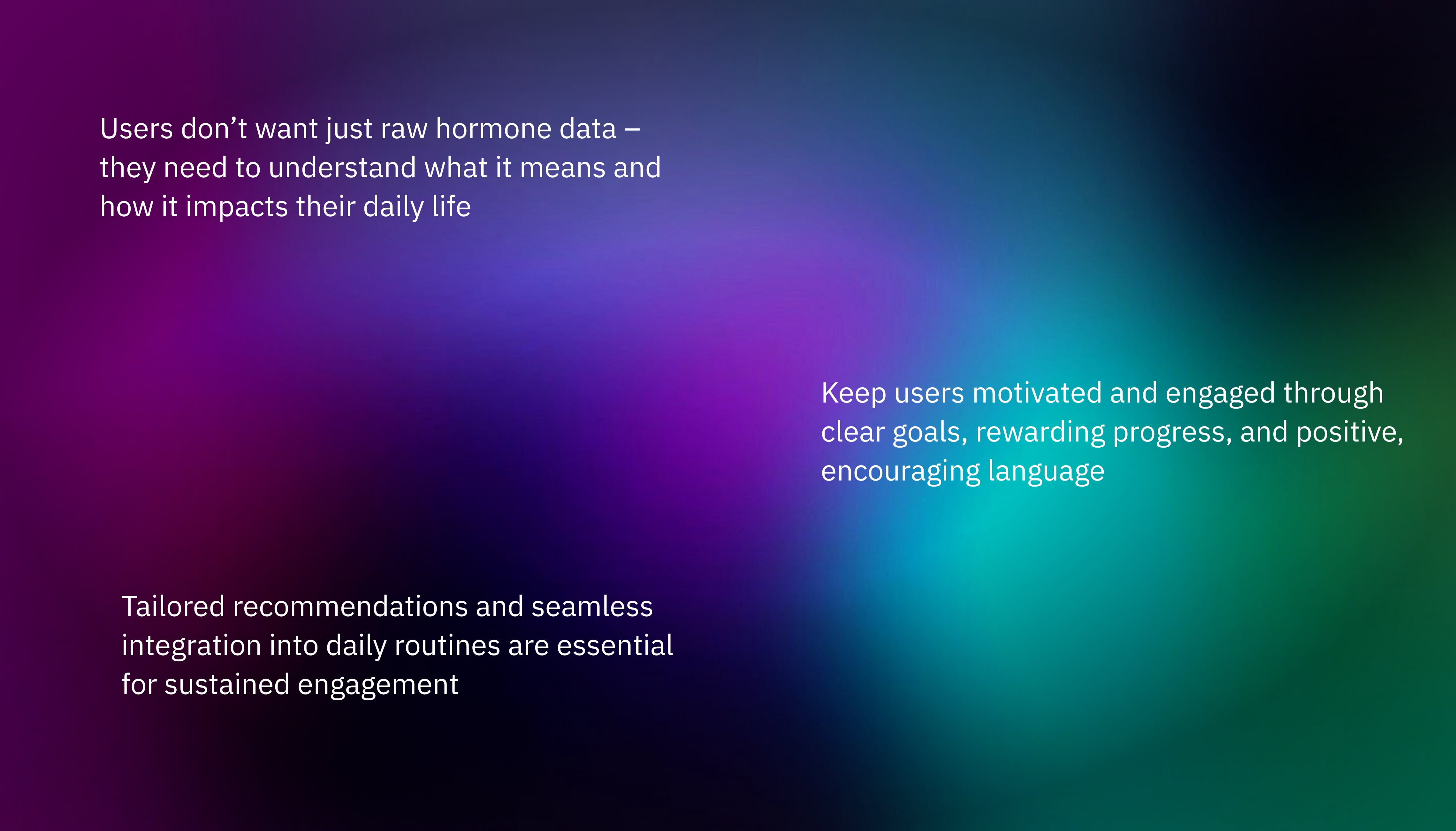
Research revealed that users are often overwhelmed by raw data and quickly lose motivation when faced with only graphs and numbers. To address this, I explored behavioral design principles to understand what truly drives and engages users in their health journeys.
Additionally, I investigated how AI could enrich the experience — transforming complex data into meaningful, personalized insights that inspire sustained motivation and proactive self-care.
THE THREE USER ARCHETYPES
The Curious
Tracks out of interest — wants to understand her cycle and stay in balance.
The Performer
Optimises training, sleep and recovery — wants data that moves the needle.
The Patient
Strong hormonal fluctuations — needs actionable advice, early warnings and reassurance.
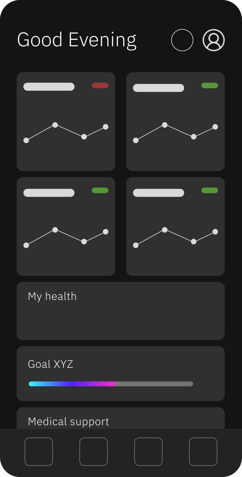
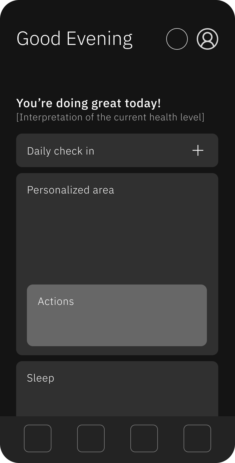
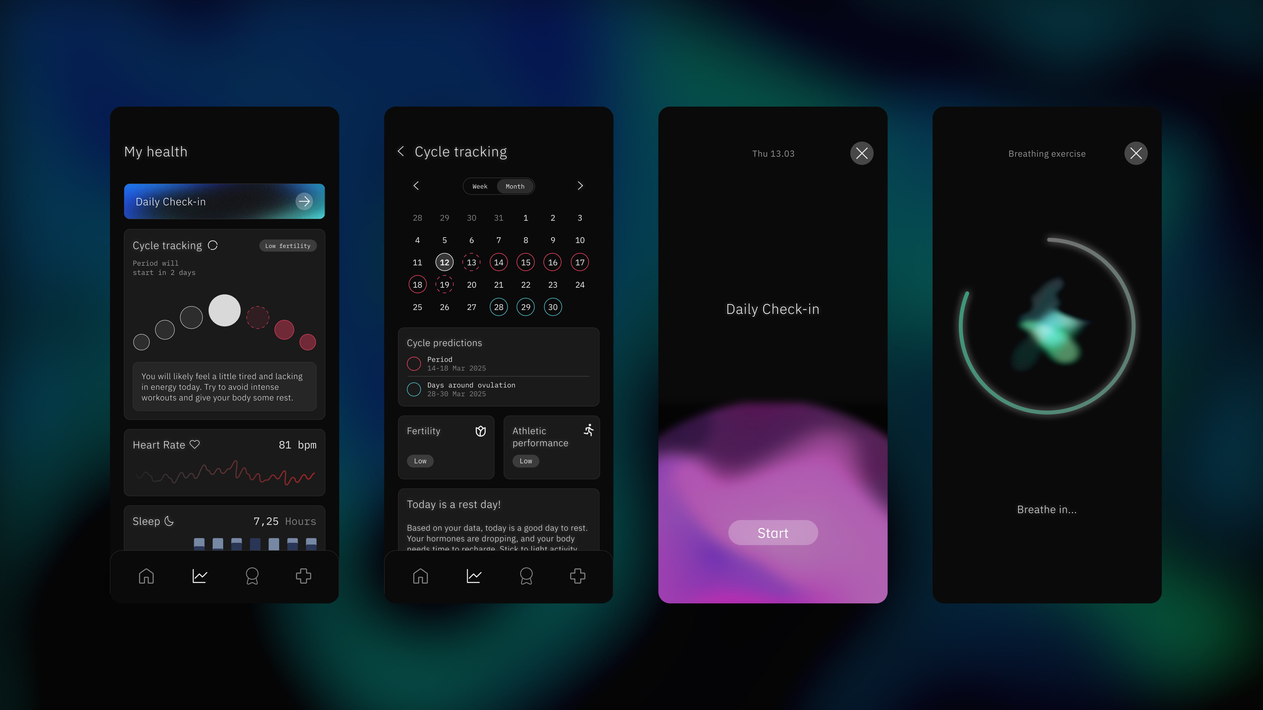
To keep the app from overwhelming users, information unfolds across three layers — from a single glance to a full deep dive.
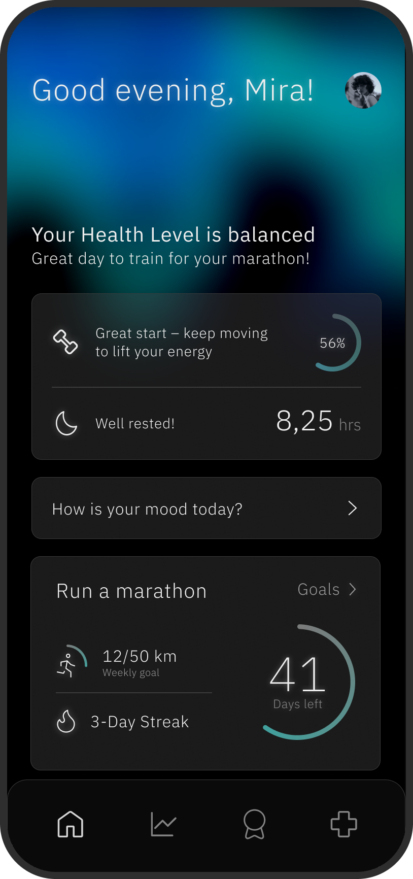
Research was clear: raw numbers left users asking “okay, but what do I do now?”. So the home screen leads with a plain-language read and a next action — the data sits one layer deeper.
The ORBIS companion app enhances the holistic user experience by seamlessly integrating hormone data with insights from other health platforms. It transforms complex information into personalized, AI-powered guidance and actionable goals — empowering users to actively manage their well-being beyond the physical device.
This app completes the ORBIS ecosystem, making hormone health approachable, motivating, and truly connected.
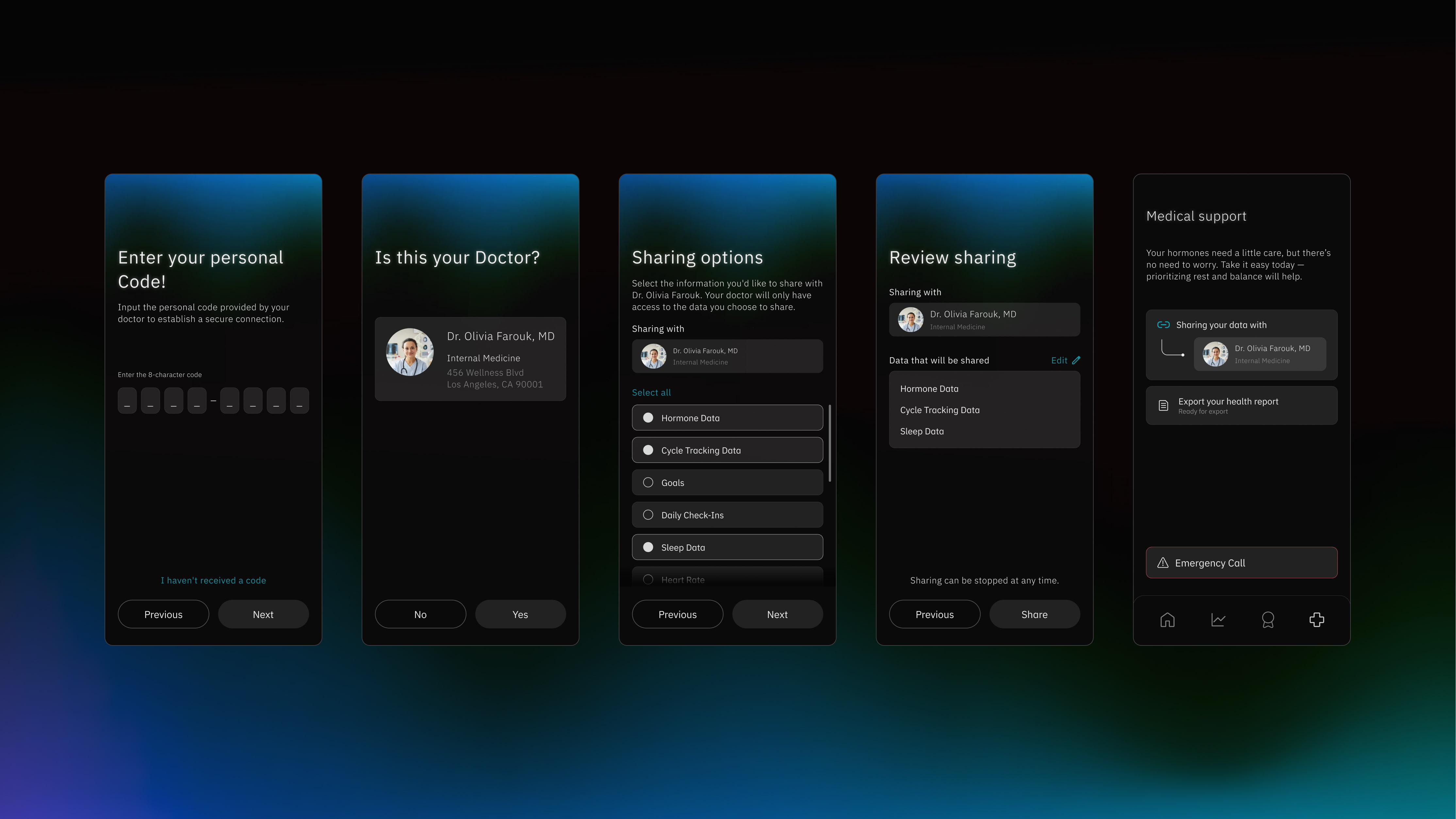
Connect Orbis with the doctors you trust
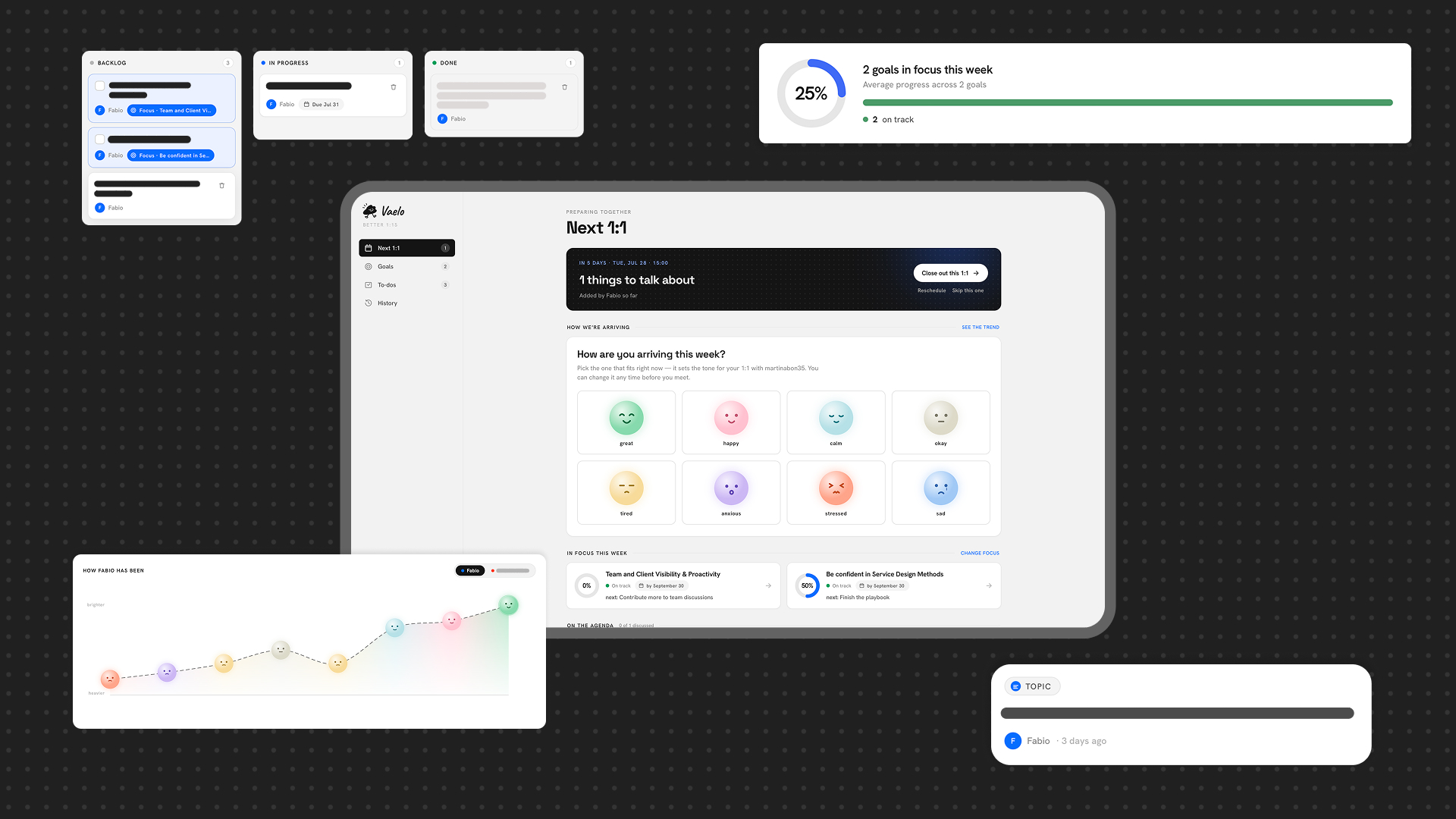
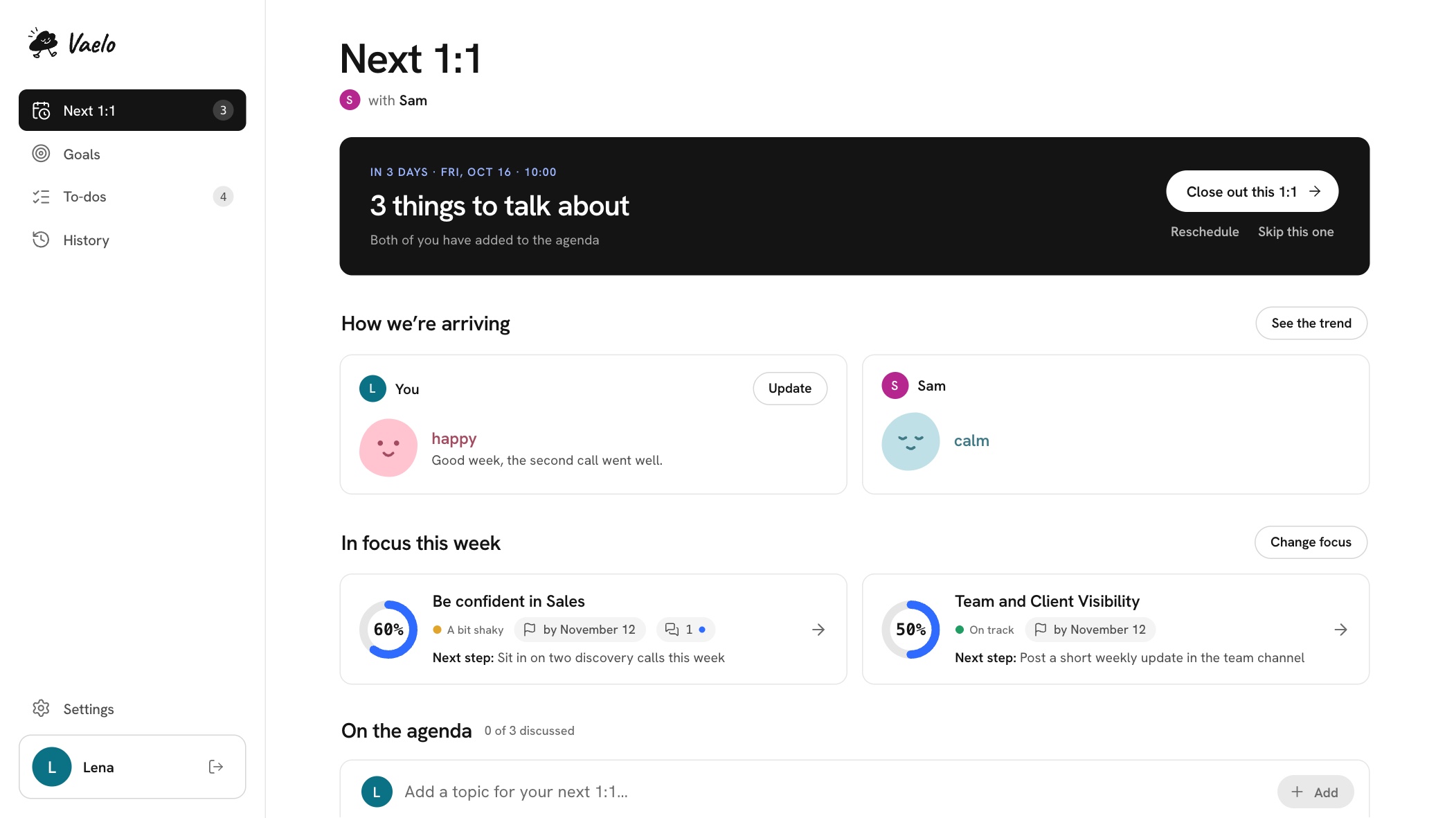
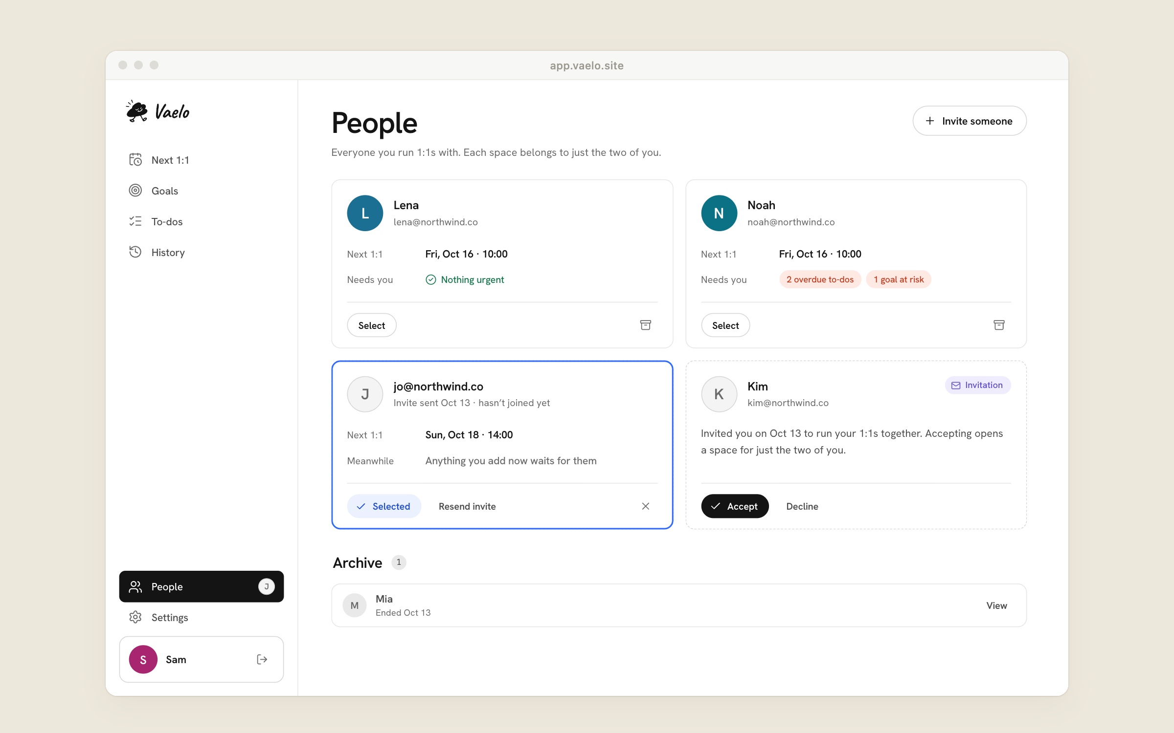
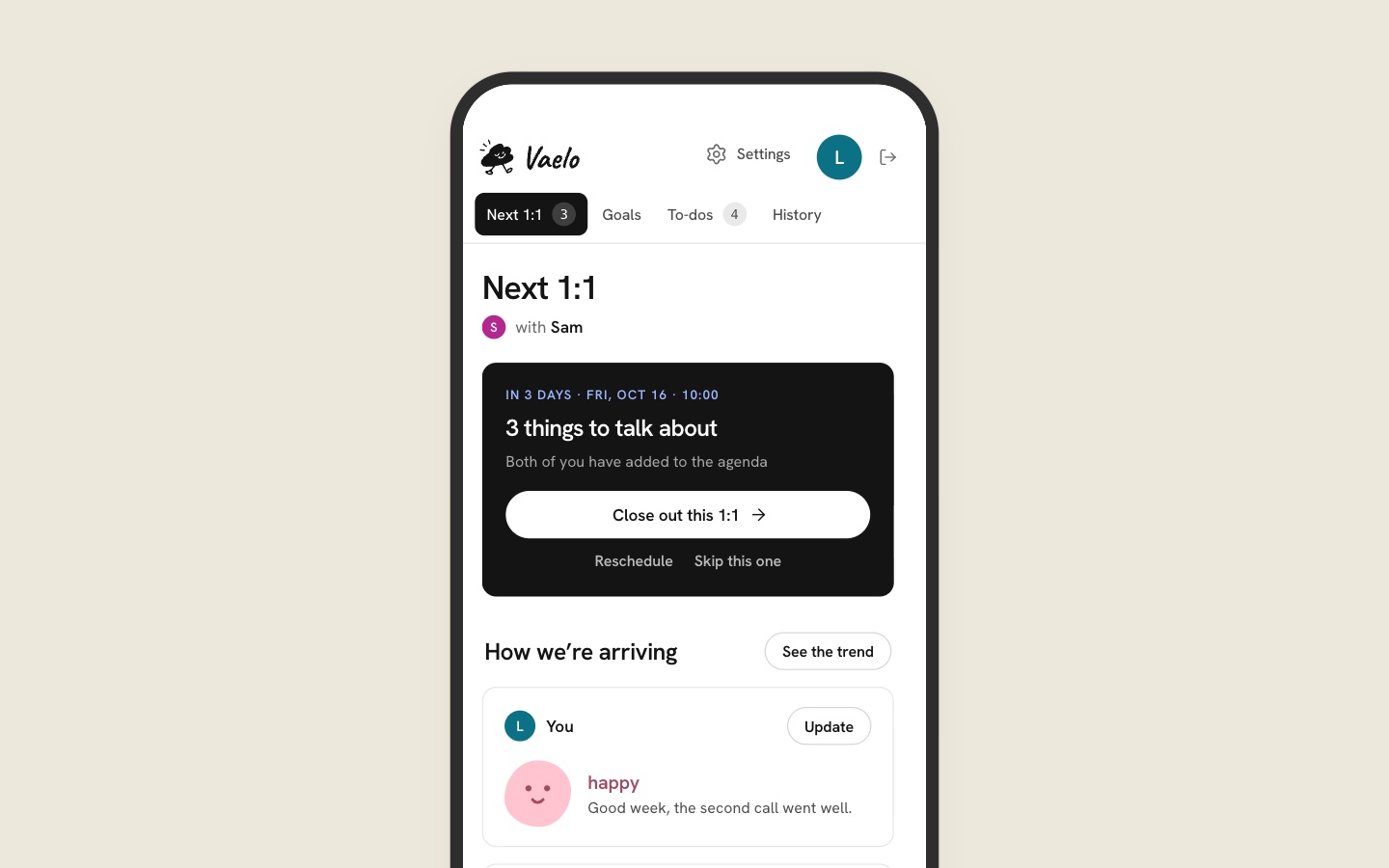
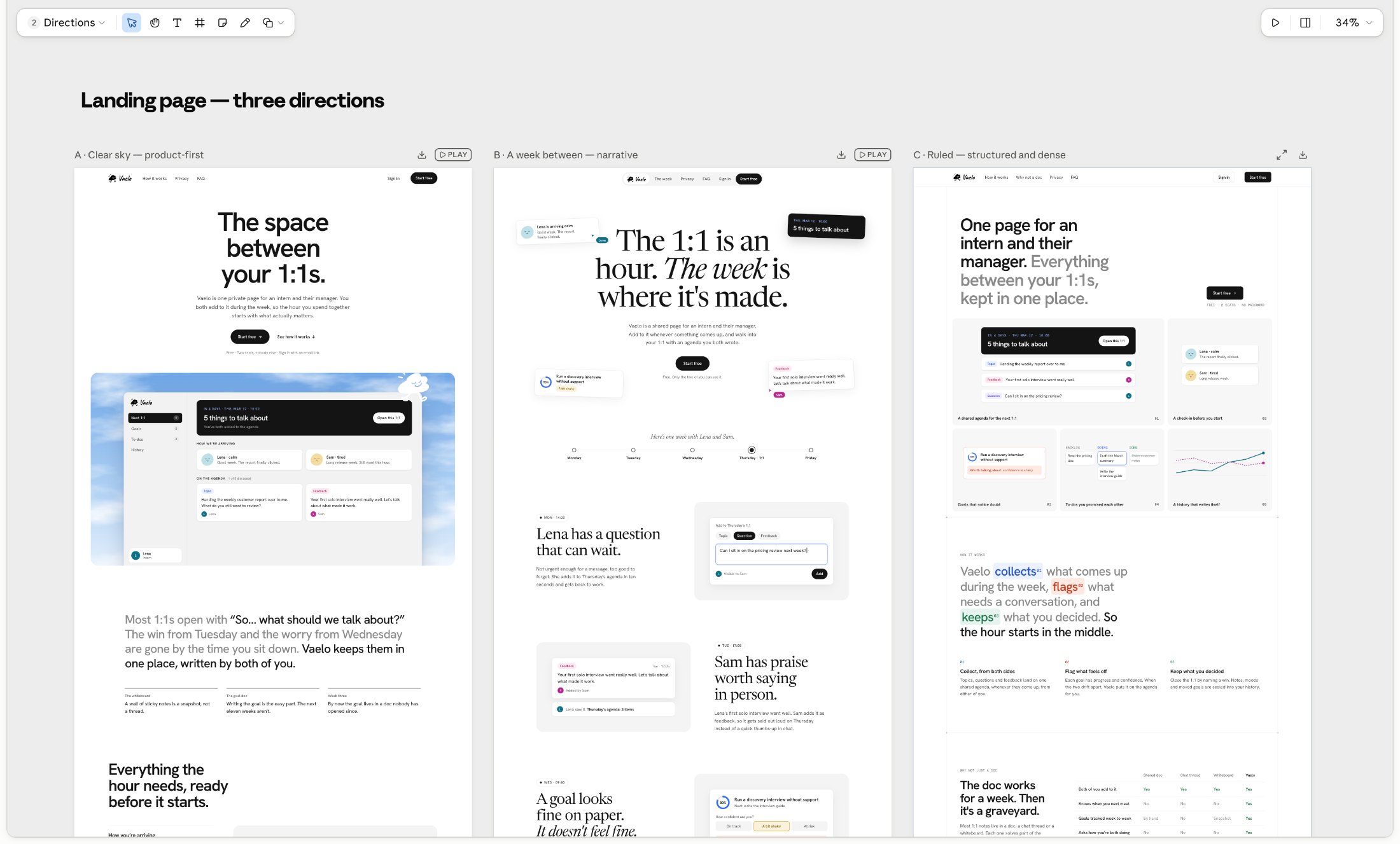
Vaelo started from a personal problem: there was no meaningful way to guide 1:1 sessions with my manager or track the goals we set together, so I built one.
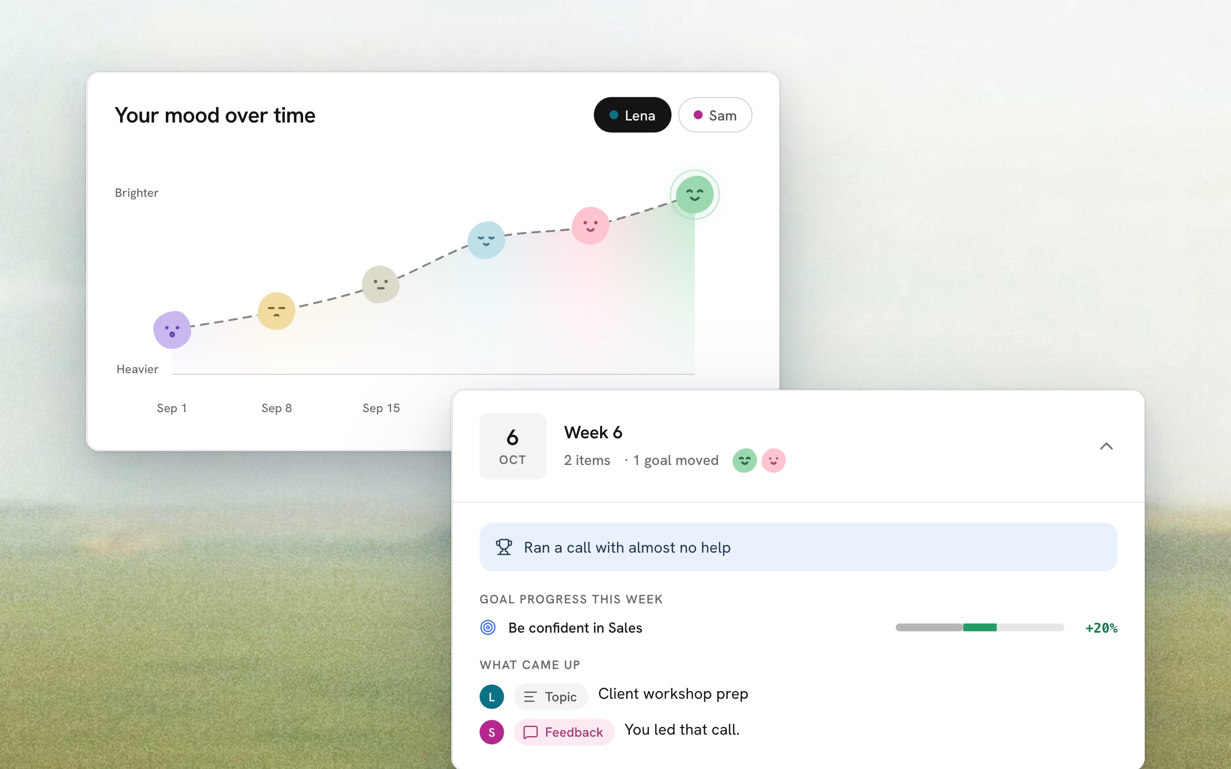
With milestones reframed as observable proof points, Vaelo helps managers and their direct reports track progress on what they actually committed to, not just how the last conversation felt.
Today, I use Vaelo in my own 1:1s, turning a personal fix into a tool that guides real conversations and tracks real goals with my manager.
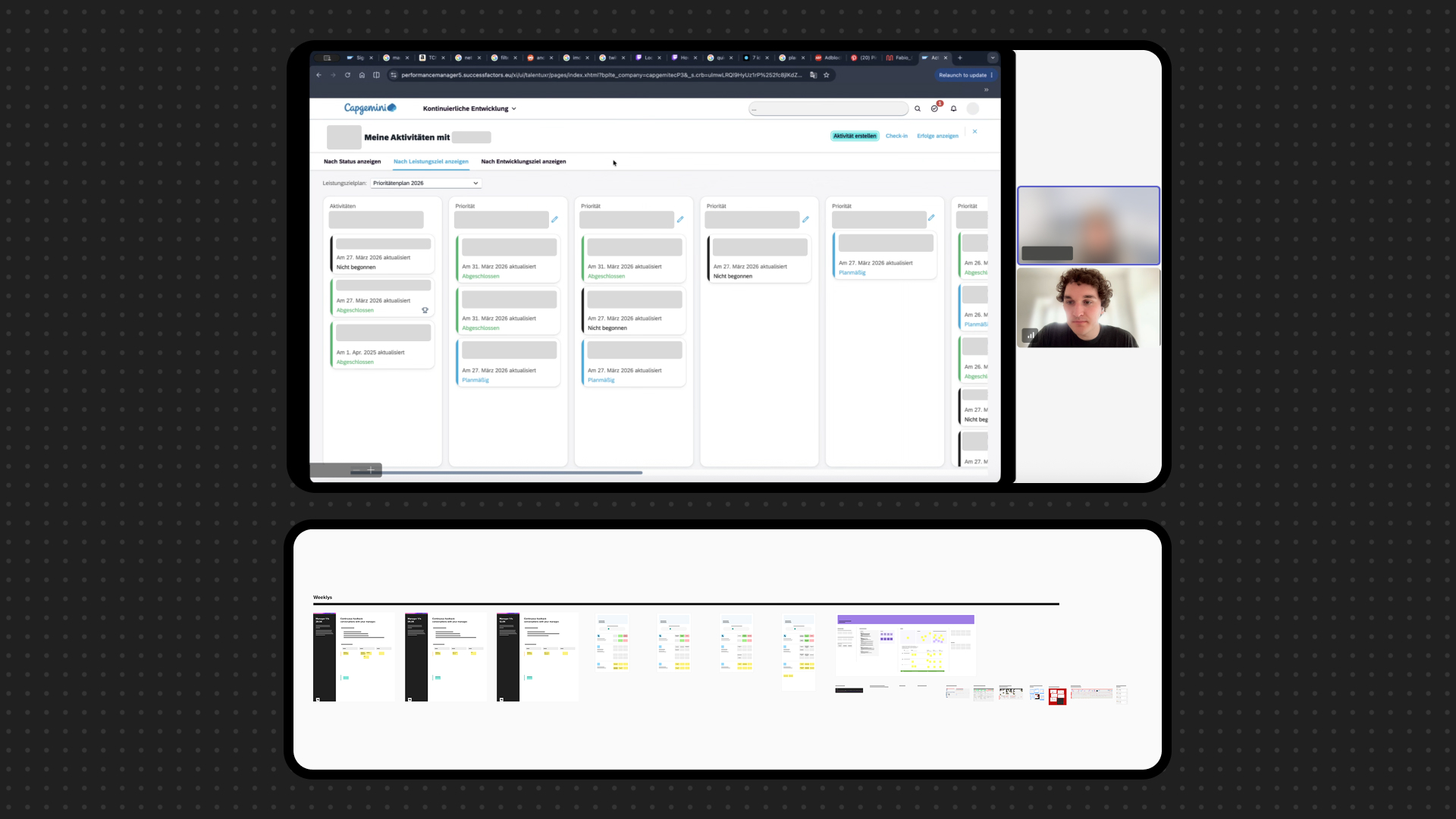
Before designing anything, I looked at how 1:1s actually happened: an official performance tool used top-down across the company, and a Mural board I'd set up with my manager to make our check-ins work.
The official tool was the one people kept describing as cold and corporate; the Mural board fixed some of that, but week after week it grew into a sprawl of stickies, making it hard to look back and track where a goal actually stood.
Talking to colleagues about their own 1:1s confirmed it wasn't just dissatisfaction with features — it was a sense that the current tool feels imposed, its corporate tone creating distance instead of trust.
Conversations also surfaced two deeper gaps: nobody felt supported through the full goal journey, from figuring out a goal to setting it and following through, and once set, goals quickly faded from memory instead of staying visible.
The outcome is a first version of Vaelo that I'm already using in practice with my manager, refining it as real 1:1s unfold. It opens each meeting with a brief check-in that sets the tone, carries that through into goals that stay visible with genuine progress tracking rather than fading into a backlog, and closes with a running agenda that keeps focus on what's actually worth discussing.
This work is confidential. Everything below stays deliberately high level — no unreleased features, screens or numbers. What I can share is the shape of the work and what I took away from it.
BMW Group — six months of product design across two very different departments: the interior experience millions of drivers touch, and the software testing tools nobody outside the company ever sees.
I joined BMW Group in Munich as a product design intern from October 2025 to March 2026. The internship was split across two departments that could hardly have been further apart: one designing the in-car user experience for current and future vehicles, the other building the software that tests that vehicle software. Because both sit deep inside unreleased product work, this case study describes how I worked rather than what I shipped.
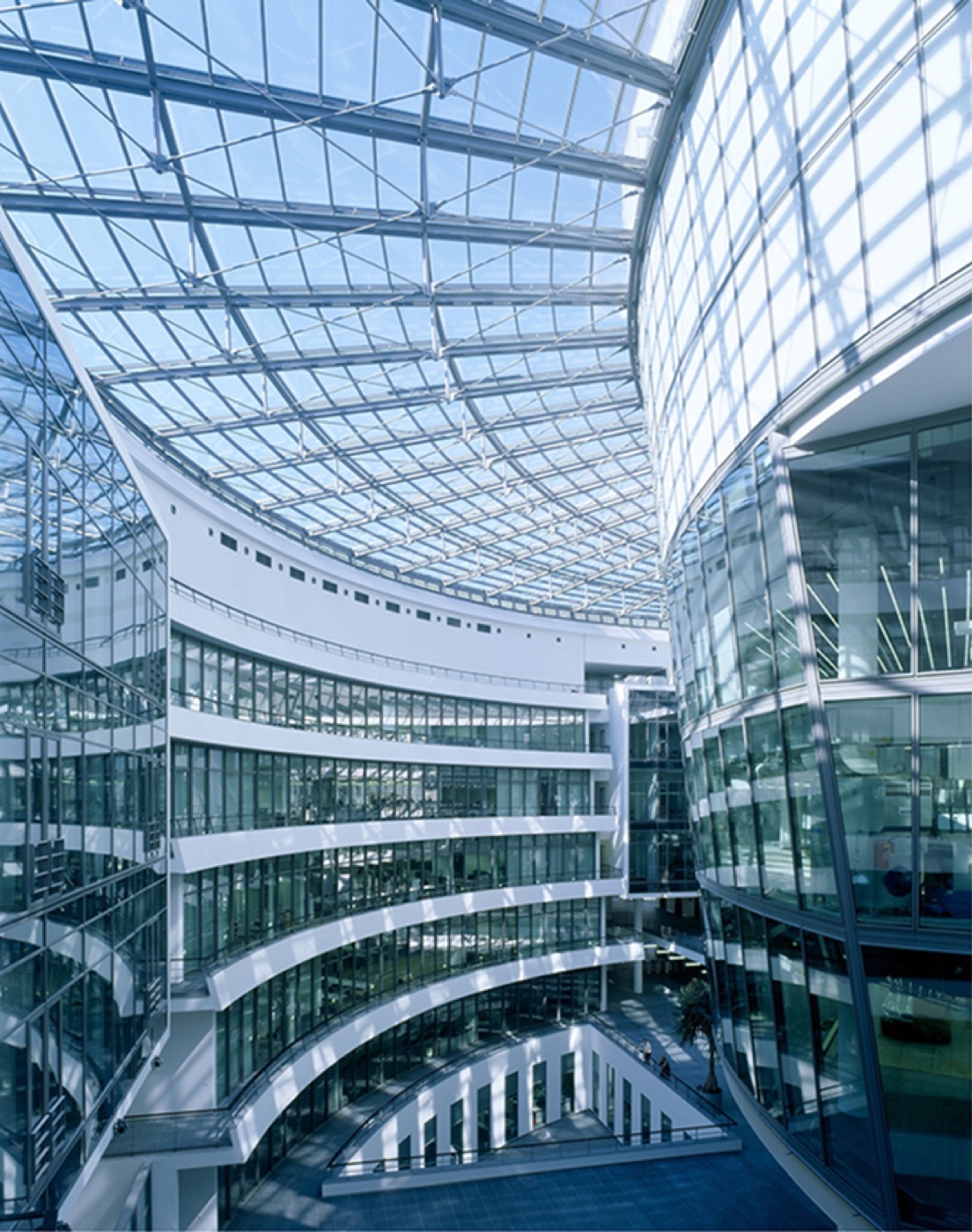
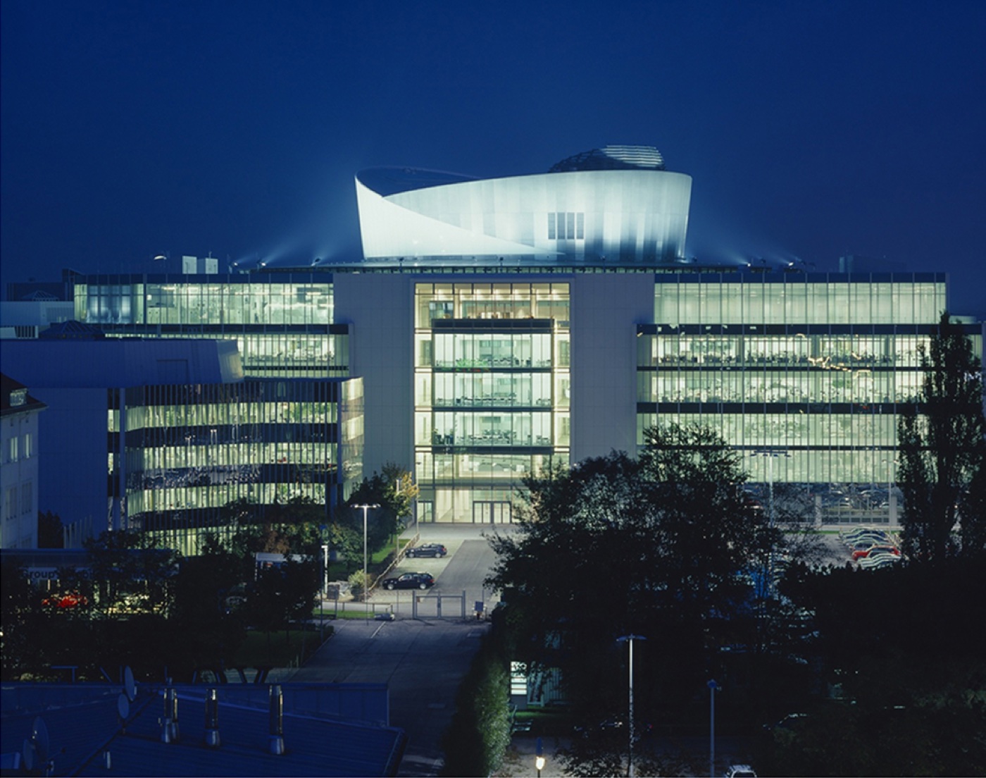
Both departments sit in the FIZ, BMW's research and innovation centre in Munich — the place where the company's future vehicles are developed. Working there meant being surrounded by the engineering side of the product every day, which shaped how design decisions had to be argued and handed over.
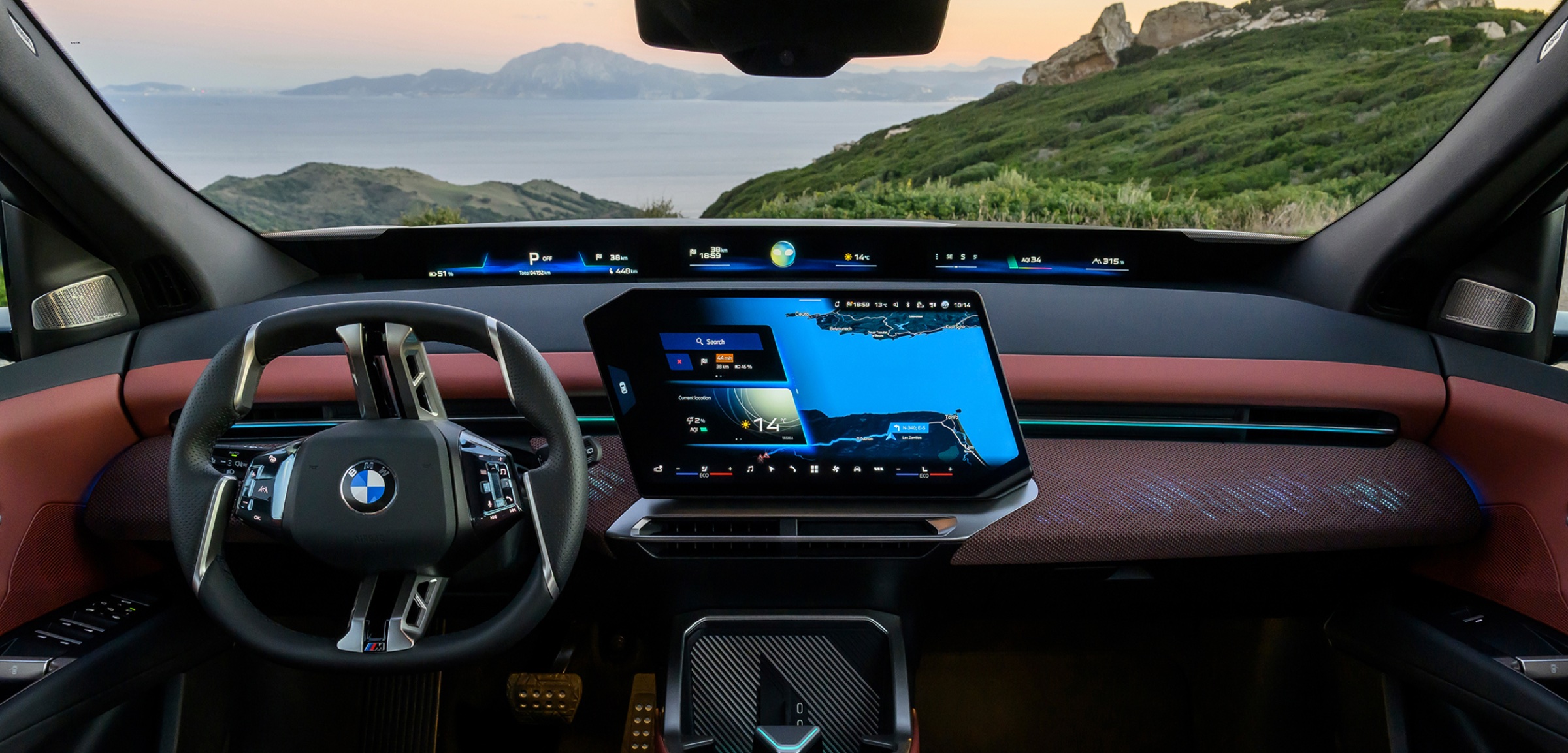
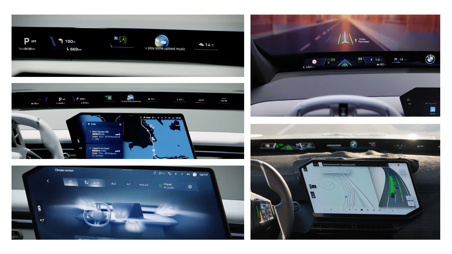
The first department owns everything about the in-car user experience — all the interfaces in the interior of the vehicle. I worked on a lot of different screen concepts and screens, both for the main infotainment system and for the Panoramic iDrive, building interaction concepts for current and future vehicle software.
My focus was the Panoramic iDrive. I worked in a small team trying to enhance its user experience by giving it more intelligence, working on new AI features for it. I can't go into more detail than that.
Most of the work happened across teams: participating in design workshops, and aligning constantly with both developers and other designers.
The second department is responsible for vehicle software testing — still a design role, but sitting inside a very technical software development organisation. I was the only designer there, which meant translating unclear, highly technical requirements into something clear and easy to use, in close collaboration with engineers and product owners.
I designed it as the sole designer and shipped it together with my product managers and one developer.
The app is built for test drivers and software engineers who track street unevenness and speed signs to improve their machine learning models. They use it to validate unevenness or speed limits the car detected by itself, and they can also record unevenness or speed limits themselves and add those straight into the model's database.
The hard part was the flow. It had to be usable while driving, so the whole design was about efficiency: as fast as possible, as easy to understand as possible, with as few clicks as possible.
The second project was a software testing dashboard. Again as the sole designer, this time in a team of around fifteen people — a project lead, project managers, software developers and testing experts. We worked in an agile product development process, shipping features of the dashboard continuously.
How design systems are structured, how decisions get made, and that it is always about getting the approval of people further up.
How to work as the sole designer — where part of the job is proving to everyone else what design is worth, especially in the era of AI.
How to turn genuinely complex topics, like car software testing flows, into interfaces that are easy to use and easy to understand.
Adaptive Park Lighting prevents light pollution to protect nocturnal ecosystems, responding only to human presence — minimal disruption to wildlife, a safe experience for people.
With a focus on sustainability and respect for nature, this project aims to prevent light pollution in order to protect nocturnal ecosystems. Through the use of adaptive lighting technology, this system responds only to human presence, ensuring minimal disruption to wildlife while ensuring a safe experience for humans.
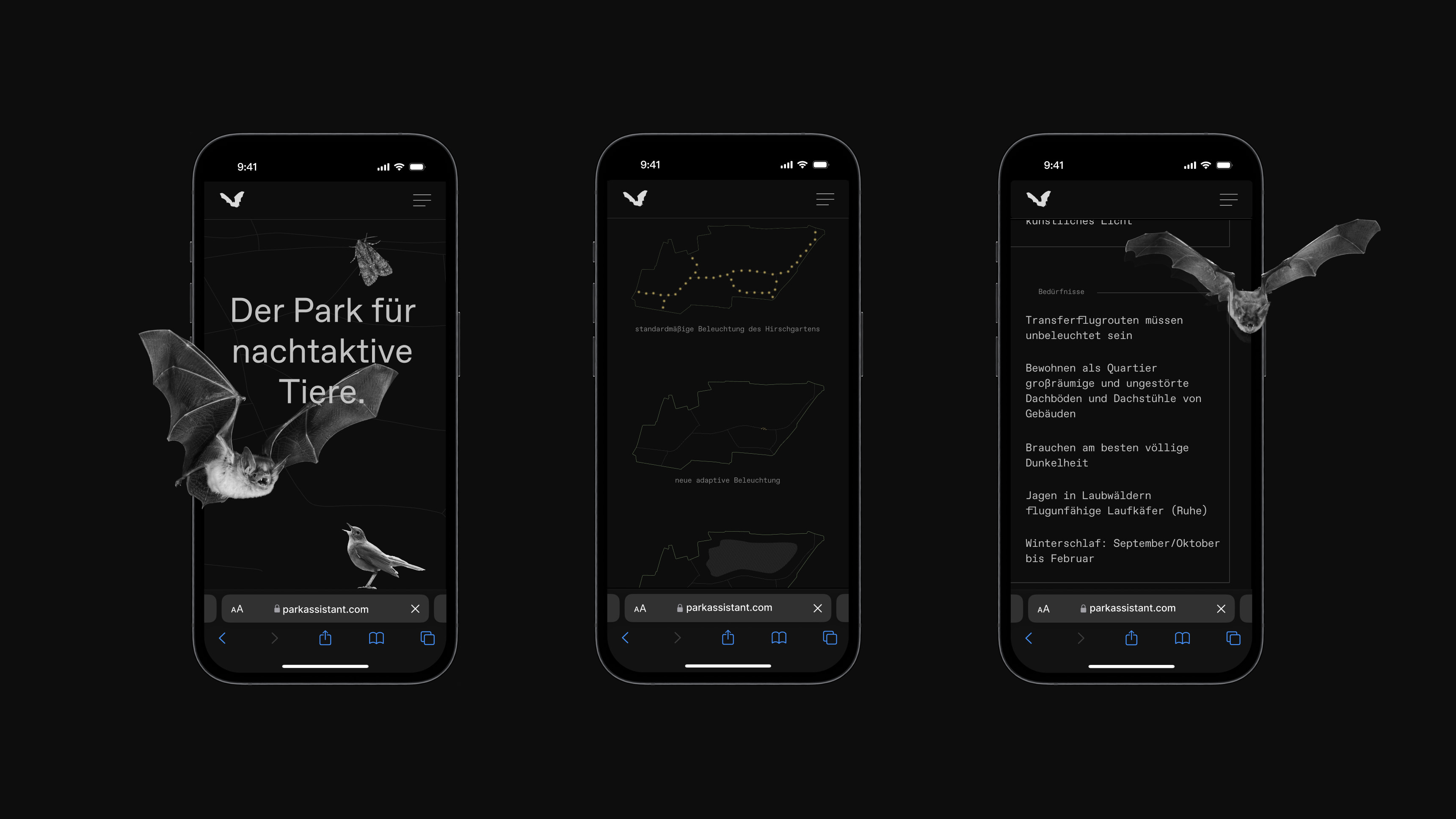
In addition, an explanatory website helps visitors to find out more information about the project and learn about the animals in this park.
Every year millions of birds get injured or die by colliding with buildings and towers due to bright city lights during migration. Many insects are attracted to the light and are completely trapped flying around the light source until they die. Additionally, excessive lighting near water disrupts aquatic ecosystems, affecting species interactions and biodiversity.
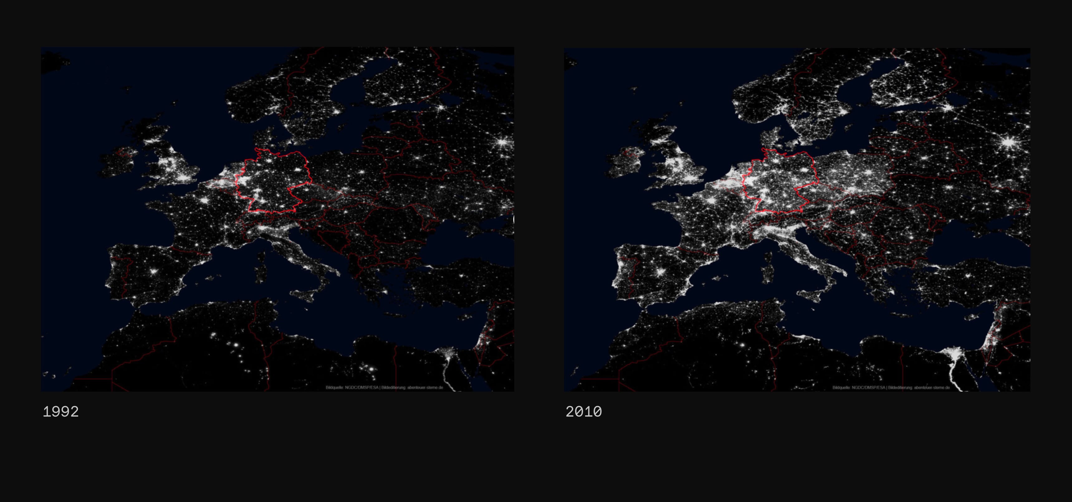
These and many more are causes of light pollution for animals, our environment and also for us humans. As if that weren't enough, light pollution is even increasing by 6% every year in Europe. In my project, I have dedicated myself to exactly this problem.
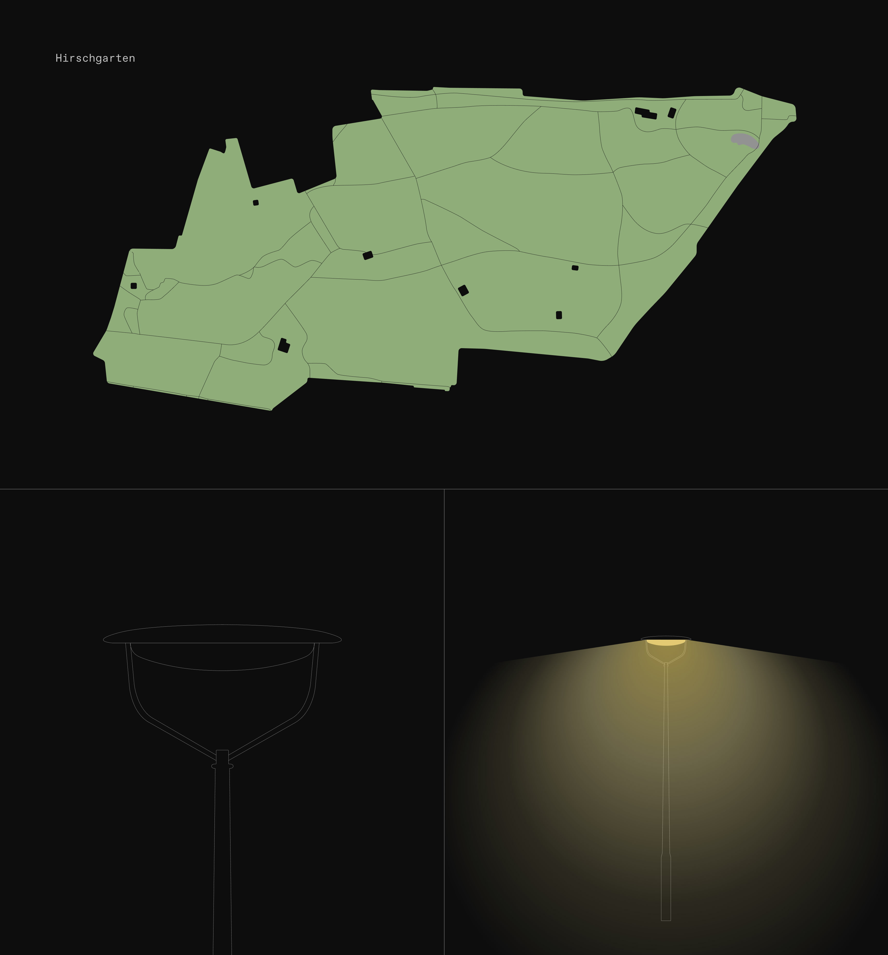
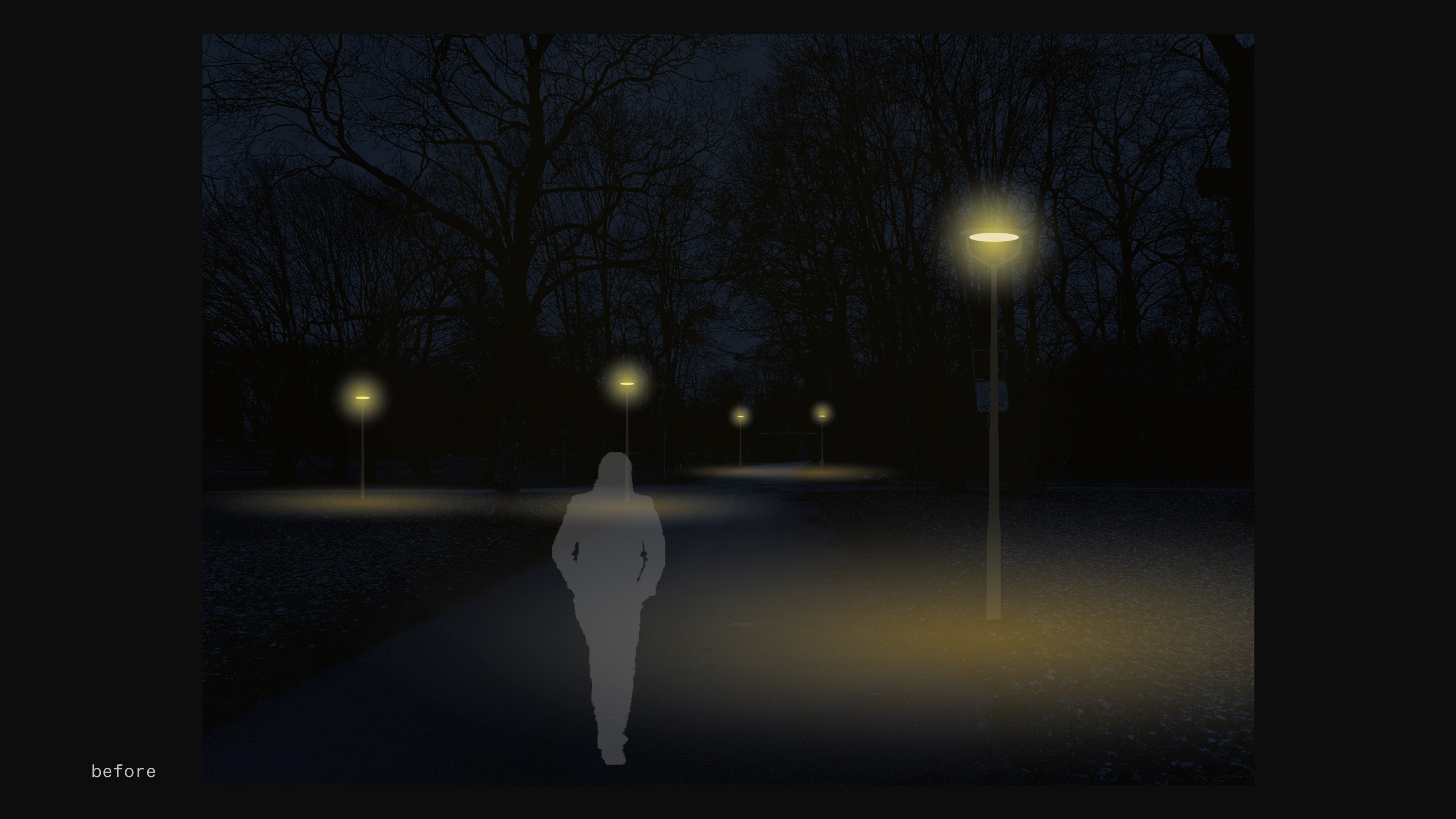
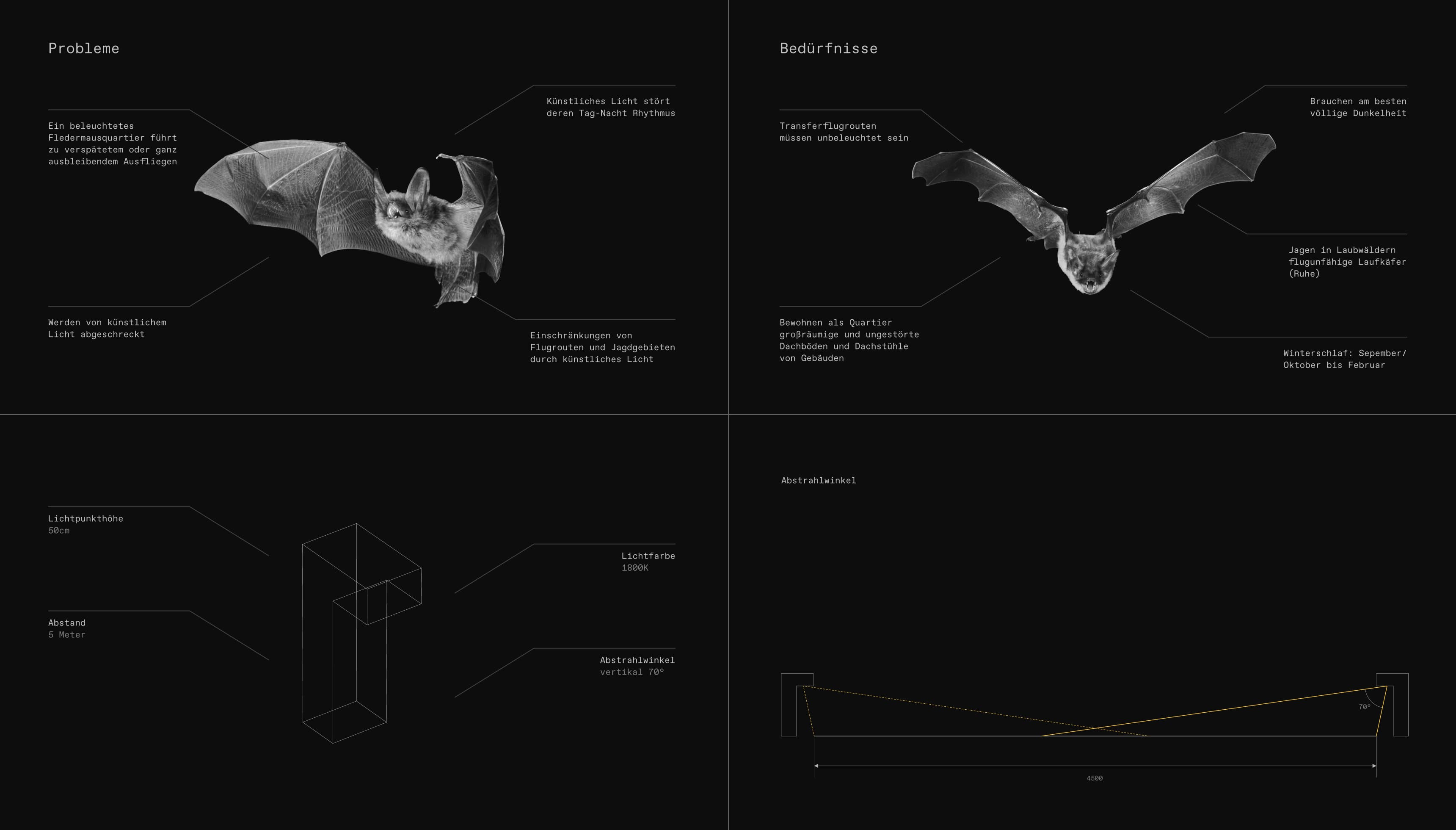
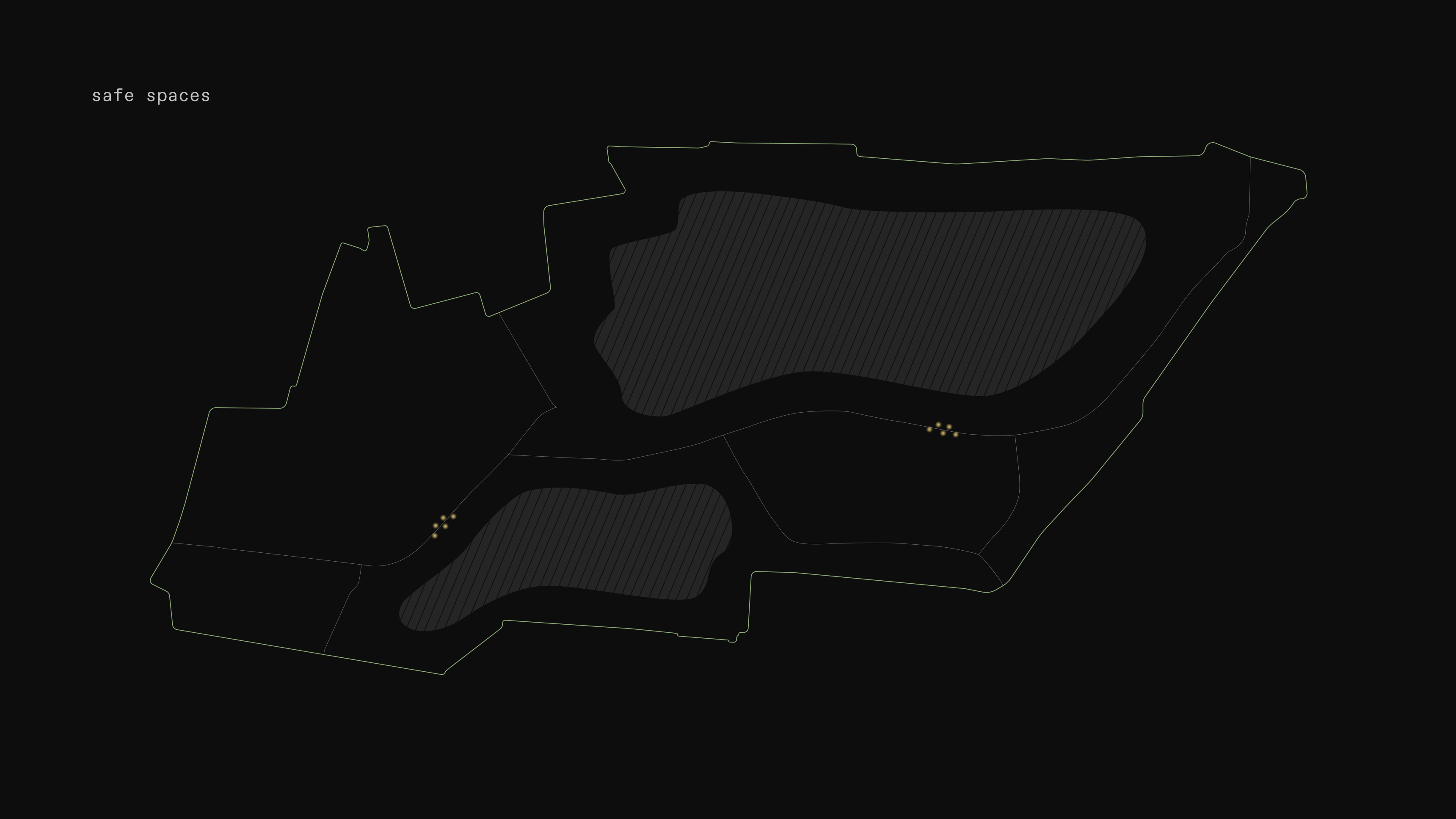
I chose the Hirschgarten in Munich as the location to apply my concept there as an example. First, I analyzed the entire park and looked at the current lighting there. Although the light from the streetlights cannot shine upwards, it still shines too far outwards, causing unnecessary light pollution.
Besides that, the street lights are lit all night long. In addition, some smaller paths are illuminated that do not necessarily need to be illuminated.
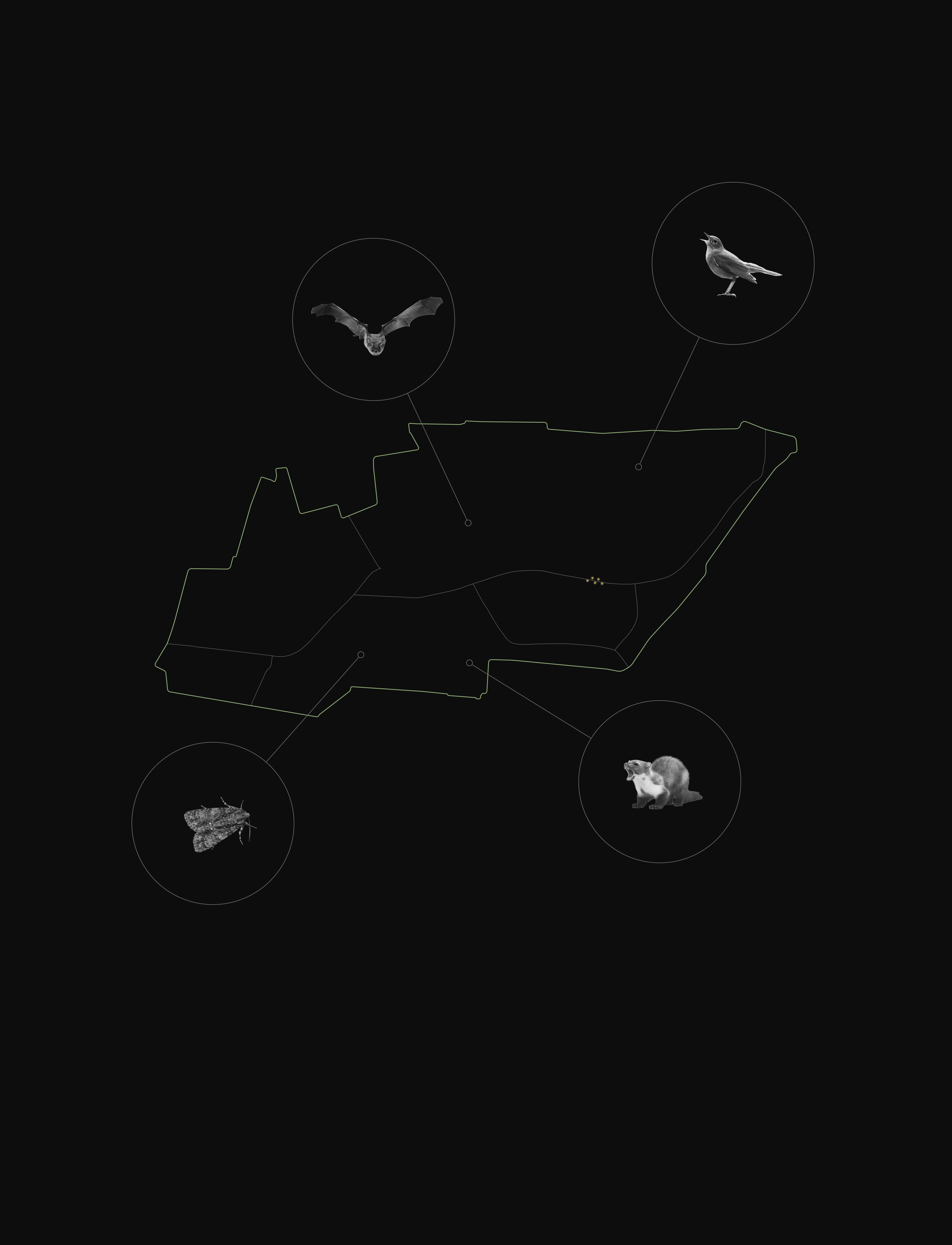
I next looked at what animals live in the park and which ones are particularly affected by light pollution. Amongst several animal species, I then decided on a very light-sensitive bat species, as this represents many of the problems of nocturnal animals very well.
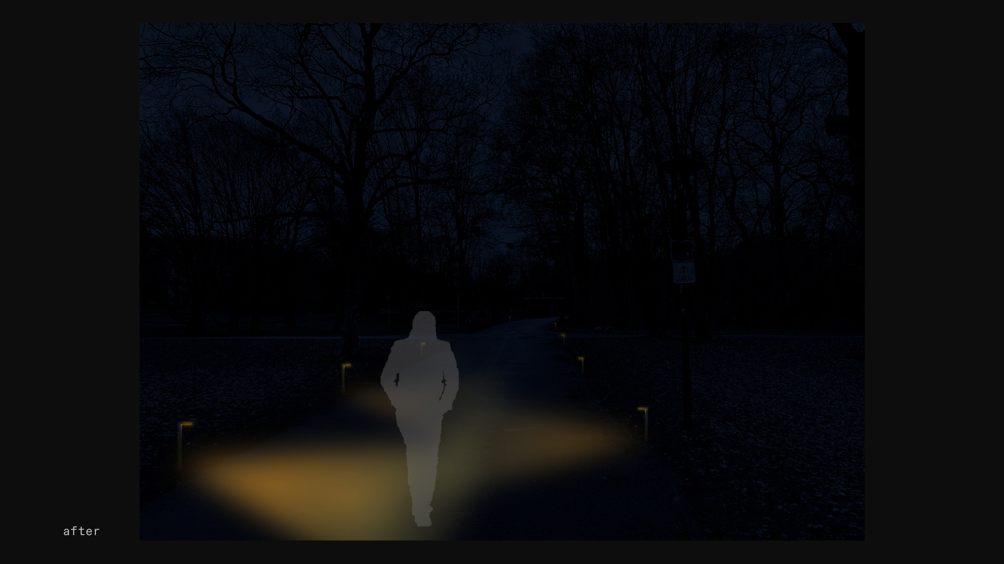
As bats move by flying, this light system is located on the ground to reduce the light in the air. Because bats are very much disturbed by artificial light, this park is permanently dark in its normal state, and the lights only go on when there is human movement. The lights go on as the person is walking through the park and guide them through while ensuring a safe experience for them.
The light color of the lights is also very warm at 1800K, which has a positive effect on insects and is less harmful to them.
I also designed a website for my project, which can be accessed via QR codes on signs at the park entrances. On this website, users can find information about the park concept, how exactly the lighting works and what advantages it has over the current lighting. I wanted to prevent park visitors from feeling lost and confused about the new parking concept.
The website also provides information about light pollution and its negative effects on nature, animals and us humans. Users can also find information on the website about the animals living in the park, their needs and problems.
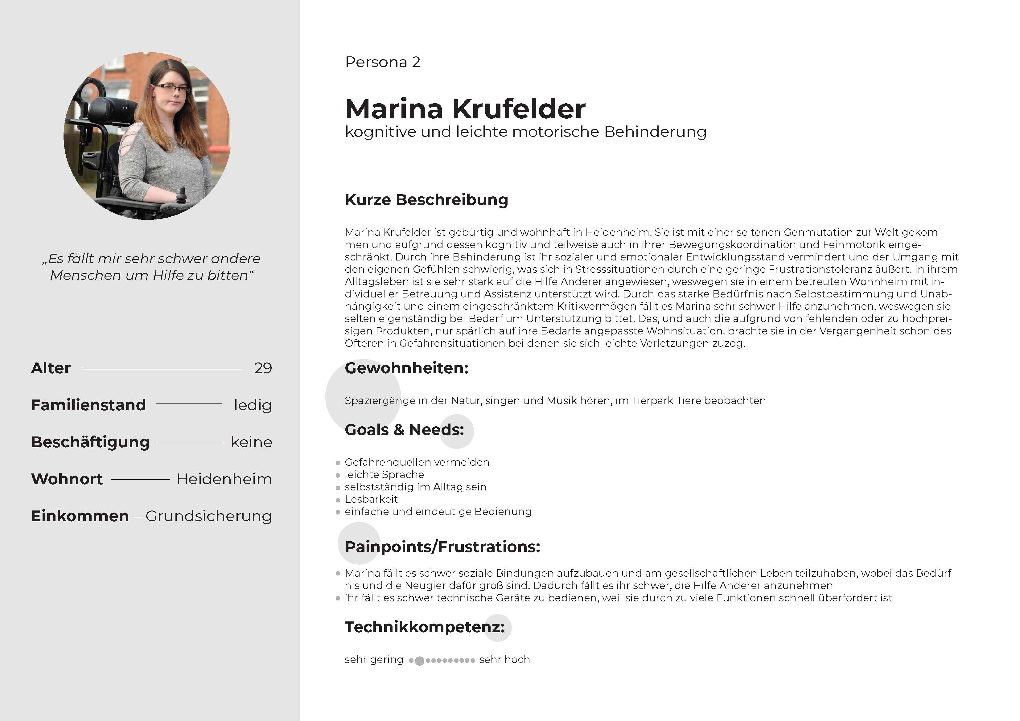
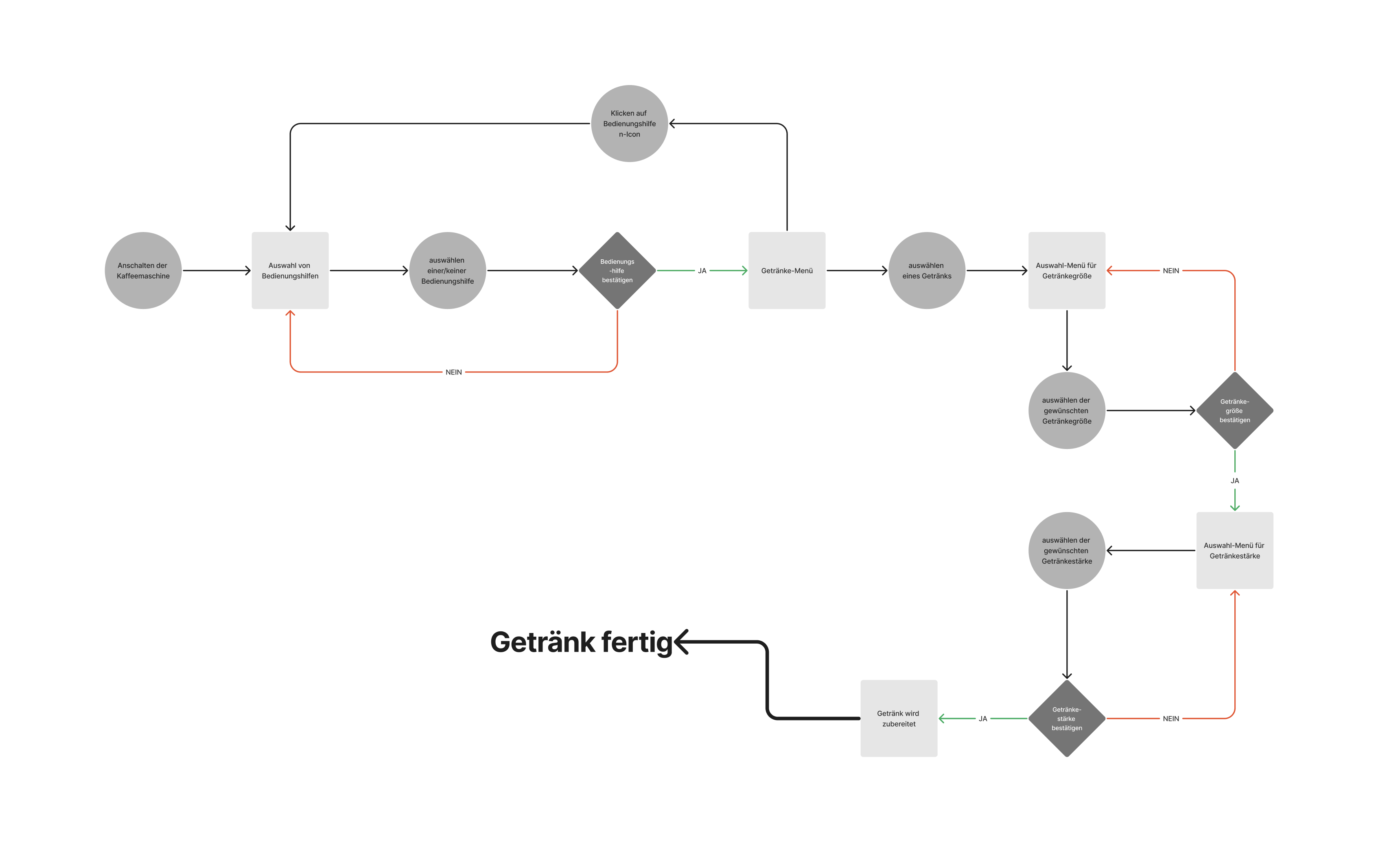
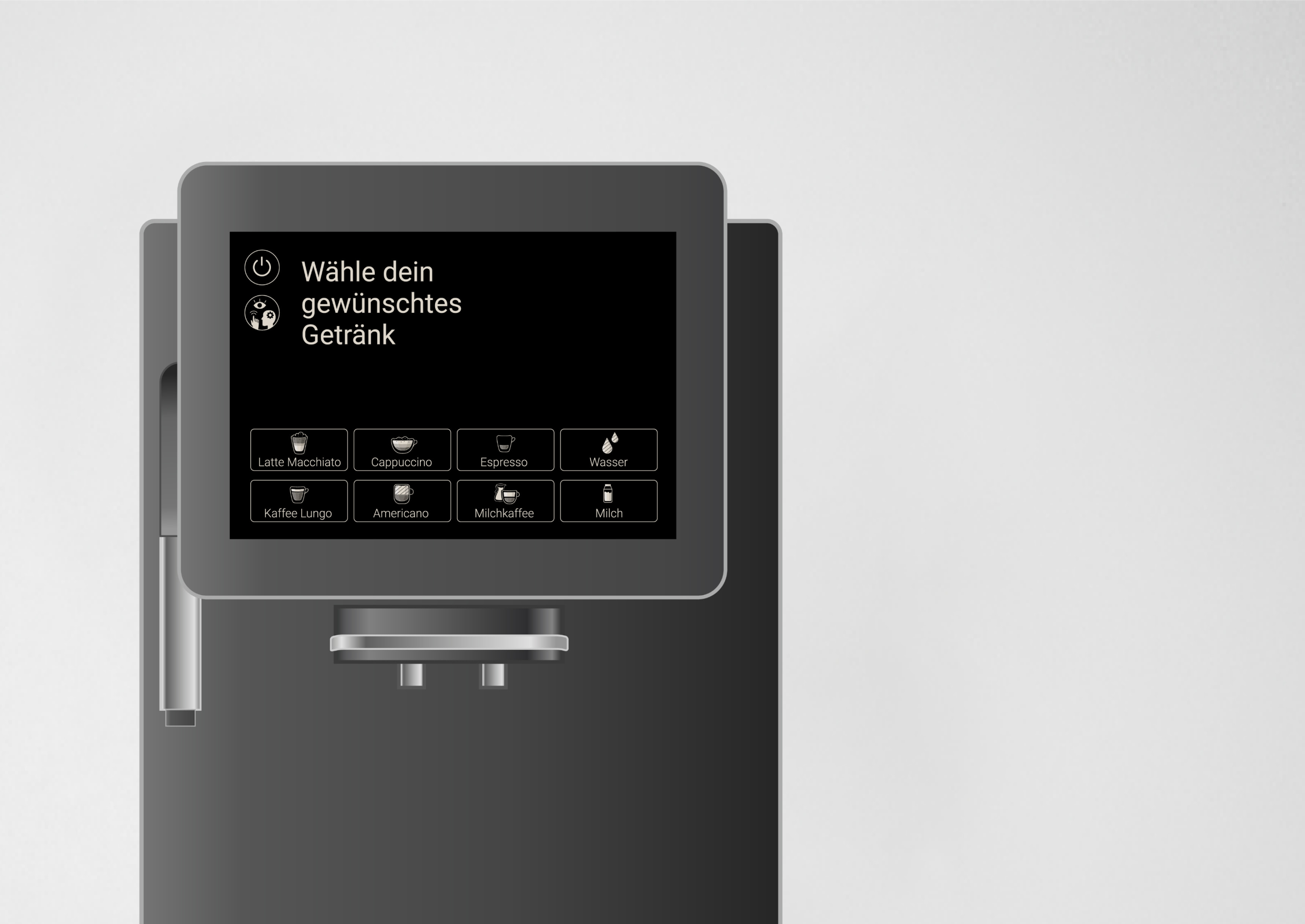
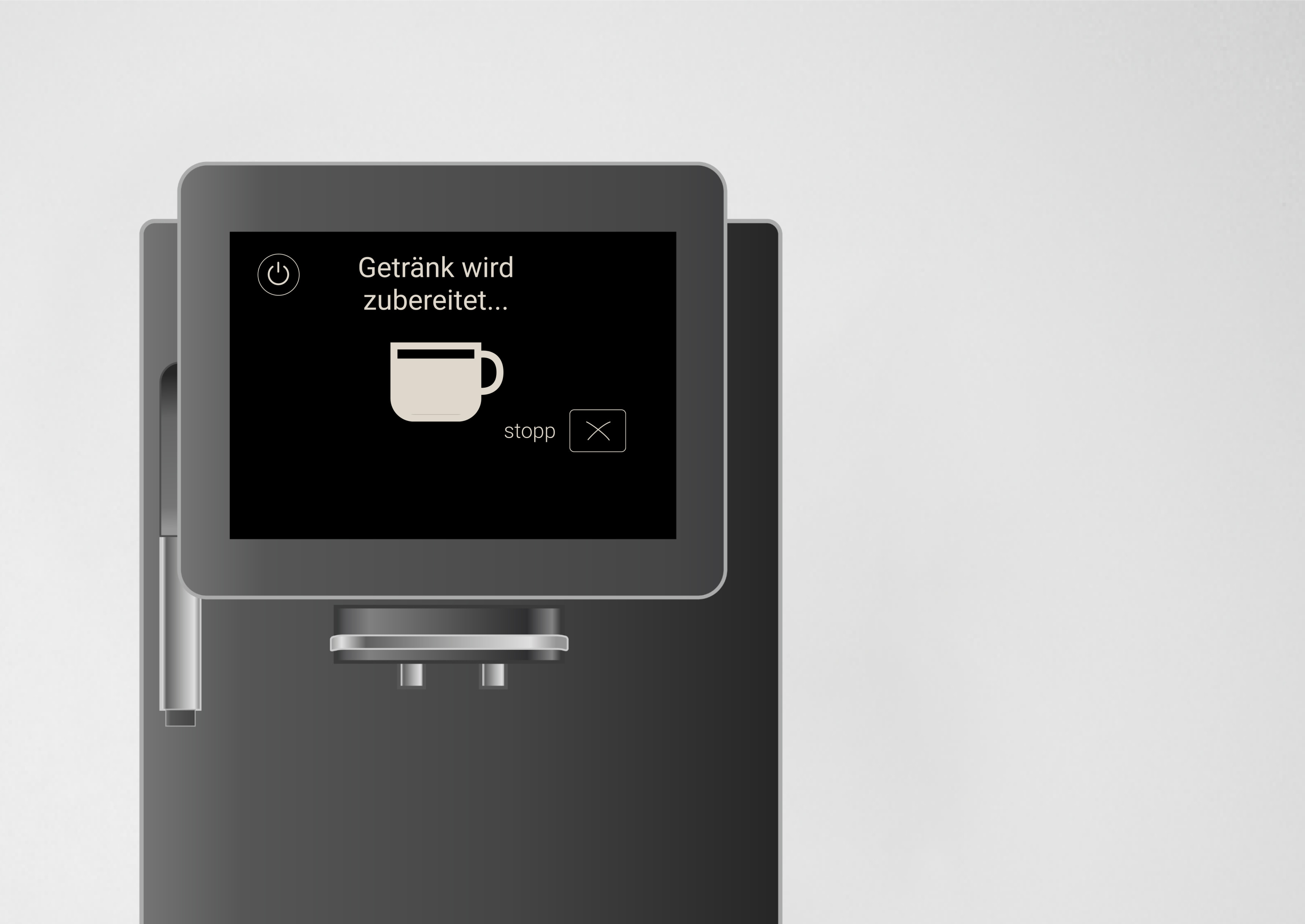
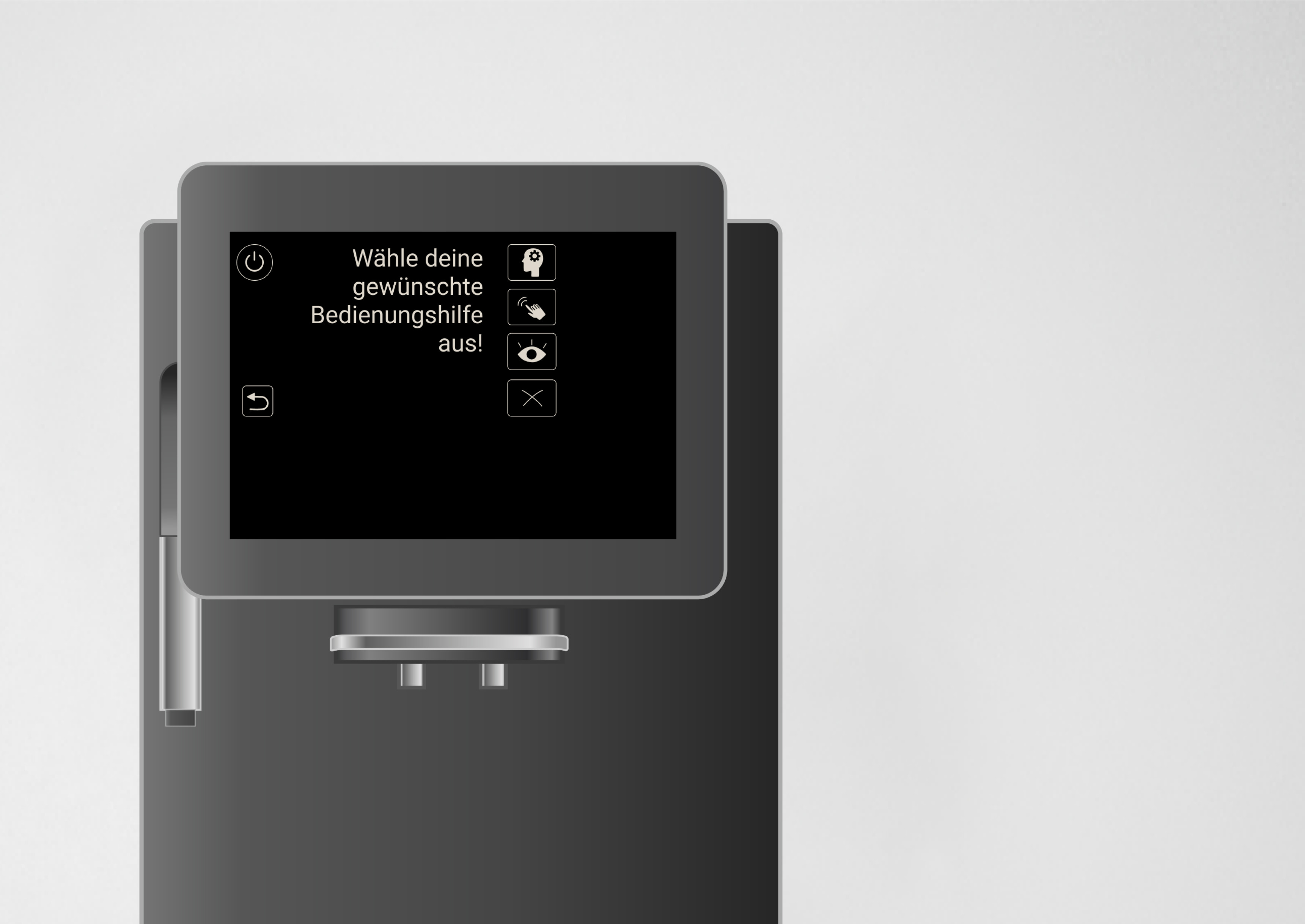
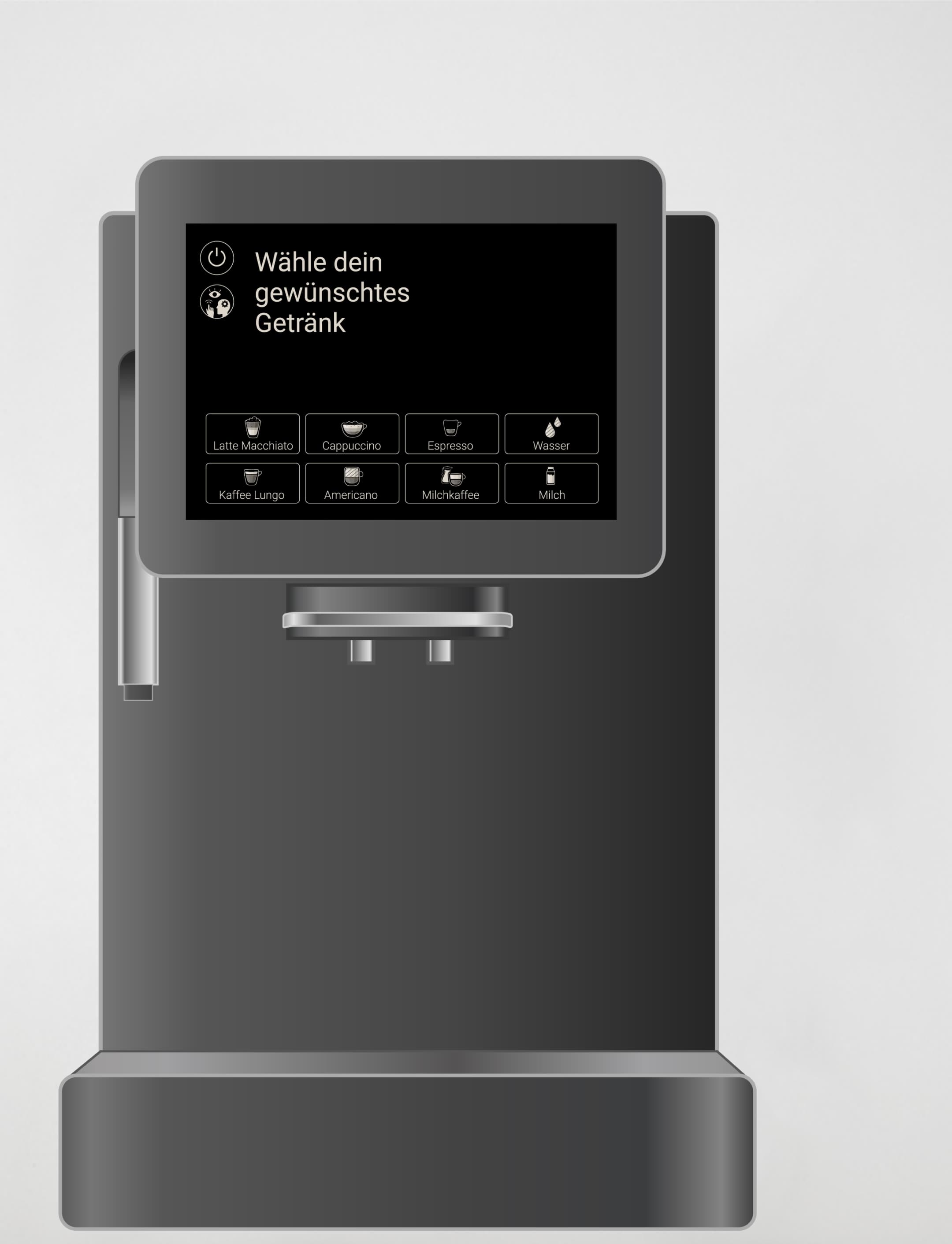
EasyBrew is a screen concept for an accessible coffee machine. From voice-control to increased contrast, depending on the type of disability, the machine offers different modes to fulfill the needs of the user.
EasyBrew is a screen concept for an accessible coffee machine. From voice-control to increased contrast, depending on the type of disability, the coffee machine offers different modes to fulfill the needs of the user.
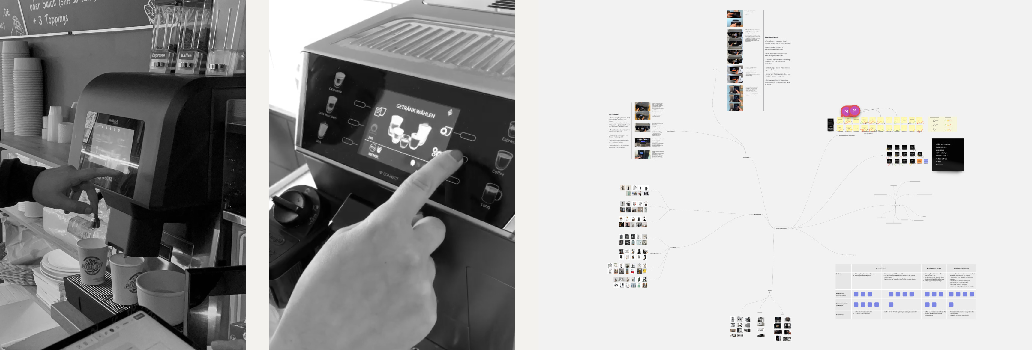
Our task for this project was to design a screen for a coffee machine. We initiated the process by a market analysis of coffee machines and their screens.
Following this, we engaged in insightful interviews with users from diverse fields like the office, gastronomy and private home, gaining valuable insights into their experiences with various screen interfaces.
In our research, we recognized the oversaturation in the coffee machine market, with only subtle distinctions among many.
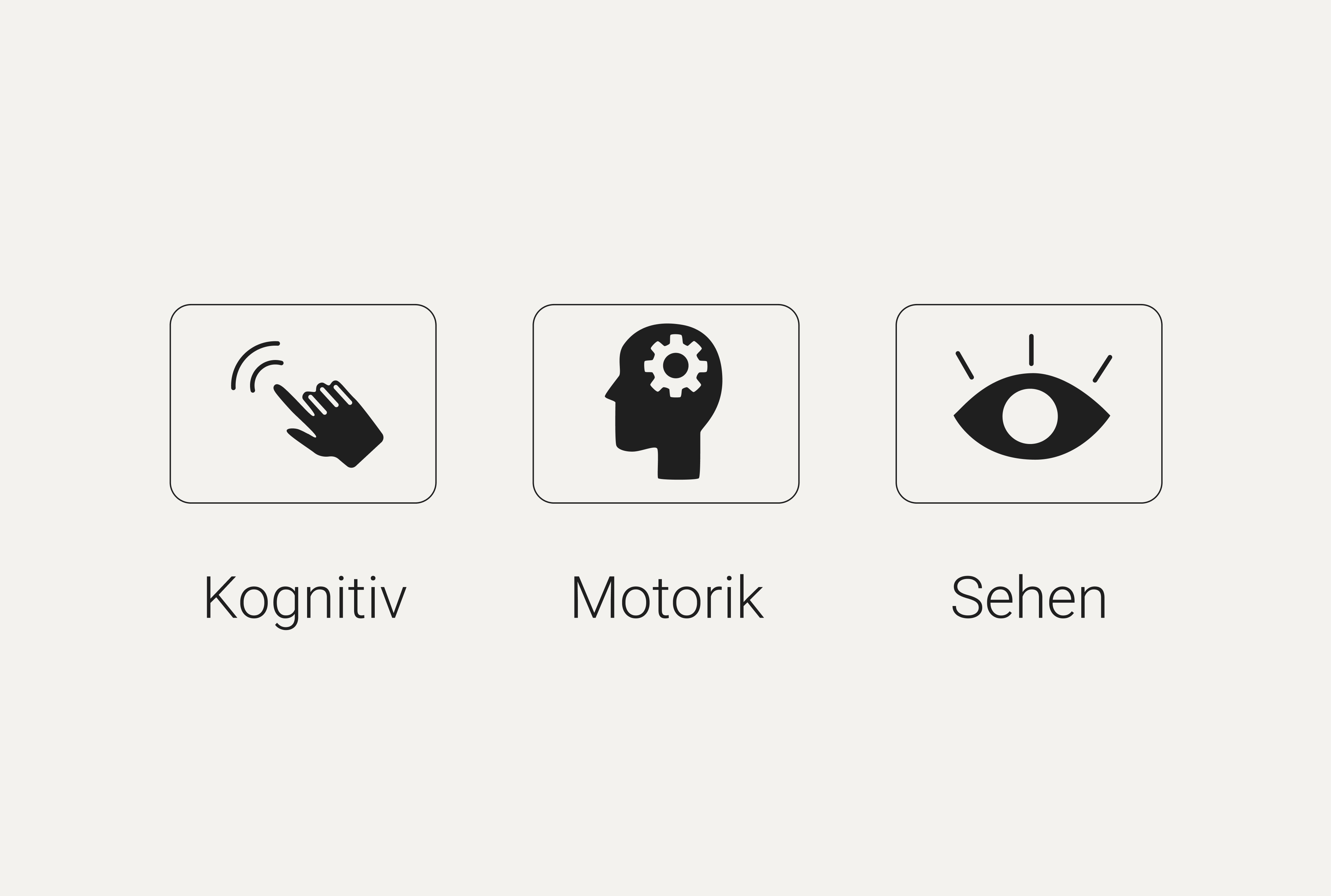
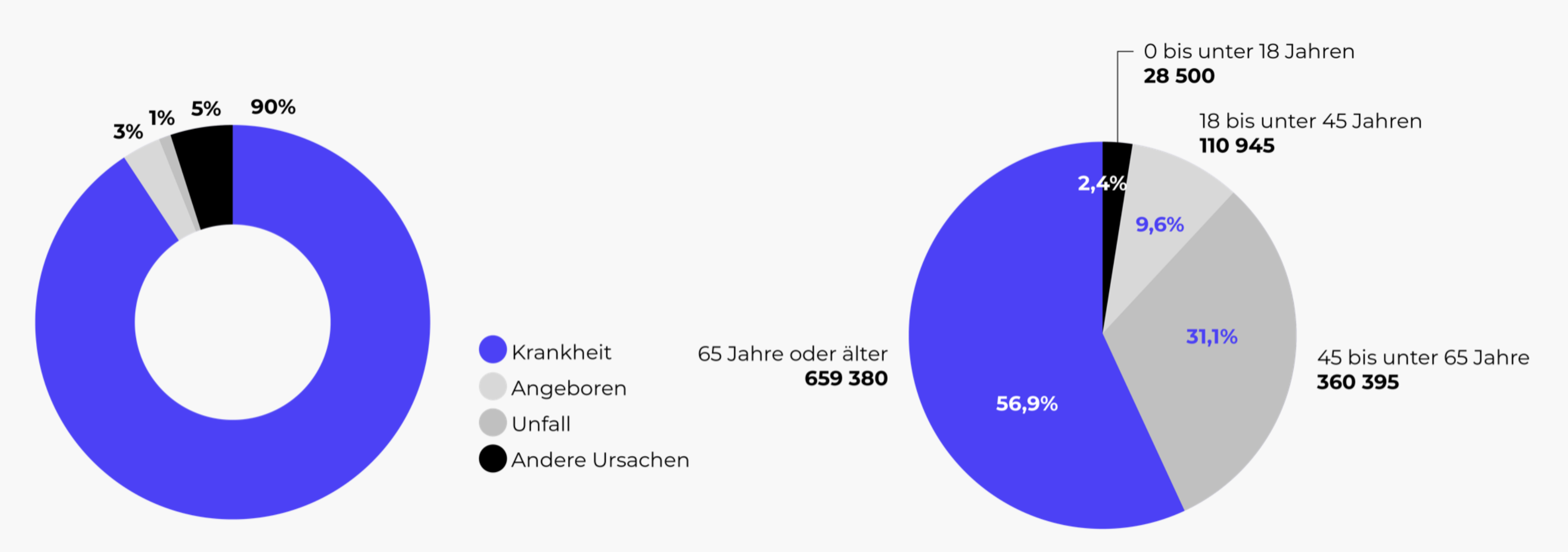
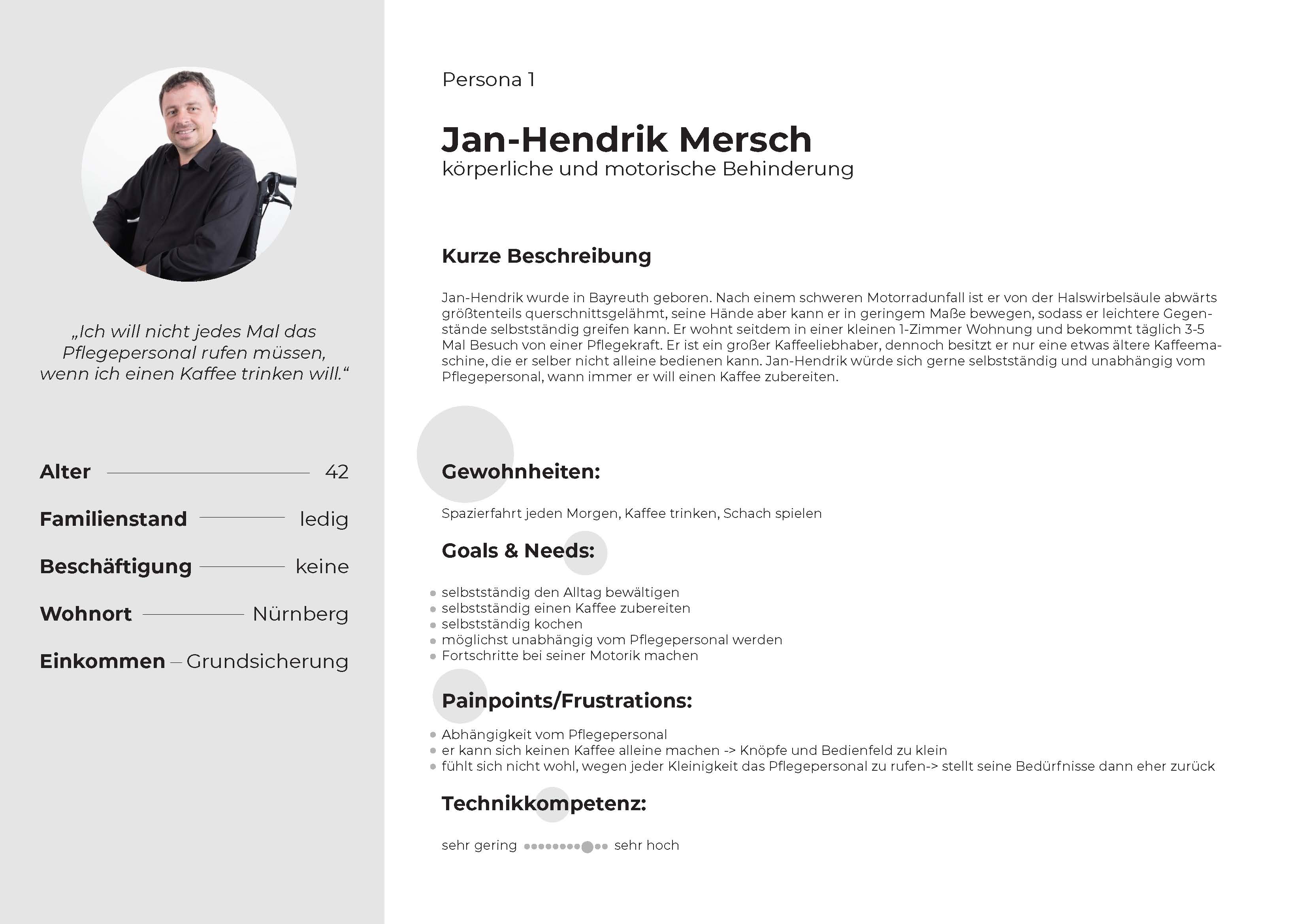
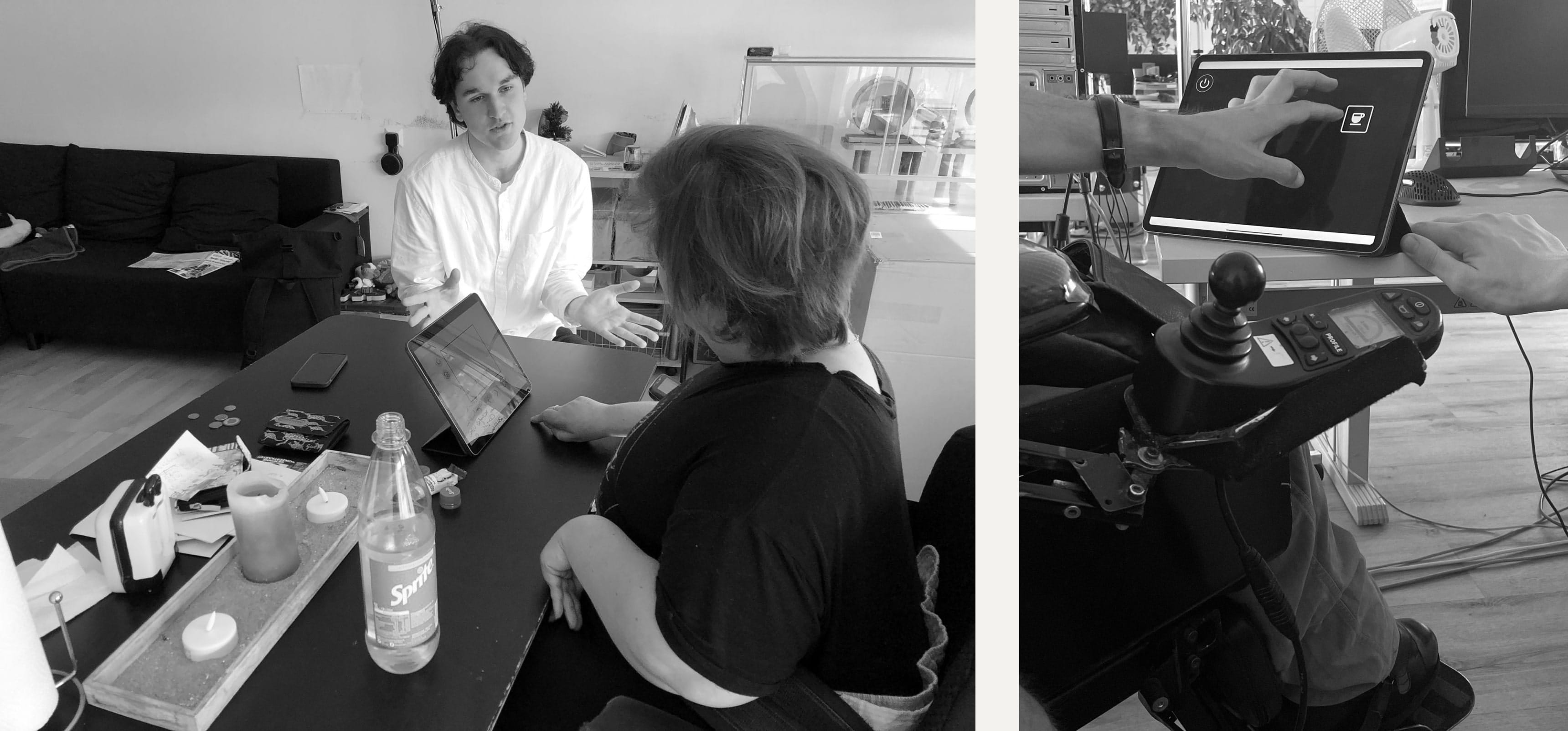
Surprisingly, we observed a widespread neglect of barrier-free operation in all coffee machines. To address this oversight, we undertook a series of interviews with individuals facing physical and mental disabilities, aiming to directly understand their unique experiences and requirements.
Due to our briefing, we were very limited in the design of the screen, but I learned to find the most suitable solution even under strict specifications.
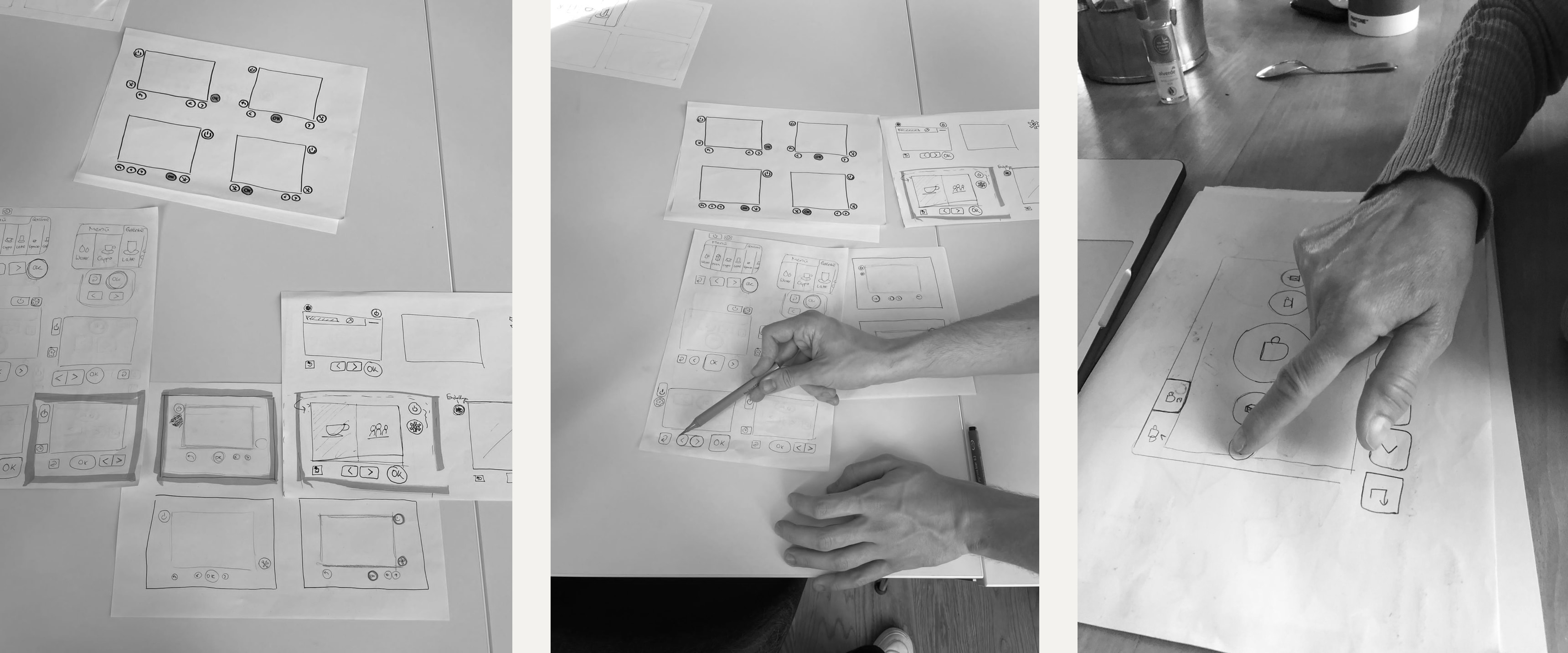
To ensure the best user experience for our specific audience, we meticulously tested all prototypes with individuals facing physical and mental impairments. Their valuable feedback played a key role in refining our designs.
The result is a screen that adapts to the person in front of it — switching modes for voice control, increased contrast and simplified flows depending on the needs of the user.
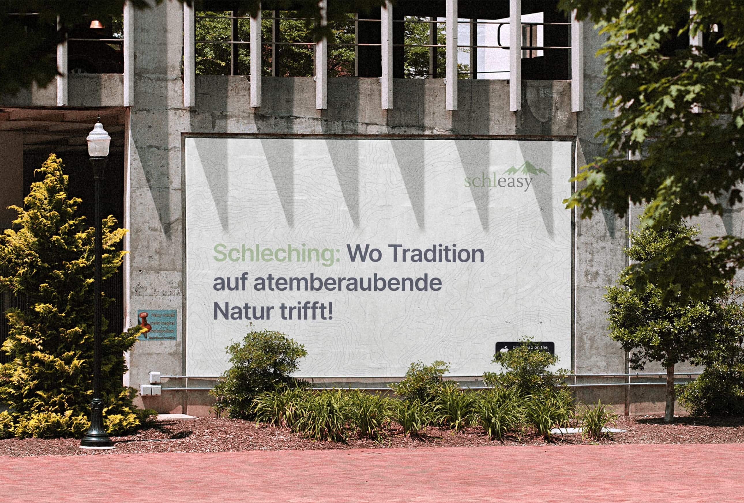
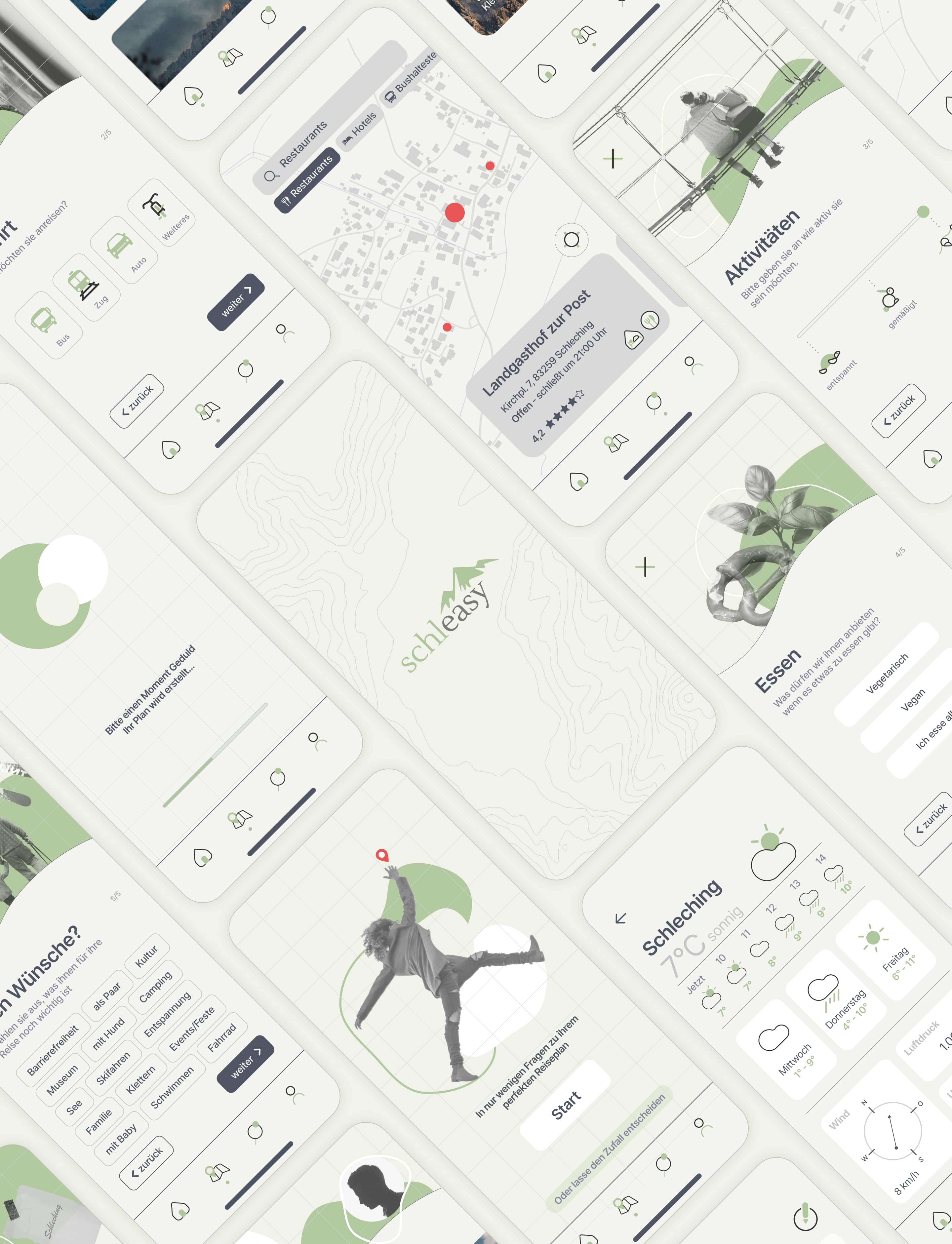
Schleasy is an app that helps tourists plan their perfect trip in just a few minutes, bringing every step from choosing a destination to booking a hotel together in one place.
Schleasy is an app that helps tourists plan their perfect trip in just a few minutes. With this app, we wanted to solve the problem of users spending a lot of time planning and researching for their trip. Schleasy brings every step from choosing a destination to booking a hotel together in one app.
This project was part of a cooperation project with the Thomas & Yvonne Wilde Family Foundation and Kulturerbe Bayern.
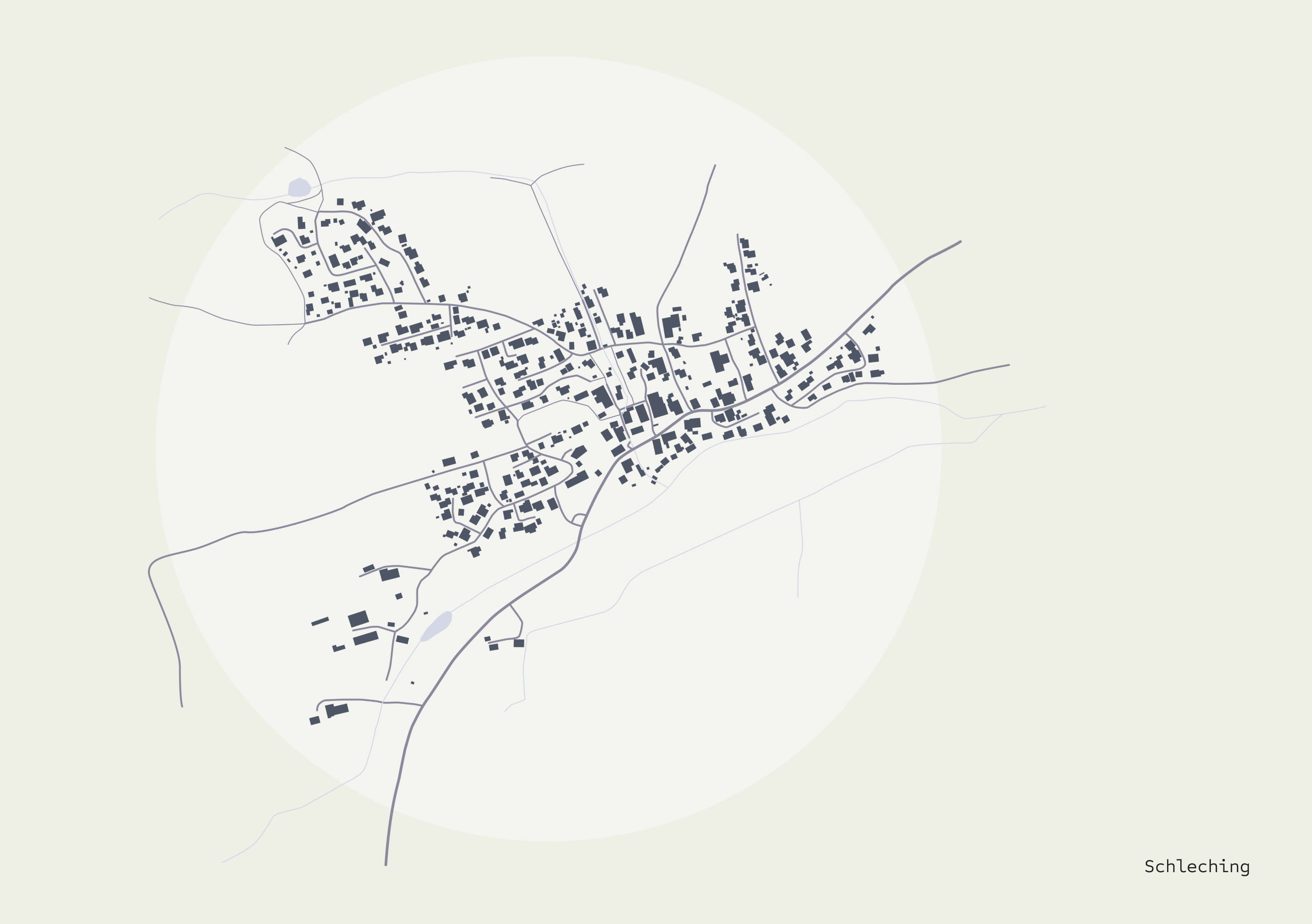
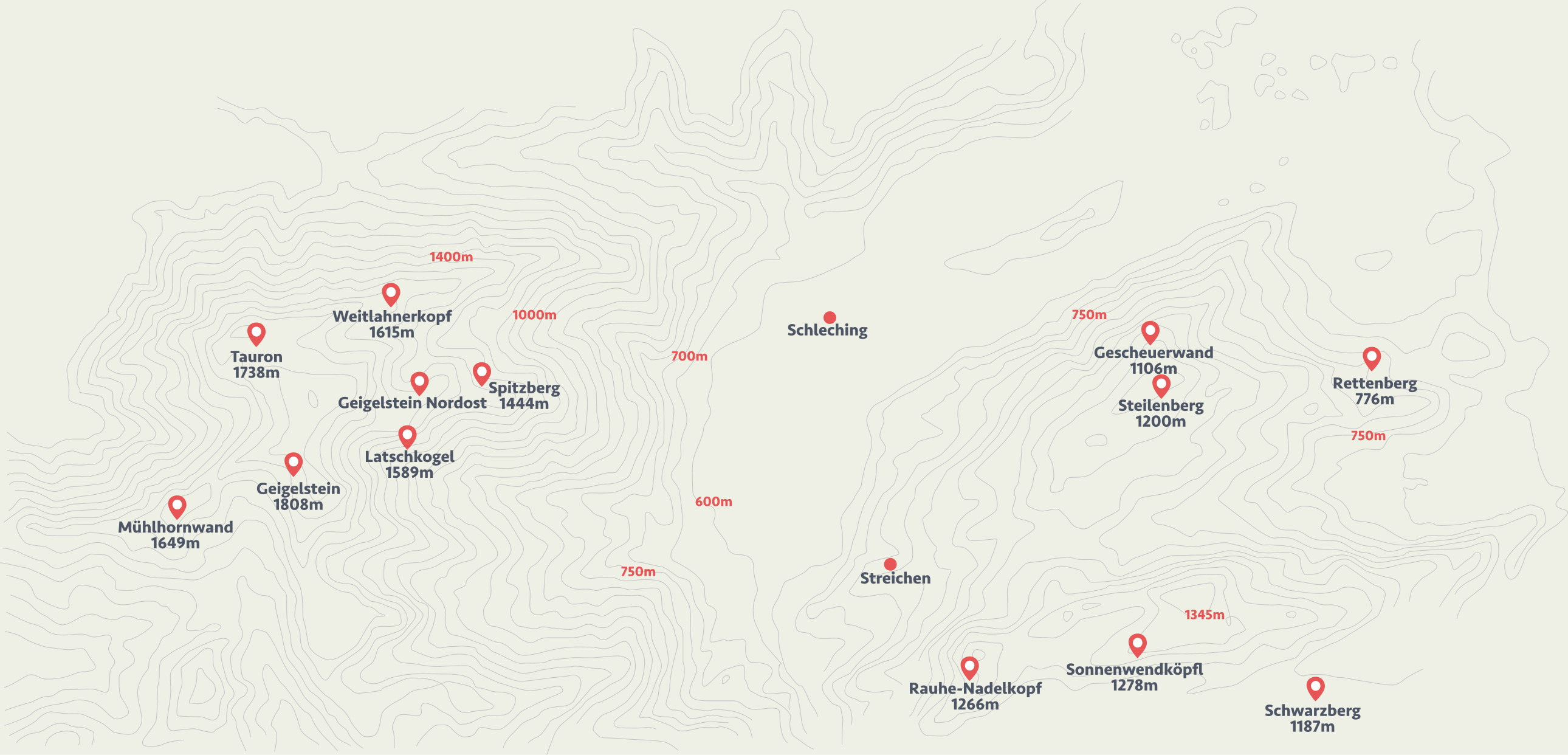
The municipality of Schleching reached out to us, expressing concerns about a decline in tourism and a desire for fresh, sustainable ideas. Our analysis involved an in-depth study of tourism offerings, statistical insights, and the unique geographical features that define Schleching.
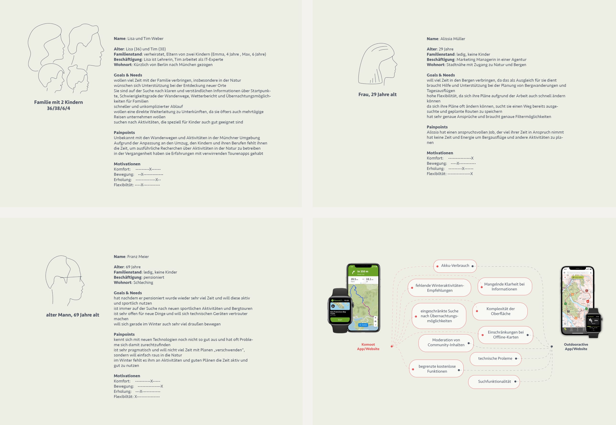
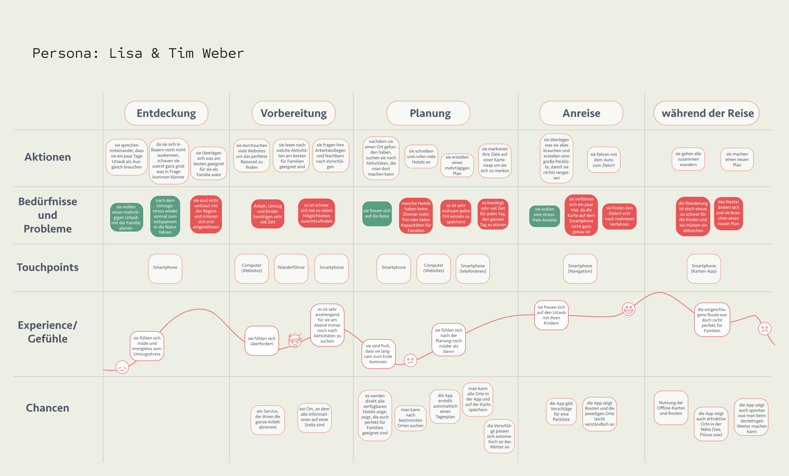
To truly understand the community, we spent several days on-site, immersing ourselves in the local environment. We engaged in insightful interviews with both locals and tourists, gaining valuable perspectives that would lay the foundation for our solutions.
Information dispersed across multiple platforms: users faced the inconvenience of scouring various websites for information.
Time-consuming trip planning: the process of organizing trips, excursions, and related activities proved to be very time-consuming.
Overlooked events and destinations: users often missed out on events or excursion destinations.
Confusing route apps: existing route apps were found to be confusing for users, causing potential navigation difficulties.
Limited awareness of Schleching. These insights laid the groundwork for our strategic interventions to address and overcome these challenges.
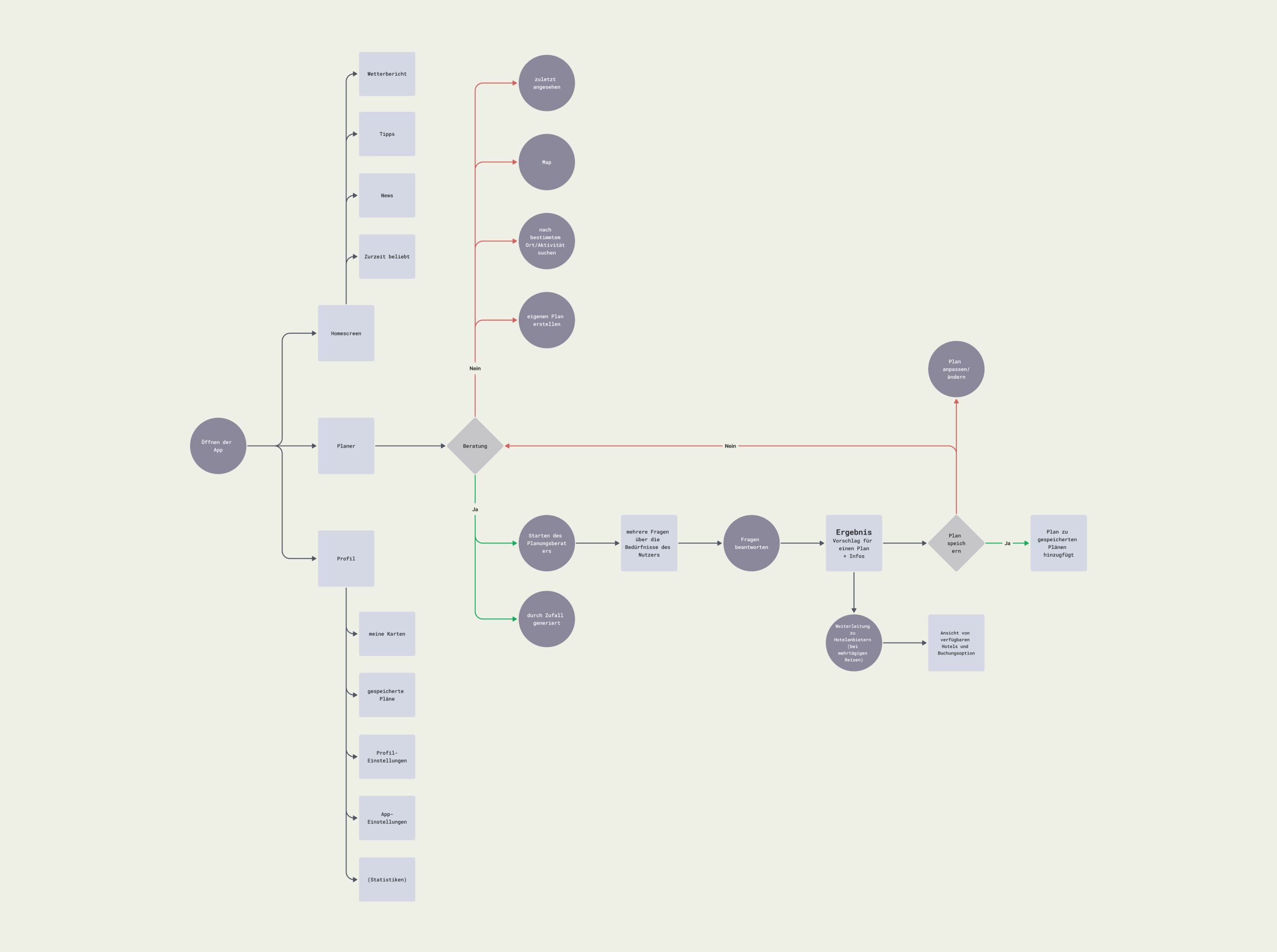
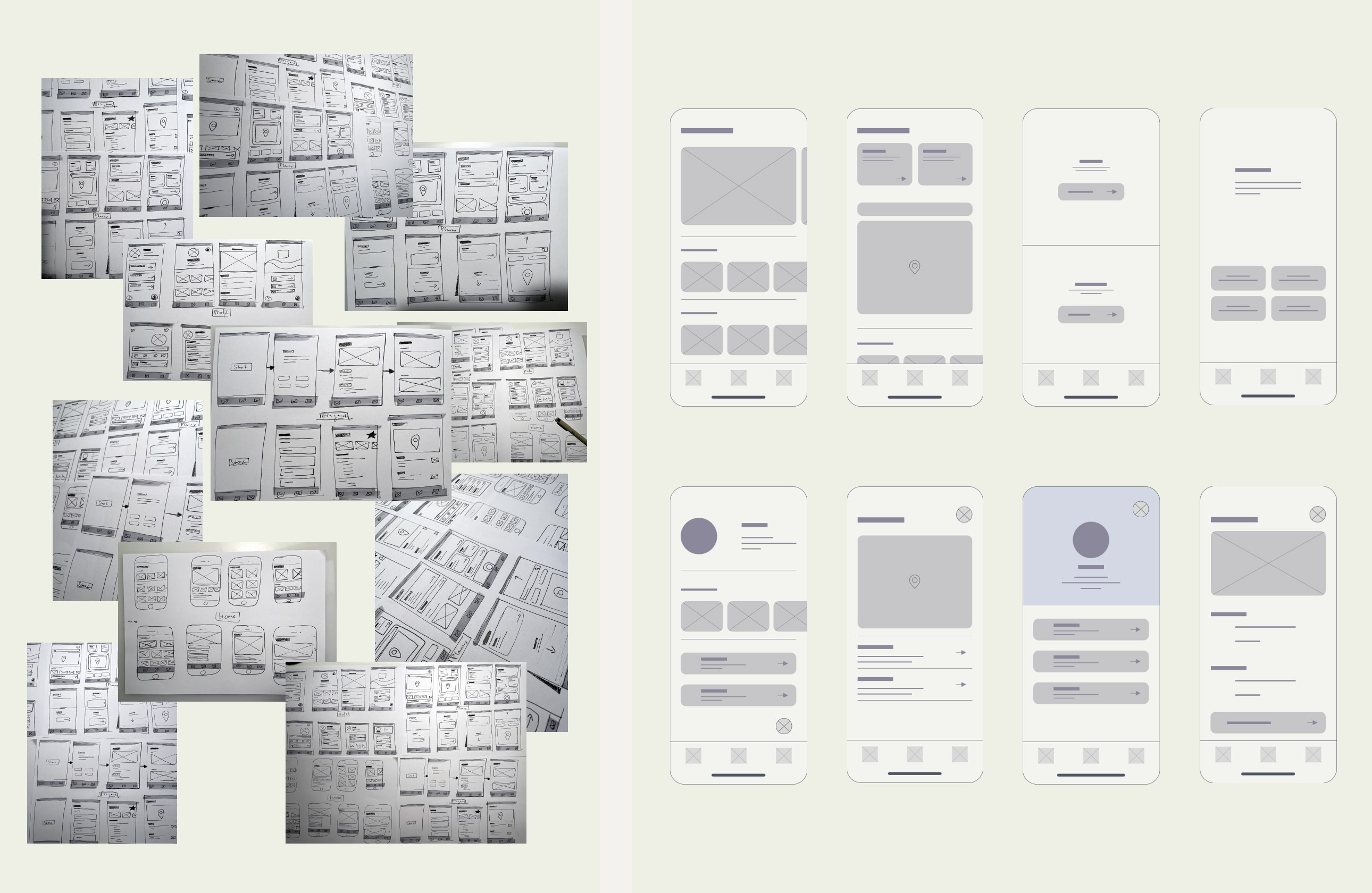
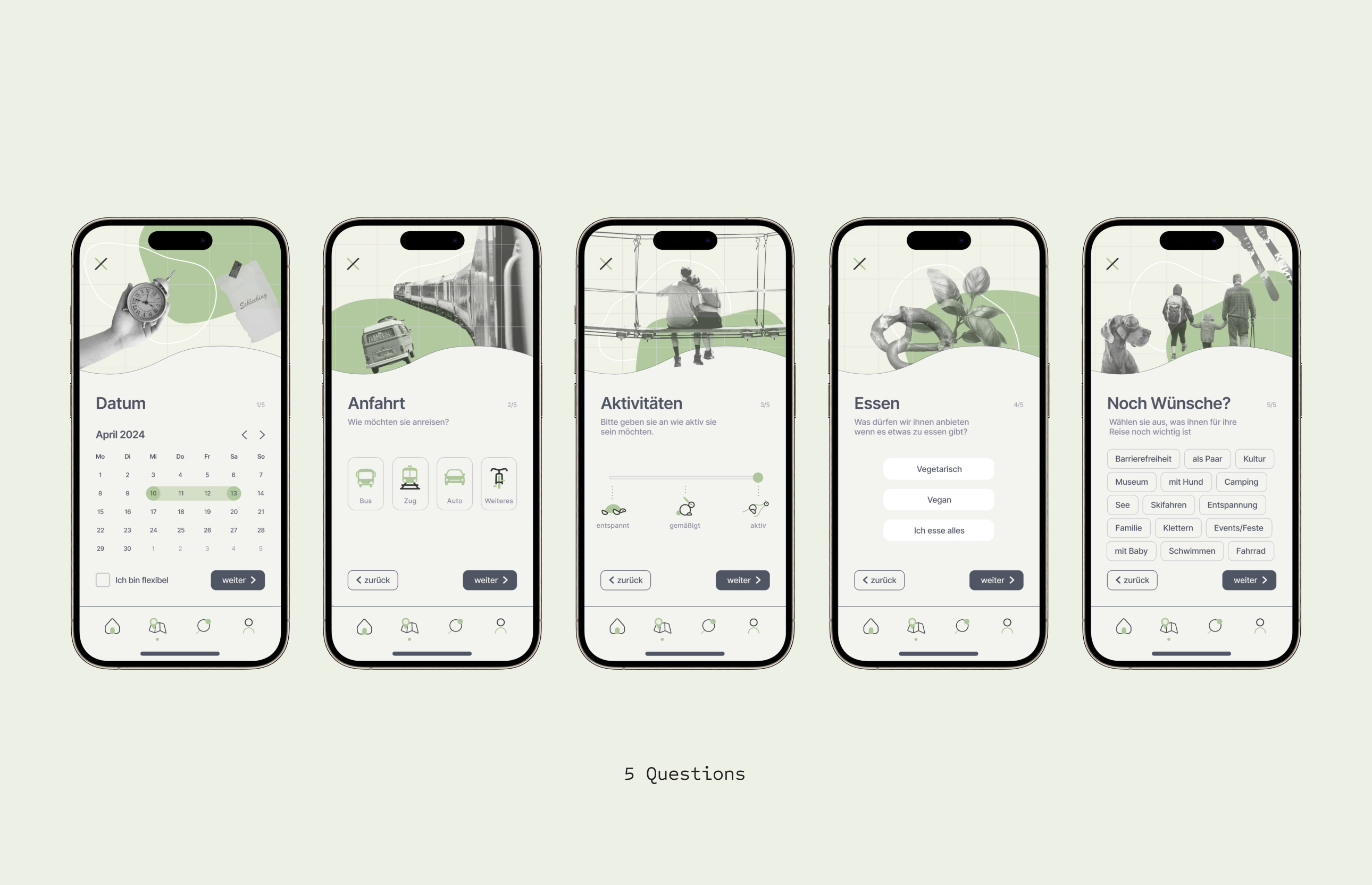
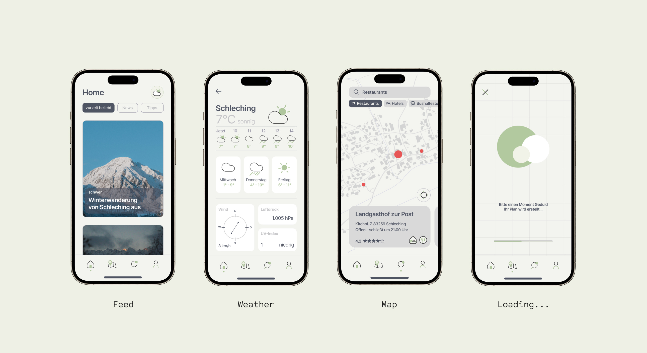
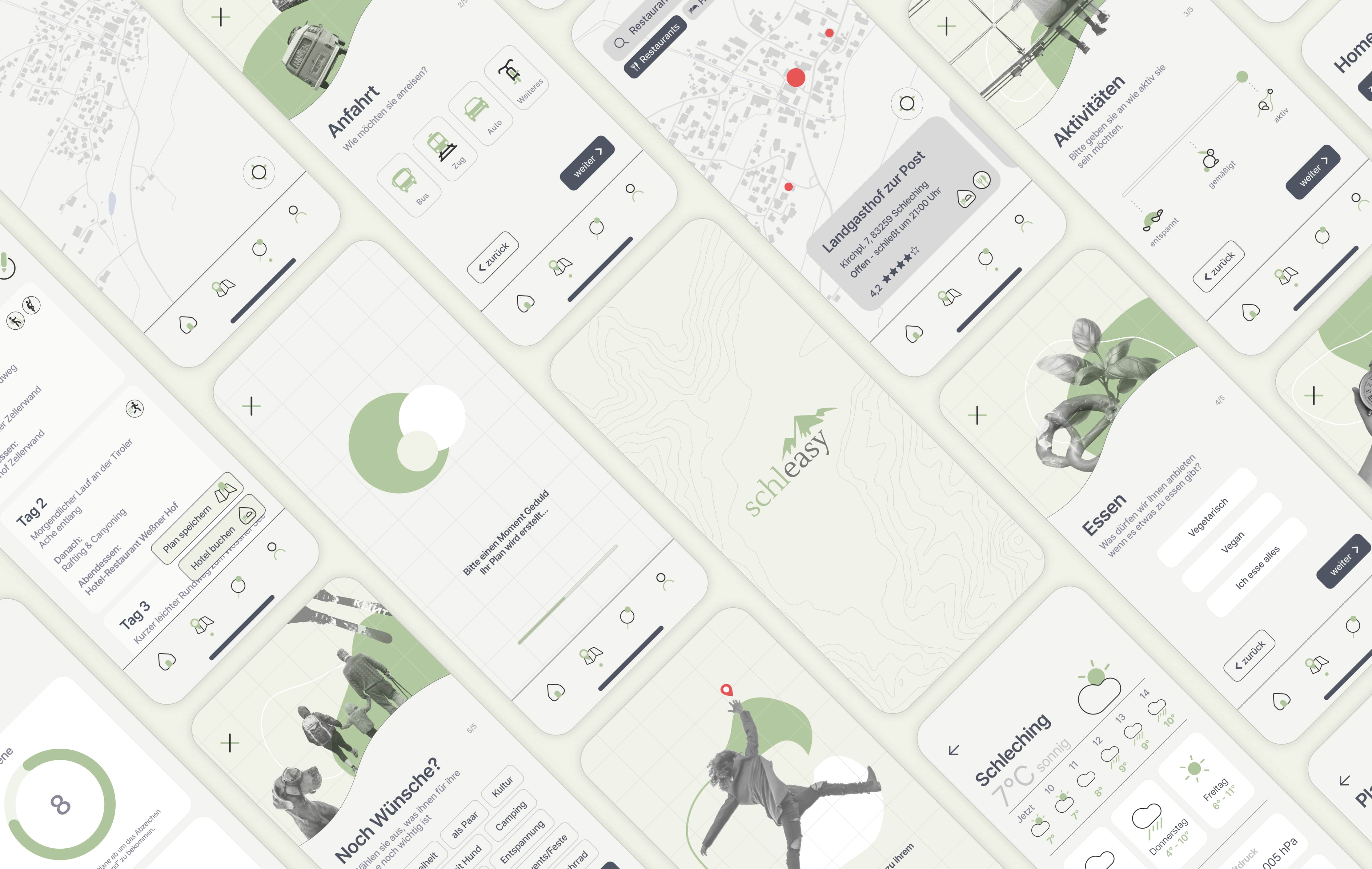
Schleasy is designed with simplicity and practicality in mind. Using a minimalistic approach, it leverages AI to craft personalized travel plans through just five straightforward questions, eliminating the need for extensive research and planning. In just a matter of minutes, users receive a tailored itinerary, freeing them from the hassles of manual trip coordination.
In addition to its core functionality, the app includes features such as a map, news updates, helpful tips, and real-time weather information to enhance the overall travel experience. We take pride in our commitment to sustainable tourism by prioritizing eco-friendly transportation options like trains and buses.
In a world where time is a luxury, our app gently nudges users to explore nature like in Schleching despite their busy schedules. It's a tool that encourages a connection with nature, providing a refreshing break from the demands of daily life.
The planner sits at the heart of the app, with the map, news, tips and weather supporting it around the edges.
Fabio Burmann · Munich, Germany · fabio.burmann@gmail.com
Responsible for the content of this site under § 55 Abs. 2 RStV: Fabio Burmann.
This is a personal portfolio. All project work is shown with permission of the respective clients or as personal, unaffiliated work. Add your full postal address here before publishing.
This site does not use cookies, analytics or tracking of any kind. No personal data is collected, stored or passed on when you browse it.
Fonts are loaded from Google Fonts, which means your browser contacts Google servers and your IP address is transmitted to them.
If you email me, your message and address are used only to reply. Add your hosting provider’s data-processing details here before publishing.