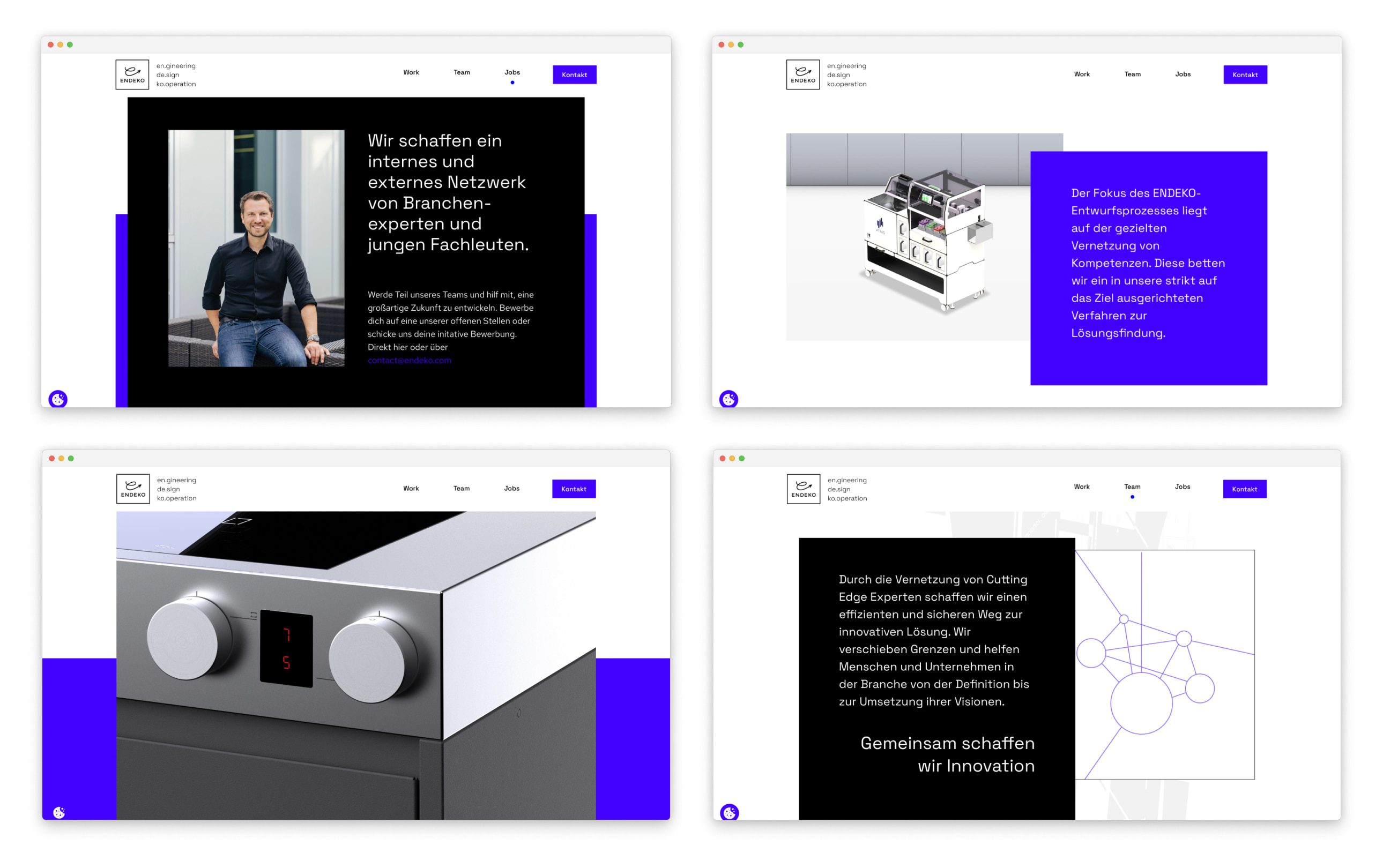
ENDEKO Website
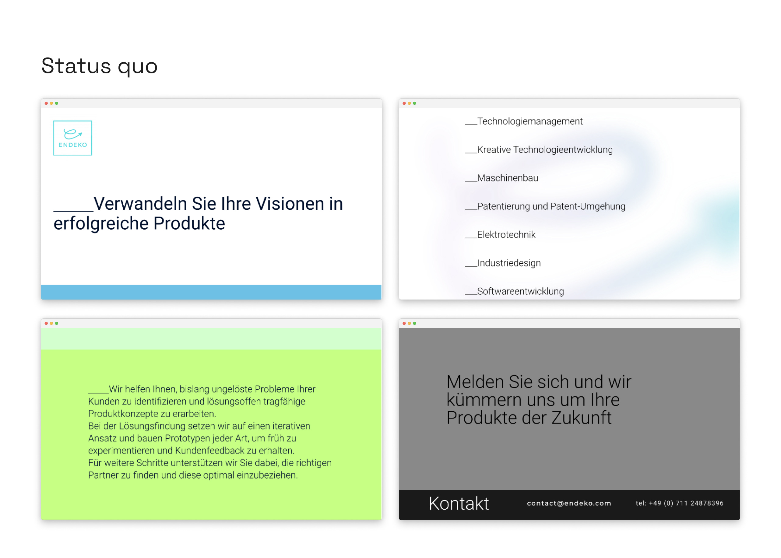
During my time at ENDEKO, one of my tasks was to redesign their website. The new website featuring a clear design language that effortlessly combines simplicity and their approach of innovation and technology. Radiating a bright and friendly ambiance, the interface invites seamless interaction, ensuring a delightful and intuitive user experience.
This website also defined ENDEKO's new corporate identity.
Colors
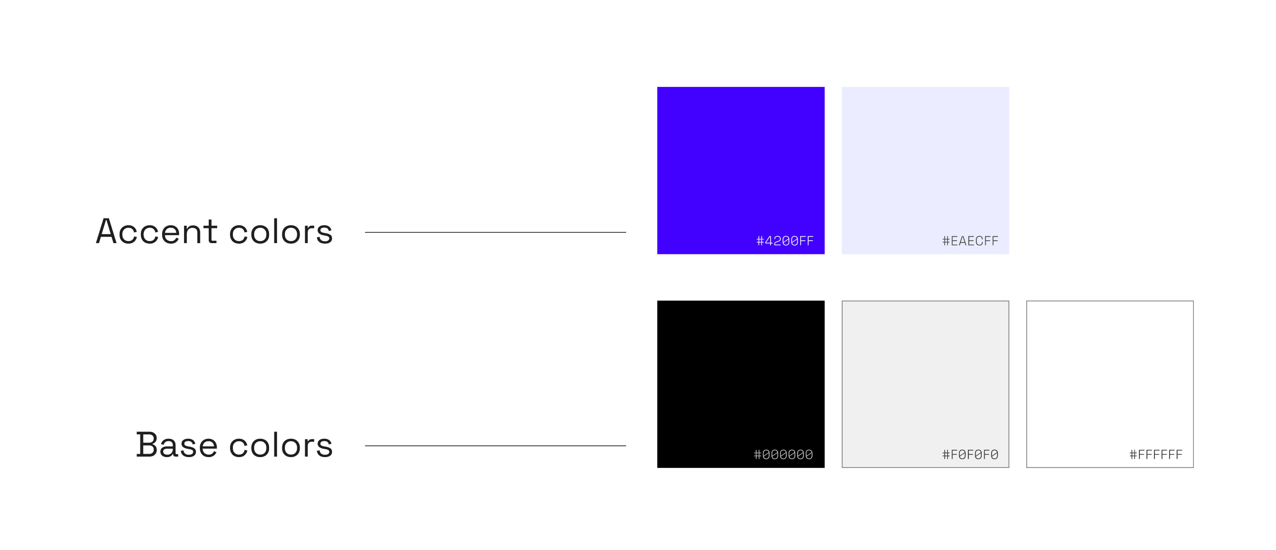
The foundational palette of basic colors establishes a robust visual framework for ENDEKO.
Complementing this foundation are two accent colors chosen to accentuate the modern and innovative essence of ENDEKO.
Together, these colors seamlessly weave into a cohesive design language that is both clear and open-minded.
Typography
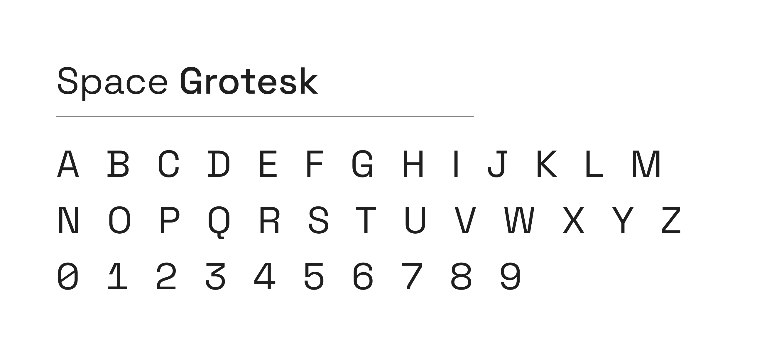
In selecting the typography for ENDEKO's website, I chose "Space Grotesk" for headlines and larger text sections.
Its technical character aligns well with ENDEKO's engineering focus.
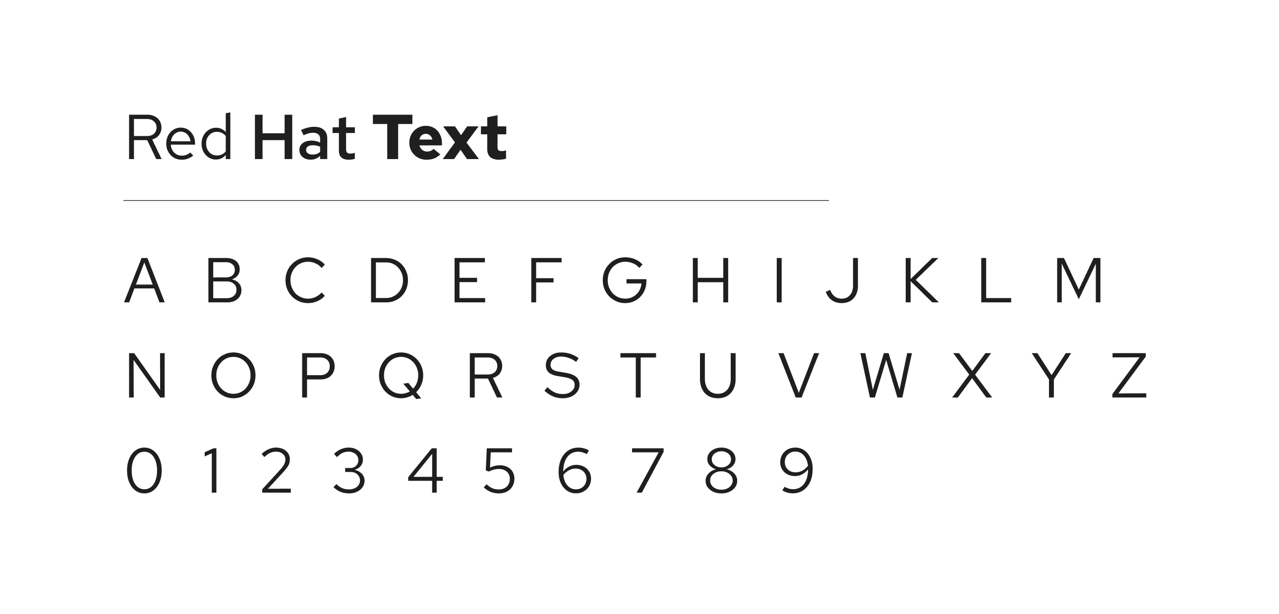
For all other text, I opted for the straightforward and modern Red Hat Text, prioritizing legibility and a contemporary feel throughout the user interface.
Graphics
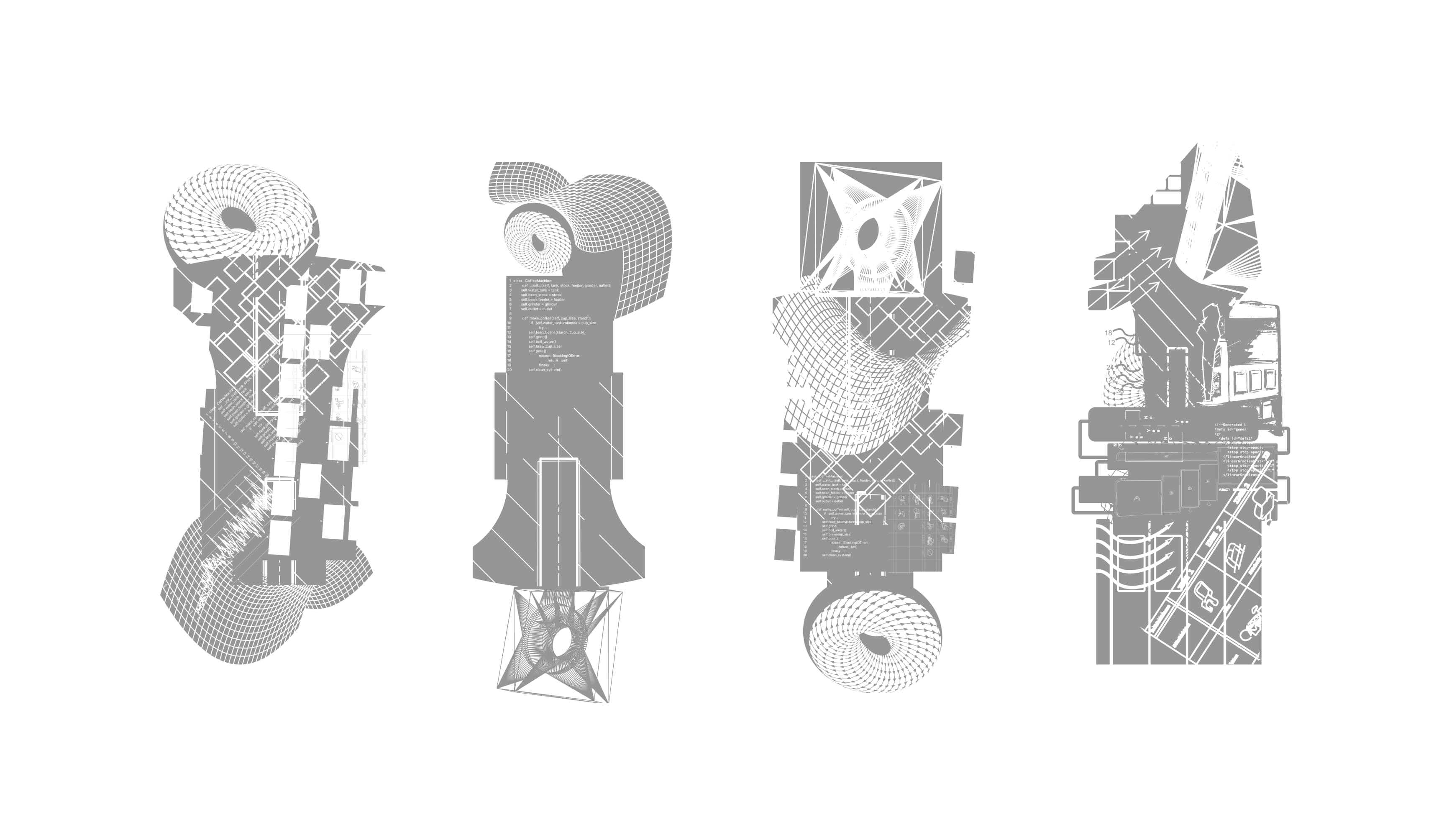
Markus Weisbeck contributed specially designed background graphics for the new ENDEKO website.
These graphics, quietly integrated with gentle parallax effects, play a vital role in the site's overall aesthetic.
